Author Archives: Molly Davies

Tas 11/12-Summary

In the research and communication skills module I found that the subjects we covered has really helped me to understand more of how to research properly when researching for inspiration ,for my future projects. I really enjoyed each lecture and then doing each task to put the lecture in to practise.

The subjects that where covered in the RCS I felt helped me understand why it’s important to reference the influences in your work. The first 2 lectures were on online resources and academic integrity. The lectures focused on Harvard referencing and the topic of plagiarism. We were shown step by step of how to reference books, newspapers and websites, I found this most helpful as it’s not something that I’ve been shown before, when it’s really important to do this in your work. When I went to do both tasks, I found that I really enjoyed visiting the library; I was able to become familiar with how to use it to help me when researching. I struggled with writing the essays as I normally do but as we were giving plenty of time to complete them I could do them bit-by-bit.

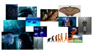
Tasks 5/6 looked at looking at how other artists have used, books, other designers, collections, movies and nature to influence their collections, I chose to look at alexander McQueen’s Plato’s Atlantis, I found this task really interesting, to pull apart how a high fashion designer was influenced. I created a mood board of 10 different things that he was inspired by when creating the collection. I found this helped me to look at different sources for inspiration when looking at my projects.
In task 7/8 we were given the choice of two texts in two different books, I chose ‘taste, Fashion and he French Fashion Magazine’ by Sanda miller. The chapter discusses the ways in which the authors used the magazines as a platform in order to make fashion as a whole equal to the other arts. They also discussed the ways in which people critique differently due to our own tastes. I found this task the hardest as I found it really hard to understand the text, once I eventually picked apart each page I was able to gain a brief understanding in order to write about it.

Task 9/10 was on the ethics around adverts, this is a topic I really enjoy looking at, as it’s a big problem within the industry and something I’ve written about before. In the lecture, we discussed and debated the issues this topic brings, I liked how everyone was able to discuss this together, I found this helped me to write about different points when it came to analysing the image we had to choose.
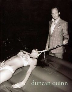
When it came to the task we had the choice of 2 controversial adverts one by American apparel and the other by Duncan Quinn both are adverts for male or female clothing, both brands using alarming images in order to sell their products. I chose Duncan Quinn’s advert for men’s suits, this particular advert I found extremely alarming especially in todays society. As discussed in the lecture the advert gave off many negative messages to its audience, such as women should be subservient for men. I found this topic most interesting, as everyone was able to discuss the different problems around the ethics in the fashion industry.
Overall, over really enjoyed these lectures and what I’ve learnt from them, I feel I will take the things I’ve learnt in this module for future reference.

Task 9/10-Ethics

Duncan quinn
The advert by Duncan Quinn which is supposedly advertising men’s suits, Described as ‘Savile Row meets Rock ‘n Roll’, by buzz feed. The advert shows a young female helplessly stretched out on top of what looks like the bonnet of a car. She lays at the foot of a well-dressed business man whom you can clearly see the face of as he looks directly into the camera. The high camera angle shows off the female’s body, as she’s lead in skimpy lace underwear with just her upper body on show. Her body looks as if she is asleep or lifeless making her look helpless and vulnerable. Her neck is tilted back whilst willingly allowing a stick like object held by the man to be clawed at her neck, this suggests she’s submissive, showing the male as a dominant figure over the woman, the fact that her face is also not shown dehumanises her.

The use of a half-naked woman draws in the male gaze as men would be drawn to the image, as they would naturally be attracted to the female body. The advert could also be seen to attract men in a negative way. The messages that the advert gives off to its male audience that this is what their suits could do for them, making women fall to their feet, and not just purchase the suits.  “we do “a great disservice” to boys in how we raise them, putting them in the “hard cage” of masculinity; and that we do “a greater disservice” to girls.” Tedx Talk, ‘we should all be feminists’ by Chimamanda Ngozi Adichie, she states that the way men are portrayed in today’s culture is allowing certain behaviours.
The advert could also suggest that women are made to serve men. The way that she is willingly laying on the bonnet of the car shows to male and female audience that women should be submissive and they are only there for men to use for sex or to for fill a need. By sending this message it allows men to think it’s okay to treat women in this way. The way the model is made to look vulnerable, by her lack of clothing and her face not shown in the shot it could suggest to the viewer the idea of rape and abuse towards women, making this look okay, suggesting to young women that they should allow men to treat them this way.
The use of a car which holds connotations of masculinity reinforces the masculine control the man has over the female in the shot.

Overall, the advert by Quinn sends negative messages to its reader, supporting this message is an issue with in the fashion industry as it targets such wide audiences.

Bibliography
Tedx Talk, ‘we should all be feminists’, Chimamanda Ngozi Adichie, 2013

Buzzfeed Staff, Buzzfeed (2012) The Five Most Sexist/Misogynistic Print Ads From The Last Five Years. Available from: https://www.buzzfeed.com/copyranter/the-five-most-sexistmisogynistic-print-ads-from-t?utm_term=.pu5EMnGYjj#.qroBE1rlZZ Acsessed: 30th November

Task 7/8- Reflective Writing

Taste, Fashion and The French Fashion Magazine

For task 7/8 we had the choice of reading 2 different texts out 2 books, I chose to look at the first text from ‘Taste, Fashion and The French Fashion Magazine’ by Sander Miller it explains the rise and struggles of the first few fashion and lifestyle magazines published in and around Europe in the 16 and 17 hundred’s, during the enlightenment in late 17th centaury and the French revolution in 1789. The authors and publishers, such as Jean Donneau de Vise, Fredrish Melchior von Grimm, Henri Bidou and many more created and published many magazines around England and parts of europe, in which they wanted to explore or showcase the different trends and fashions but also the work of other designers like, interiors. By doing this they wanted to create a window for the fashion world to bring fashion designers to the forefront making their work to be appreciated in the way other artists such as painters and musicians do.

The magazines where used as a platform to make fashion more of a common interest, influencing women on the finest clothes and creating fashions and trends. In the book ‘Adorned In Dreams’ by Elizabeth Wilson, she states “The mass production of fashionable styles- itself highly contradictory, links the politics of fashion to fashion as art. It is connected both to the evolution of styles that circulate in ‘high’ and avant garde art; and to popular culture and taste”. From reading the first chapter, in ‘Taste, Fashion and The French Fashion Magazine’ by Sanda Miller. The text mainly discussed the ideas of taste and how this can alter or effect how we critique objects or work and how other people critique different things differently because they have a different taste, but it also making a valid critique. For example, Immanuel Kant states from the text ‘Taste, Fashion and The French Fashion Magazine’, “our subjective experience
 ‘Beauty is in the eyes of the beholder’- affirms that there is no common denominator in our likes and dislikes”. This back’s up the idea of people having different concepts of ‘taste’, meaning no critique can be wrong. I found when reading this I thought It was a good concept as I may like a certain style of paintings and appreciate them where as others may have a different style to me therefore could disagree with my liking of certain works of art.

Bibliography
Barlett, Cole & Rocamora (e.d) 2013, Fashion Media: Past and Present, London: Bloomsbury

Wilson, E, (2003) Adorned In Dreams. United Kingdom: I.B Taurus & CO Ltd.
https://books.google.co.uk/books?id=Je49xdoIajwC&printsec=frontcover&dq=adorned+in+dreams&hl=en&sa=X&ved=0ahUKEwiD7rCLhfbXAhUhJsAKHaDrCBQQ6wEIKjAA#v=onepage&q&f=false

Task 5/6-Visual Research

Alexander McQueen’s Spring/Summer 2010 Plato Atlantis explores colour and texture whilst mainly inspired by nature. I feel inspired by this collection as he has included many references and portrayed each of them through techniques on each garment, for example life above sea, moth and snake prints, as well as the transition to underwater with stingrays, jellyfish and blue/green hues. These two opposites are heavily explored with a twist of Si-fi fantasy such as aliens/creatures and under water cities, Atlantis and Ridley Scott’s Alien, 1979. As well as reversing the ideas of Darwin’s theory of evolution by making the garment have more amphibian like features.

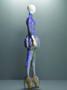
McQueen’s Spring/Summer 2010, is split between under water life and above sea level. The garments exploring underwater life are covered in blue and green hues mixed with iridescent sequins. The full body garment has Ÿ sleeves a high neck and a jellyfish like puff around the thighs. The full iridescent sequined garment mirrors the scales of a fish or the gleam of the sun on the sea’s surface, while the puff looks like the head of a jellyfish.

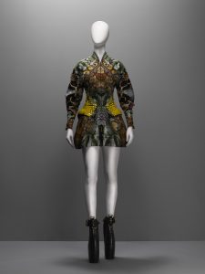
The colours and textures of snakes and moths heavily inspire the above sea garments. The garment is a mini dress with oversized long sleeves and a small collar with a zip down the front, it is covered yellow, green and brown tones of snake skin print, teamed with mustard like yellow sequins on the waist to look like the scales of a reptile, shaping the waist in an unusual way. Inspired by John McTiernan’s ‘Predator’ 1987. The strong/structured garment accentuating parts of the body giving the human body animalistic features.

Overall, I really like his SS10 collection, I find the combinations of cool blue tones and warm brown tones from the inspiration of nature are really well explored and are interesting within each garment as well as the over exaggerated structure of the Si-fi element in the garments.


-Darwin nineteenth century theories of evolution
-twenty-first century concerns of global warming
-Snakes, moths, Jellyfish, Stingrays
-Atlantis
-Ridley Scott’s ‘Alien’ 1979
-James Cameron’s ‘The Abyss’ 1989
– John McTiernan’s ‘Predator’ 1987


Bibliography
Bethune K. V&A The Museum of Savage Beauty (2015) Encyclopedia Of Collections: Platos Atlantis. Avalible from: http://www.vam.ac.uk/museumofsavagebeauty/rel/encyclopedia-of-collections-platos-atlantis/
Accessed: 29th November 2017

Task 3\4- Academic Integrity

Balenciaga: Shaping Fashion

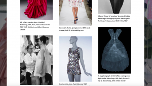
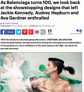
I chose to reference my 3 sources on the Balenciaga exhibition. I went to visit the exhibition at the V&A, the exhibition follows the life of the brand and the journey of CristĂłbal Balenciaga. The exhibition showed the how the brand started and how the structures of certain garments where made. I found this exhibition interesting as not only seeing the illustrations and initial ideas but also the finished garments as well as a few
garments tailored for certain people or events.

The book I referenced gives more of an insight to how he worked. The book describes the illustration process, choosing fabrics for each garment and who the garment was for, the struggles around perfecting each one and inspirations and fabrics and ideas for his famous collections.

The website I referenced I found it gave me a brief understanding of what the exhibition entailed. Photos of his most famous pieces from the beginning of his career up to more intricate detailed designs on this current work. Quotes from other designers such as, Christian Dior, reflects on how his fashion influence developed the fashion industry. The website also has a gallery section showing different garments from some of his pervious collections as well as other collaborations with other designers that feature in the exhibition giving dates of when the garment was made by who and where it was taken.

The newspaper article i referenced reflected on the 100 year anniversary of the brand, looking back at some of his most famous pieces worn by big celebrities and fashion influencers in their time. the article reflects on his time as a designer and the 80th anniversary of his Paris salon. This article gave a personal twist and a closer look into people with a higher status whom wore his designs.

Bibliography

Book:
Miller, L.E (2017) Balenciaga: Shaping Fashion, London, United kingdom, Harry N.Abrams

Website:

V&A Balenciaga: Shaping Fashion (2017) Available from:
https://www.vam.ac.uk/articles/about-balenciaga-shaping-fashion (Accessed 29th November 2017)

Newspaper
Mail online Reporter (2017) As Balenciaga turns 100, we look back at the showstopping designs that left Jackie Kennedy, Audrey Hepburn and Ava Gardner enthralled. Available from: http://www.dailymail.co.uk/home/you/article-4534778/As-Balenciaga-turns-100-look-designs.html
(Accessed 29th November 2017)

Task 1/2-Online Resources

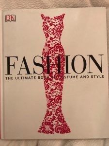
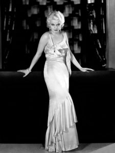
For the first task I looked at a fashion book I had at home, ‘Fashion, The Ultimate Book Of Costume And Style’ by Katheryn Hennessy. The book gave an in-depth look to each era of fashion and styles and how they evolved. I chose to look at the 1930’s. In the book is a picture of 19 year old jean Harlow wearing a tight cut silk dress, in which accentuates her body. I found the 1930’s era interesting as the glamour evening gowns where something I really liked, the chapter gave me more of an incite to how garments where changing and being worn, the fabrics used where not only showing off the female body but adding a glamour and sexy appeal.


Photograph of Jean Harlow in the 1930’s aged 19, ‘Fashion, The Ultimate Book Of Costume and Style’, chapter ‘1930-1939 Shimmering gowns’ page 275


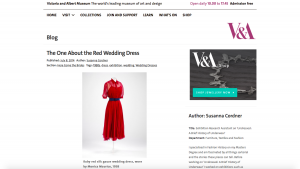
I then searched online for another source; I searched the V&A for 1930’s garments. I found a 1938, red wedding dress. The dress worn by Monica Maurice in 1938, was made out of red silk gauze, the light and elegant dress is midi length and has a back belt around the waist. The use of the silk gauze and small slip under the dress creates a sexy twist on a white wedding dress showing off the shoulders. I found this piece was interesting as in this era women where starting to dress with more sexy and using elegant materials, allowing the female body to be accentuated and on show.

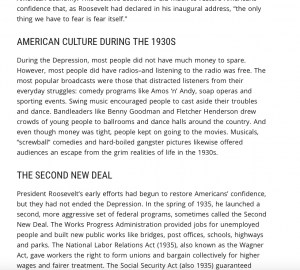
I then went on to research further, I looked into what was going on around the 1930s and how this could of effected or benefited fashion at this time. I found many websites which discussed the great depression. The website I looked at explains the struggles with in the years after and how they got America back on its feet. I found this source helped me understand what was going on in and around the fashion industry at that time.

Bibliography Hennessy K. (2012) Fashion, The Ultimate Book Of Costume And Style. London, Great Britain, Dorling Kindersley Limited.

Cordner S. V&A (2014) The One About The Red Wedding Dress. Avalible from: http://www.vam.ac.uk/blog/here-come-brides/the-one-about-the-red-wedding-dress
6th December 2017

The Great Depression. Avalible from: http://www.history.com/topics/1930s
6th December 2017