Writing this blog has played an essential role in my understanding of the wider context of art. It has stretched me and encouraged me to do extra research which does not directly link to my studio practice. I have found the tasks interesting and varied. The blog is a great opportunity to push myself to think more about what goes on in the world of art and in the past related to areas that I wouldn’t normally think to investigate. I have broadened my understanding of the history of art, of contemporary artists, of different art movements and institutions and of critical discussions surrounding art. I’ve been encouraged to consider different ways of making art outside of my usual practice and I think it has been a valuable addition to my art education.
Author Archives: Lily Williams
Task 10: Upload one image of your choice to represent your practice, and exactly ten words.
Vibrant
Sensual
Colourful
Sensitive
Provocative
Detailed
Conscious
Human
Continuous
Personal
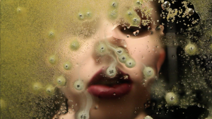
Choosing one image only to represent my practice has been a real challenge. My practice is so varied and there’s such a wide range of areas that I am interested in and media I enjoy working with and want to explore further. Therefore I decided to choose an image from my most recent project: Artist’s Film. This image is a good representation of my love for vibrant colour and high quality/detail. The film I made showed a girl’s mouth pressed up against a glass surface, her tongue and lips moving around in different coloured substances with vibrant contrasting lipstick colours.
Another passion of mine is making wearable art, which links strongly to the human aspect of my work. In the past my practice was mostly based in drawing and painting. I’m still very interested in painting as a media but at this stage I want to explore everything before I settle into a more permanent way of working. My practice is still very much evolving, and I am really enjoying the discovery and experimentation at this stage in my artistic experience.
Leo Steinberg , in his essay The Flatbed Picture Plane,1972, describes that certain artists, such as Robert Rauschenberg, Dubuffet and Duchamp started working on pieces that ‘tilt the pictorial plane’. Steinberg claims that the ‘tilt in the picture plane from vertical to horizontal’ is ‘the most radical shift in the subject matter of art’. Steinberg explains that before the 1950s we were used to seeing pictures as if we were looking through a window; ‘the picture as representing the world’. He compares a new way of making pictures to the ‘flat bed printing press’ as a metaphor to represent the two dimensional aspect of this new picture plane. Richard Serra, in his essay The Yale Lecture, 1990, explores ideas about site specific work and its fundamental relationship to its immediate environment, in contrast to modernist sculpture which ‘function critically only in relation to the language of their own medium’. He goes on to discuss how art can be used by organisations to counter ‘cynicism of commercial and political manipulation’, and argues that it is the artists responsibility to speak out against this use of art for unethical corporate gain.
Both authors say that there was a shift in their respective areas of focus during the period around the 1950s.
En.wikipedia.org. (2017). History of printing. [online] Available at: https://en.wikipedia.org/wiki/History_of_printing#Flat-bed_printing_press [Accessed 7 Dec. 2017].
Theoria.art-zoo.com. (2017). The Yale Lecture – Richard Serra | ART THEORY. [online] Available at: http://theoria.art-zoo.com/the-yale-lecture-richard-serra/ [Accessed 7 Dec. 2017].
Web.mit.edu. (2017). The Flatbed Picture Plane. [online] Available at: http://web.mit.edu/allanmc/www/othercriteria.pdf [Accessed 7 Dec. 2017].
Task 12: Choose a large work and imagine it smaller
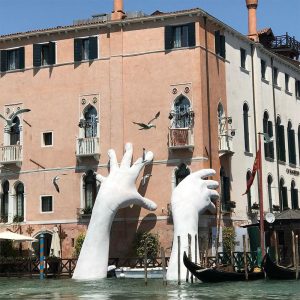
This work by Lorenzo Quinn was made for the 2017 Venice Biennale. It is titled ‘Support’ and was made to highlight climate change, as well as the specific effect of the rising water level in the city of Venice. For me, the sheer scale of the piece is what really makes it have such an impact. If the sculpture were any smaller the hands could easily get visually lost amongst the boats, posts and other things near the water/building. I think that the only way these could maintain their impact on a smaller scale is if they were moved to a completely different location. Having said that, they are a site-specific piece of art work and so to translate the same meaning in a different place would be a great challenge. I think that the current scale of the hands let your imagination envisage them belonging to a person who is only just big/strong enough to try to hold up the building and stop it sinking further into the water. On a practical level, reducing the scale of these hands wouldn’t be difficult, and you wouldn’t have to remove much detail in them, if any. If the sculpture was going to be scaled down, one would have to recreate the whole scene, including real water and the boats in order for the piece to carry the same message. You could, for example, create a scale model for showing in a gallery, which might still get over the same message. The rest of the scene would be the challenge.
Colossal. (2017). Support: Monumental Hands Rise from the Water in Venice to Highlight Climate Change. [online] Available at: http://www.thisiscolossal.com/2017/05/support-hands-sculpture-venice/ [Accessed 7 Dec. 2017].
Evening Standard. (2017). Artist takes on climate change with giant sculpture in Venice Canal. [online] Available at: https://www.standard.co.uk/lifestyle/design/artist-takes-on-climate-change-by-installing-giant-hands-sculpture-in-venices-grand-canal-a3547486.html [Accessed 7 Dec. 2017].
Quinn, L. (2017). Venice Biennale 2017 | Lorenzo Quinn. [online] Lorenzo Quinn. Available at: https://www.lorenzoquinn.com/venice-biennale-venice-2017 [Accessed 7 Dec. 2017].
Task 9: Choose a work of contemporary art and show how a particular aspect of theory might apply to it.
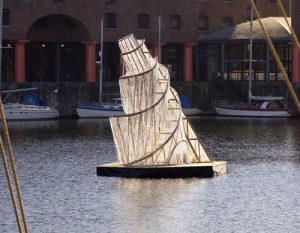
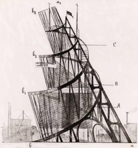
Ai Weiwei, Fountain of Light, 2007 Tatlin’s construcivist tower design, 1919
The original tower was designed by Vladimir Tatlin in 1919 as a celebration of the formation of the Communist Third International after the Bolshevik Revolution of 1917. Designed as part of the Constructivist movement it was supposed to be made from steel, iron and glass. These components were significant as they were symbolic of power, hope and modernity. It was going to be over 400m high, taller than the Eiffel tower, but never actually got constructed due to a lack of materials. Ai Weiwei transformed Tatlin’s monumental constructivist design into an 8 meter tall chandelier. Lit with 800 lightbulbs, it was shown at the Tate Liverpool, floating in the Albert Dock. It was a site specific work, designed specifically for Liverpool. This was particularly relevant due to Tatlin’s tower’s links with industrialisation which played such a big part in shaping modern Europe, especially Liverpool.
Their manifesto states that a constructivist object is ‘simply a product of an industrial order like a car, an aeroplane and such like.’ The fact it has been turned into this decorative chandelier made of crystal completely undermines the original constructivist ideals of powerful, strong utopian design. However I don’t think that Ai Weiwei is mocking Tatlin’s ideals by transforming his tower into a chandelier. Ai’s tower can definitely be seen as a tribute to Tatlin’s tower which was never realised.
The National. (2017). Louvre Abu Dhabi: the long-awaited first look inside. [online] Available at: https://www.thenational.ae/arts-culture/louvre-abu-dhabi-the-long-awaited-first-look-inside-1.673668 [Accessed 7 Dec. 2017].
Royalacademy.org.uk. (2017). Ai Weiwei: 13 works to know | Blog | Royal Academy of Arts. [online] Available at: https://www.royalacademy.org.uk/article/ai-weiwei-13-works-to-know [Accessed 7 Dec. 2017].
Tate.org.uk. (2017). Cite a Website – Cite This For Me. [online] Available at: http://www.tate.org.uk/download/file/fid/6611 [Accessed 7 Dec. 2017].
Ft.com. (2017). Auditions for the role of China’s Picasso. [online] Available at: https://www.ft.com/content/b31bc7f6-e910-11db-a162-000b5df10621 [Accessed 7 Dec. 2017].
www.wikiart.org. (2017). Monument to the Third International, 1919 – 1920 – Vladimir Tatlin. [online] Available at: https://www.wikiart.org/en/vladimir-tatlin/monument-to-the-third-international-1920 [Accessed 7 Dec. 2017].
Mundy, J. (2017). Lost Art: Vladimir Tatlin. [online] Tate.org.uk. Available at: http://www.tate.org.uk/context-comment/articles/lost-art-vladimir-tatlin [Accessed 7 Dec. 2017].
The Art Story. (2017). Constructivism Movement, Artists and Major Works. [online] Available at: http://www.theartstory.org/movement-constructivism-artworks.htm [Accessed 7 Dec. 2017].
Anneberk.nl. (2017). Ai Weiwei – Anne Berk. [online] Available at: http://anneberk.nl/articles-english/ai-weiwei/ [Accessed 7 Dec. 2017].
Tate. (2017). The Real Thing: Ai Weiwei: born 1957 | Tate. [online] Available at: http://www.tate.org.uk/whats-on/tate-liverpool/exhibition/real-thing-contemporary-art-china/real-thing-exhibition-guide-11 [Accessed 7 Dec. 2017].
Task 6: Invent a new mode of practice
A mode of practice that I am interested in developing is the physical use of the human body to create artwork. This has been done in so many ways in the past from Yves Klein’s Anthropometry paintings, to Mona Hatoum’s use of actual human hair in her sculptures.
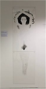
For my FMP of my foundation course I used hair removal wax strips to make etchings from, and also created a full scale etching of a woman, represented only by her (body) hair. I have found that the common theme in the artwork I most enjoy is the human body. This can be interpreted pretty loosely, and the body isn’t always the subject. For example I am really passionate about making garments and wearable art. I also have an interest in sculptures made from everyday objects, like the stools by Ai Wei Wei, or Tony Cragg’s piece Social Situation 1992. In each of these examples, the body is an integral aspect of the objects’ purpose; they would be obsolete without it.
Under this broad theme of working with the body, I’ve been thinking about the areas of contact our bodies make with surfaces and other bodies. It occurred to me when listening to a guided meditation. I was told to focus on the contact of body with the chair and floor. I immediately tried to picture the shape of the area of contact. It would be interesting to map this somehow, and eventually I would like to represent it three dimensionally. I am yet to develop the practicalities of this, it is very much still a concept in progress, but I think it is a starting point that has a lot of potential.
Task 5: Write about a single exhibit from an exhibition and reflect on the value of seeing it ‘in the flesh’
I recently saw a film by the Norwegian artist Torbjørn Rødland at the Sperpentine Sackler Gallery called 123 BPM (2005). It was made from clips, mostly of trees and plants and a woman doing an exercise routine, all in time with a techno beat. It’s strangely interesting to watch the leaves shake on a branch – which is a very familiar scene – but to a repetitive beat it applies a whole different context. In the film the movement of the branches contrasts with the random movement we usually see in nature. Their movement to the music almost personifies them, compelling the viewer to relate to them in a different way. Because the repetition of movement is continued for most of the film, you start thinking about how the artist captured this movement; whether the branches were bouncing naturally in the breeze, or if it was someone’s job to repetitively shake a branch for the film. I find this thought adds a playful humour to the piece, especially when applied to scenes such as the clip where we’re looking through reeds to two figures sitting in a small two man boat in the distance on a large, tranquil body of water. The boat is central in the frame and directly underneath a pinkish moon. A grey, misty sky merges almost seamlessly into the surface of the water. The scene is calming and picturesque – or it would be if it wasn’t for the single reed shaking vigorously to the stomping repetitive beat. I think this playful juxtaposition is effective and amusing. Seeing the film in the gallery environment made a difference to watching it on a laptop screen because I was far more immersed and focused on it. Being in a dark room with the music loudly emanating from the speakers behind me intensified the whole experience and definitely added value to the artwork. I think it is really important to experience art work ‘in the flesh’ when possible.
Task 4: Write a short review of the exhibition an exhibition you have seen recently.
Exhibition Review:
11th Nov 2017 Serpentine Sackler Gallery
Torbjørn Rødland: The Touch That Made You
I really enjoyed a recent exhibition at the Serpentine Sackler Gallery. It was a collection works from the past two decades by the Norwegian artist Torbjørn Rødland (born 1970). I felt that the curation was good, and that the pieces worked well in the space. Each photograph had an element of intrigue; whether it be a photo of a puzzling and ambiguous scenario with a young, topless, muscular boy holding a much older man against a wall by the throat, or a scene where a woman is resisting abduction, the attacker out of the frame and a bizarre juxtaposing brightness to the image. There was also a selection of photos which might be loosely referred to as ‘still lives’. The interest in these comes from his playfulness with the interaction of incongruent materials like fire with flesh or ice, and hair with food. I was drawn in by his photographs, and in the cases where it applied, I felt compelled to try to analyse the expressions of his subjects, to draw more about the context of their situation from them. The way the emotion has been captured leaves the narratives beguilingly ambiguous, and I think this is largely what makes his photos so intriguing.
Task 2: Consume a book
Book: On Being an Artist by Micheal Craig-Martin
On Being an Artist is a series of comments on the art world. It is interspersed with personal, anecdotal snippets which give an insight into some of the significant experiences in Michael Craig-Martin’s life as an artist. If approached chronologically, the reader will build a sense of the journey that Craig-Martin travelled when becoming an artist and what he has learnt since. In this sense, some of the chapters feel very autobiographical. Due to the fact that each chapter is between half a page and four pages in length it is very easy to dip in and out of. This means if you so wish you would be able to select only the chapters which talk about art in an objective way – the kind of thing you might read in an art history book for example – which would give you a different, far less personal sense of this book entirely. For me, the most interesting chapters are the ones that combine anecdotal experience with conclusive observations. For example, Craig-Martin discusses ideas of freedom and discipline in art school, he first tells of his own desires and expectations, and then goes on to state that in art schools “the aura of ‘discipline’ that permeates most educational institutions is wonderfully marginalized… …It is obviously incompatible with creative activity.” I would say that for an art student, or anyone interested in the art world, his writings are relevant, informative, entertaining.
Craig-Martin, M. (2015). Michael Craig-Martin. New York: Art / Books.
Task 1: Upload images of work you made recently and write about how it developed
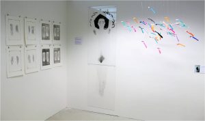
‘Defining a Woman by Her (Body) Hair’ 2017
Perspex dry point plates
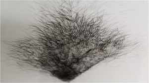
This piece is called ‘Defining a Woman by Her (Body) Hair’. My project was based on social expectations and gender inequality. I refined it to focus on the theme of female body hair. The project was heavily research based and I was really invested in the whole process. I designed a survey to hear people’s opinions on body hair and I recorded numerous informal conversations . The responses were really interesting. I felt it was important to investigate this specific topic because of the emotional effects that prejudices surrounding female body hair have on women and especially young girls who are essentially taught to hate their natural bodies and that they must remove all body hair in order to be valued in our society.
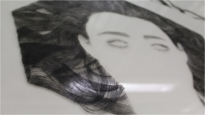
I considered painting or drawing the body hair on a canvas for my final piece. Then I came across an etching by Kathe Kollowitz. In the image ‘Mother with Her Dead Child’ 1903, the shading created by the fine lines of the etching had this strange ambiguity between hair and shadow which I really wanted to try to harness. I experimented with dry point and found it a very effective way of depicting hair. I continued to work with dry point and decided to use it for my final piece. Due to technical issues when printing I decided to hang the inked up Perspex plates instead of printing onto paper. Overall I am really happy with the outcome and have had lots of positive feedback about my art work. Women have told me that my artwork has given them the confidence to accept their natural bodies, which I think is great.

