Author Archives: Lena El-Kholy

Summary

Over the last ten weeks I have learnt a lot from the Research and communication skills lectures. I have learnt to look at a variety of sources from videos to books to utilising the internet. This has helped me improve my research skills and the way I analyse different pieces of information. I have also learnt a lot about Graphic Design, Illustration and Photography throughout the twentieth century and the different art movements that occurred with the advancement of technology supporting graphic design. I have developed my knowledge with the connection between graphic design and modernism, counter culture and the ethics of graphic design.  The sessions have also developed the way I write by getting me to delve deeper, looking at information and not taking facts at face value but pushing me to finding evidence.

The main topics that the lectures have covered have been technology, authenticity, modernism, counter culture, post modernism and ethics. These topics have been crucial in helping my development and understanding of how to improve myself with regards to my graphic design practice. I have seen how graphic design has developed through the different art movements to becoming more political and mindful with art being used more to express opinions through visual means.

The most significant task that was very thought provoking in my opinion was the ethics behind graphic design. It brought to my attention that graphic design will always be sending out a message, no matter how small it is and if I want to be an ethically ‘good’ graphic designer I need to be aware of what I am creating and not trying to get a job at the highest paying company.
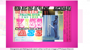
Jonathan Barnbrook is the artist that has really stood out to me the most over the course as he has questioned other graphic designers with the work they create.

Above is the image that Barnbrook made to question graphic designers stating, ‘Designers are falling over each other to kiss corporate ass’.

Another part of the research skills lectures that I have found important has been how to use Harvard referencing in my work. It is a key factor not only in research but also the creative industry as it gives recognition to other people and artists work. I find this goes hand in hand with the ethics behind graphic design and learning about authenticity and if it is possible to be truly authentic. I have also enjoyed watching the Netflix series, Abstract: The art of design as they have given me an insight into other artists work and the way they think.

Overall, I have really enjoyed the Research and communication skills lectures as they have been very informative and educational.

Publish or Perish

“What’s important is the story, the message, the feeling, the connection – How do you make this reach people?” (Platon: Photography, 2017). The reason this quote is relates to me as a Graphic Design practitioner is because graphic design at its core is all about communication. How I can deliver a message that will reach my audience that will connect and resonate with them.

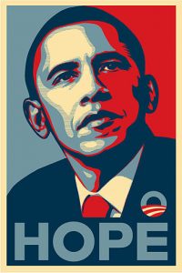
https://upload.wikimedia.org/wikipedia/en/5/55/Barack_Obama_Hope_poster.jpg

The first piece I’m looking at is the “HOPE” poster made Shepard Fairey. The reason this piece has a connection to it is because Obama represented a change. This was in terms of bring change to the wants of the American people and helping the civil rights movement in terms of being the first African-American to become president. This gave hope to many African-Americans dealing with discrimination, poverty and racism.

Is Economic Progress Killing the Planet?

Jonathon Barnbrook is a graphic designer and typographer. This piece is a print from 1999. It stood out to me because Barnbrook is using it to communicate the environmental issues that are occurring from economic development around the world. This is the story that needs to reach the people. The reason Barnbrook is important as he takes a stand when it comes to corporate designing considering the ethical and political implications of design work. “He was a signatory to the First Things First 2000 manifesto, in which graphic designers pledged to ‘put their skills to worthwhile use’ and address the ‘unprecedented environmental, social and cultural crises’ that they saw in the world” (Jonathon Barnbrook, 2017).

This image is titled ‘Union Mask’. It was created by Peter Kennard. As an artist he is using his art to express what is happening in the world to communicate a story being “to criticise the UK’s support of America’s Bush administration and its ‘War on Terror’.” (Stop the War Coalition Poster Number 1, 2003).

“Kennard holds a mirror up to war, poverty, and human suffering. His work is an attempt to ‘rip apart the smooth, bleached and apparently seamless surface of the media’s presentation of the world and to expose the conflict and grubby realities underneath.’” (Peter Kennard’s Powerful Political Protests through art, 2016).

These three artists among others are all important as they consider the ethical values behind their work and use the work they produce to communicate a message.

Works Cited

Jonathon Barnbrook. (2017, November 29). Retrieved December 5, 2017, from Wikipedia: https://en.wikipedia.org/wiki/Jonathan_Barnbrook

Peter Kennard’s Powerful Political Protests through art. (2016, October 4). Retrieved December 5, 2017, from theculturetrip.com: https://theculturetrip.com/europe/united-kingdom/england/articles/peter-kennard-s-powerful-political-protests-through-art/

Platon: Photography (2017). [Motion Picture]. Retrieved December 3, 2017, from https://www.netflix.com/watch/80093804?trackId=14277283&tctx=0%2C6%2C7b654c82-34e9-4305-a84c-22632937880d-51811183

Stop the War Coalition Poster Number 1. (2003). Retrieved December 5, 2017, from ivm.org.uk: http://www.iwm.org.uk/collections/item/object/15027


Post-Modernism

Post modernism occurred in the late 20th century as rejection to modernism and its ideas. Post modernism was about multiple ideas. Questioning ideas and finding the truth, and not being spoon fed by those in power and the media. Es Devlin talks about “Showing, revealing and deconstructing” (Es Devlin: Stage Design, 2017) which I think is a good way of defining post modernism.

[1]

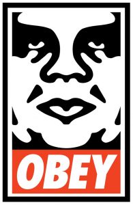
If we look at Shepard Fairey and his piece “OBEY” it’s a prime example of post modernism. He wants the public and the viewer to question what they ought to OBEY. He says people don’t like to be told to OBEY but don’t mind if its suggested which is what happens daily through media and advertising.

“The concept of OBEY was always about reverse psychology and to encourage people to question obedience.” (Exploring Shepard Fairey’s OBEY projects in Hong Kong with fingercroxx, 2016).

This work was showing the public what was happening around them, revealing the standard and getting them to think and deconstruct the norm.

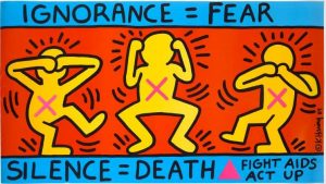
Keith Haring, Silence = Death (1989). Image courtesy of the New York University Library collection.

Another famous artist of the post modernism era was Keith Haring. He was born in 1958 and died in 1990. The reason Haring was influential was because he used his art to show his audience issues with the current affairs of the time.

“Much of his art was made to protest a wide variety of evils — the dangers of nuclear power, the damage of AIDS and crack cocaine, the destruction of the environment, the abuses of organized religion and corrupt politics, the injustices of homophobia and racism” (Galenson, 2013)

The above image was done to bring awareness to the issues of AIDS and to inform viewers that a percentage of the population were dealing with this problem.

[2]

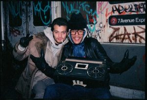
The photograph above was taken by Jamel Shabazz. The reason I find him vital to the post modernism era was because he documented the streets of New York as they were, not the Utopian view that the modernist era wanted to show. His photographs were “street life in its purest and exhilarating form” (jamel-shabazz, n.d.)

Works Cited

Es Devlin: Stage Design (2017). [Motion Picture].

Exploring Shepard Fairey’s OBEY projects in Hong Kong with fingercroxx. (2016, November 29). Retrieved November 26, 2017, from vimeo.com: https://vimeo.com/193511387

Galenson, D. (2013, May 17). Keith Haring: Rebel With Many Causes. Retrieved November 28, 2017, from huffingtonpost.com: https://www.huffingtonpost.com/david-galenson/keith-haring-rebel-with-m_b_3293746.html

jamel-shabazz. (n.d.). Retrieved December 2, 2017, from aramanegallery.com: http://www.aramanegallery.com/project/jamel-shabazz

[1] https://store.obeygiant.com/products/obey-offset-poster 

[2] http://www.aramanegallery.com/project/jamel-shabazz

Counter-culture is defined as “A way of life and set of attitudes opposed to or at variance with the prevailing social norm”[1] in the oxford dictionary.

Counter-culture of the 60’s was a time when people were standing up for rights and demanding equality and freedom. The Vietnam war started in 1955 and ended in 1975. The younger generation were protesting anti-war movements. African-Americans were fighting for equal rights and abolishing segregation.

Mati Klarwein, album art, Bitches Brew, 1970

On this album cover there’s a black lady and white lady connected at their heads and hands. Each side of the album cover has contrasting themes.

“For many, the sounds and images of Bitches Brew were intrinsically linked to the political climate, and specifically the racial climate of the early 70’s. The cover’s decidedly Afro-centric and psychedelic undertones reverberated within both the Black Power movement and the progressive counterculture of the early 70’s, but for different reasons.” (Ritchie, the-story-behind-mati-klarweins-bitches-brew-album-art, 2010).

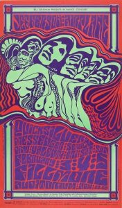
The hippie movement in the 60’s and 70’s was considered Counter-Culture with the introduction of psychedelic art. Many people were using drugs. “The Psychedelic era was the time of social, musical and artistic change influenced by psychedelic drugs, occurring between the years of 1965–69[1] or the early 1960’s to the mid-1970’s” (Psychedelic_era, 2017). Below is an example of how psychedelic art was going against the social norm in terms of using “explicit” images to shock. The main reason it had a shock factor was because it was different and was challenging the ordinary.

[2]

Here is a photograph of Miles Davis, a famous Jazz musician. He was a key contributor to counter culture in the 60’s and 70’s. “Miles Davis was a major force in the jazz world” (miles-davis-9267992, 2017). Davis life style represented counter culture from the use of drugs, “In 1975, Davis was once again drawn into drug abuse, becoming addicted to alcohol and cocaine.” (miles-davis-9267992, 2017), to having album artwork Bitches Brew representing political change and peace, to pushing Jazz into the spotlight. “Bitches Brew soon became a best-selling album. As a result, Davis was featured on the cover of Rolling Stone magazine—becoming the first jazz artist to be so recognized” (miles-davis-9267992, 2017).

The use of sensibility and spirit combined with meaning as quoted by Paula Scher in the film (7’22”)[3] is all represented throughout counter culture through the different imagery.


Bibliography

miles-davis-9267992. (2017, September 22). Retrieved November 25, 2017, from www.biography.com: https://www.biography.com/people/miles-davis-9267992

Psychedelic_era. (2017, August 20). Retrieved November 25, 2017, from Wikipedia: https://en.wikipedia.org/wiki/Psychedelic_era

Ritchie, N. (2010, December 16). the-story-behind-mati-klarweins-bitches-brew-album-art. Retrieved November 25, 2017, from revive-music.com: http://revive-music.com/2010/12/16/the-story-behind-mati-klarweins-bitches-brew-album-art/

[1] https://en.oxforddictionaries.com/definition/counterculture

[2] http://www.denverpost.com/2014/10/09/denver-exhibit-turns-the-psychedelic-60s-into-the-stuff-of-museums/

[3] https://www.netflix.com/watch/80093802?trackId=13752289&tctx=0%2C0%2C994b385f0c6e8f96aebacce8cd12e6ef4f1c3d66%3Abcb5c97928642b8324169e7aa1bd3490de1e62ce

Is it possible to be truly authentic?

To answer this question, we need to understand the meaning of authenticity. Authenticity is defined as “Of undisputed origin and not a copy; genuine” (Oxford dictionaries, 2017).How is someone original if as artists we look for inspiration in the world around us that somebody else has already designed? “What a good artist understands is that nothing comes from nowhere. All creative work builds on what came before. Nothing is completely original“(Kleon, 2012), which I agree with. Personally, as a graphic designer to feel truly authentic is to find something I love and to explore and understand it, and then further develop it until it no longer resembles the “original” inspiration.

The values of modernism are to create something new whilst refusing traditional methods. Contemporary practice is creating for the now and the future, which can only be done by thinking differently.

This makes me think of a book called ‘The Medium is the Massage’, “We look at the present through a rear-view mirror. We march backwards into the future” (McLuhan, 2008). The original book was published in 1967, which makes this book pivotal at its time as it pushes for a modernist approach in contemporary practice.

In conclusion, I believe that achieving authenticity at its core definition is impossible, but with inspiration and further development new ideas are born which leads to some form of authenticity as the new idea is no longer a replica. While a concept may be original to the designer it may have already been played out somewhere else in the world therefore I agree with the quote “What is originality? Undetected plagiarism” (William Ralph Inge, 1928).


Bibliography

(2017, November 08). Retrieved from Oxford dictionaries: https://en.oxforddictionaries.com/definition/authentic

Kleon, A. (2012). Steal like an Artist. New York: Workman.

McLuhan, M. (2008). The Medium is the Massage. London: Penguin Group.

“Technology is the mortal enemy of art”

As a graphic design practitioner, I disagree with the view that “Technology is the mortal enemy of art” as I believe it has created opportunities[1] within the graphic design industry. For example, “The app economy alone has created more than 1.6 million European jobs”[2].

I also believe that technology has simply made the tools for a graphic designer simpler to use yet the creativity of the designer is still needed. Technology has allowed graphic designers to be more adventurous with their creativity as processes are less tedious from what they used to be[3].

Looking at how technology, such as the internet and social media has impacted the art industry we can immediately see that anyone’s art, whatever the medium can now be universal, accessed from anywhere.

With technological advances the graphic design industry expanded in terms of software being more available to those who wanted to try graphics out. A graphic designer today only really needs a laptop, software and a dependable internet connection. According to YouTube and Lynda.com the number of users they had to more recent times had increased[4]. I believe even with this creating more “competition” for experienced  graphic designers, graphic designers won’t become shadowed by amateur designers as their thinking process and creativity in graphic design just isn’t the same as someone who has experience.


[1] http://www.applydirect.com.au/Blog/how-graphic-design-jobs-have-evolved [viewed on the 25/10/2017]

[2] http://www.debatingeurope.eu/2017/04/05/technology-create-jobs-disrupts/#.WfDDuaiPK70 [viewed on the 25/10/2017]

[3] https://dmjcomputerservices.com/blog/technology-changed-design-industry/ [So has technology enhanced or hindered the design industry?]

[4] https://www.youtube.com/watch?v=jlj6Nid8ynl The impact of digital technologies on the practice of graphic design, 15 october 2013 [viewed on the 25/10/17]

Comparing Images

dan

This piece of artwork “Cigarette Break”, was produced by Dan Kitchener. You can see a man offering a cigarette to a dragon. Kitchener created this piece by using photoshop, making a digital painting. I looked at Kitchener because he is one of my favourite artists in my chosen discipline.

Looking at the meaning of colour and analysing the image; the colours used are predominantly blue, red and yellow; primary colours. Further review shows the image is mostly blue. Blue represents trust[1]. Therefore, when I look at the image I don’t feel alarmed for the man casually standing opposite the dragon.

Yellow isn’t used a lot in the image yet it has a big impact; less is more. This is because yellow is the “most luminous”[2] colour in the spectrum and represents happiness[3]. Again, linking back to why the viewer feels at ease looking at the image.

“Red is the colour of good luck in Asia[4]”, this adds to the tranquillity of the image.

shoes

I started looking at photography. I like this photo because of how the negative space has been used and how the artist has played with perception causing an optical illusion.

Here this photo does not use colour which contrasts with the graphic design piece. These pieces however are both modern. I like the lack of colour as it adds to the mystery of the image which has a foreboding feeling. This links back to the meaning of colour with the colour black being associated with mystery and negativity[5].

[1] https://www.colormatters.com/the-meanings-of-colors/blue – paragraph 5.

[2] https://www.colormatters.com/the-meanings-of-colors/yellow – paragraph 1.

[3] https://www.colormatters.com/the-meanings-of-colors/yellow – paragraph 3.

[4] https://www.colormatters.com/the-meanings-of-colors/red – Meanings of Red in Different Cultures.

[5] https://www.bourncreative.com/meaning-of-the-color-black/ – paragraph 3.

Terminal Bar

The Terminal Bar is a short documentary film made up of black and white photographs. The photographs were all taken by a man named Sheldon Nadelman and was then produced by Stefan Nadelman, Sheldon’s son.

Sheldon Nadelman was a bartender at the Terminal Bar. He documented the customers who came into the bar, and the surrounding area all between the years 1972 to 1982. Sheldon Nadelman narrates parts of the film telling us about the customers and their lives, allowing the audience to go back in time and get an understanding of what the Terminal Bar was really like.

The music used in the film is upbeat which keeps the viewer engaged. The photos all move and change in rhythm to the beat creating an effortless flow in the short film. The use of newspaper cut outs also supports what the narrator is saying and adds a more realistic view to Nadelman’s film.

Towards the end of the short film Sheldon Nadelman revisits the location of where the Terminal Bar used to be as it had changed into a video store. This links back to why Sheldon Nadelman was taking photos to begin with; “If you don’t put it down on paper, no one knows.” he says. He was showing us how the bar was constantly changing. From being a bar that was notorious for having rough customers, to how it became known as a gay bar and then shutting down, turning into a video store.

Overall, I enjoyed the film however it wasn’t to my taste, but what I take away from the film is to continuously document my own work.