Author Archives: Lianna Evans

Task 7 & 8

I have chosen to discuss the text ‘Taste, Fashion and the French Fashion Magazine’ by Sanda Miller which explores the development of the fashion magazine and its influence on society as well as how it was influenced by society and current affairs, with Miller describing them as ‘most truthful mirrors of their time’.

She discusses ideas around the intertwining of the concepts of ‘fashion’ and ‘taste’ and how the fashion magazine potentially shaped the ‘taste’ of society and was an influencing factor for what was ‘good taste’ or what was ‘bad taste’.

Sanda Miller discusses how the Fashion magazine was thought to have first come about in seventeenth-century France under the reign of Louis XIV but really gained its ‘wider intellectual profile’ in the 18th Century with the rise of the Enlightenment.

This is because the Enlightenment was a philosophical, cultural and intellectual movement spread throughout Europe, radically transforming people’s views on both science and the arts. People started to think for themselves and as a result of this develop their own opinions and ‘taste’. The German Philosopher Immanuel Kant summarised the Enlightenment period with the words ‘Dare to be wise! Have courage to use your own understanding!” (1) (Kant, 1784)

With regards to art,  the emphasis began to be placed on the psychological and philosophical meaning behind the work rather than judging it purely on its aesthetic.

Following this deeper appreciation of the arts came the development of the Art Critic and the founding of the Salons held at the Louvre. The Salons allowed the public to view art, boosting it’s status in society and making the arts a more relevant and present topic worthy of discussion and Art critics  – such as Diderot- paved the way for this as they helped the public access the meaning behind the art on display.

Miller argues that just as art critics like Diderot shaped public’s opinion on art as they wrote their reviews on it- putting across their own opinion formed upon personal taste of artwork displayed on the salons, the fashion magazines also became ‘more than mere repositories of taste; rather, they prescribe it.’. By this I think she means that fashion magazines begin to deeply influence society’s opinion on what was fashionable at the time- just as I think they do today. I agree with this as I think we are all deeply influenced by what we see in fashion magazines and media, even if may be on a subconscious level. This is accurately conveyed by Jukka Gronow in the article ‘Taste and Fashion: The Social Function of Fashion and Style’- ‘In the classical European humanistic tradition, fashion was always thought to be antithetical to good taste’. (Gronow, 1993) 

BIBLIOGRAPHY

  1. Kant, I (1784) An Answer to the Question ‘What is Enlightenment?’  (Penguin UK, Google eBooks 26 Sep 2013 ) 
  2. Gronow, J, (1993) Taste and Fashion: The Social Function of Fashion and Style (Published by: Sage Publications, Ltd.)  https://www.jstor.org/stable/4200841

Task 11 & 12 – Conclusion

Through completing  the tasks in this module of Research and Communication I have been able to develop a wide range of new skills which will help me with my design work in the future. Writing is something I have always found challenging but this module has helped to increase my confidence in my written work, with the weekly tasks allowing me time to reflect and form a personal response to a variety of different articles and media.

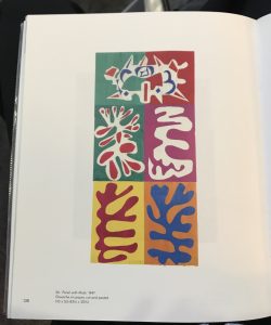
Task 1 and 2 taught me about finding Primary and Secondary sources and the difference between the two. For this task I analysed an image of Matisse’s work from a book in Winchester library and then went on to deepen my understanding of his work by finding an article online which explained more about Matisse’s paper cuts and the development of his later work.

Task 3 and 4 gave me an insight into the issues of Plagiarism and Academic integrity- an extremely important subject to know about as future designers in the fashion and textile industry. Although the task was similar to the previous one, I found this lecture to be one of the most interesting out of all of the lectures of the module so far as I was unaware of the scale of this issue in the industry.

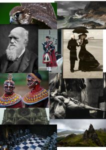
Task 5 and 6 taught me about design references and the deeper meaning and messages behind artists work. For this task I identified 10 references of Alexander McQueen’s work and I especially enjoyed creating a mood board of design references as it was so interesting to see the variety and diversity of all the references when they are all placed together and how they have informed

Task 7 and 8 I found by far the most challenging as we had to read and interpret academic article. Whilst I understood what the author was saying, I did struggle to translate this into my own words and produce a response and this is defiantly something I wish to improve on throughout this module.

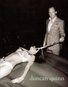
Task 9 and 10 addressed ethical issues in fashion and textiles advertising and I found this task and lecture by far the most interesting yet. The lecture for this task really made me realise how much of an impact one controversial advert can have on a fashion brand. For the task I chose to discuss the ethical issues surrounding a controversial campaign image by the menswear brand Duncan Quinn and I really enjoyed analysing the photography in the advertisement and finding the potential ethical issues surrounding it.

This final task (Task 11 and 12) was a great finish to the module as it has now allowed me to reflect upon all of the tasks I have completed. This reflection has made me realise how much I have learnt and how many beneficial new skills I have developed. I think most importantly for me this module has significantly increased my confidence in my writing and I have developed a firm understanding of how to analyse and produce a considered response to both images and academic writing.

Task 9/10 – Ethics


The image I have chosen to discuss is an advertisement released in 2008 by the menswear brand ‘Duncan Quinn’. The image shows a smartly dressed male (wearing a Duncan Quinn suit) dragging a woman in lingerie across a car bonnet by a Duncan Quinn tie fastened around her neck.

There are many ethical issues surrounding this advertisement. Firstly and most obviously is the issue of sexual objectification of the woman in the photograph. She is strategically placed in the foreground of the image so that her near naked body is the first thing that the viewer sees. This has most likely been composed like this so that it catches the eye of the male viewer and potential client but although effective, it is an unusual technique considering the product being advertised (the Duncan Quinn suit) is the second thing that the viewer sees.

It is concerning that the viewer cannot see the woman’s face which instantly strips her of any identity or individuality, whilst in contrast to this, the dominating male in the image stares directly into the camera with what could be read as a slight smirk on his face, almost as if he is proud of his ‘possession’. There is certainly a sense with this image that woman’s body’s are there to be a subject of admiration and desire for men and that a woman’s purpose in life is to satisfy the requirements of men. The novelist and art critic John Berger incapsulates this when he spoke in the second episode in the BBC TV series ‘Ways of Seeing’ –


“She has to survey everything she is and everything she does, because how she appears to others – and particularly how she appears to men – is of crucial importance for what is normally thought of as the success of her life.”

http://www.dazeddigital.com/artsandculture/article/34166/1/why-we-still-need-ways-of-seeing-john-berger

Another issue to address is the fact that this image has been released by a high fashion brand which is well respected in society, meaning that the treatment of women depicted in the advertisement is more likely to be viewed as acceptable behaviour. This position in society along with the artistic photography almost makes the abuse and violence shown appear glamorous or stylish. The overall impression given is that if the male customer chooses to wear the Duncan Quinn brand then they will look so good in their suits that they will attract the attention of beautiful woman (like the one in the photograph) who will be submissive towards them and allow them to abuse them.

Task 5&6


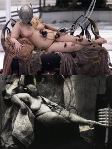
Photograph from http://www.dazeddigital.com/fashion/article/26031/1/if-you-like-mcqueen-s-ss01-voss-you-ll-like-joel-peter-witkin

Above-  photograph of the finale of McQueen’s VOSS SS01

Below- photograph by Joel-Peter Witkin entitled Sanitarium (1983)

The image from my mood board of Alexander McQueen’s design references I have chosen to discuss further is a photograph by Joel-Peter Witkin entitled Sanitarium (1983). Joel-Peter Witkin is an American photographer from New Mexico who’s grotesque and controversial work forces the viewer to confront the ‘taboo’ and often focuses on the outsiders in society such as transsexuals, the physically disabled and fetishists. His compositions often include corpses and dismembered body parts and he takes inspiration from classical paintings and religious imagery, notably the work of Caravaggio and Giotto. Witkin claims his vision and fascinations with death and the grotesque all began after an incident he witnessed as a young child where a car accident resulted in the decapitation of a little girl- “At the place where I stood at the curb, I could see something rolling from one of the overturned cars. It stopped at the curb where I stood. It was the head of a little girl. Witkin recalls- “I bent down to touch the face, to speak to it — but before I could touch it someone carried me away” (Storck, Jeanne (2001). “Band of Outsiders: Williamsburg’s Renegade Artists”. billburg.com). ‘Sanitarium (1983)’ depicts a voluptuous masked nude woman reclined in a Venus-like manner, breathing into a tube which is attached to a hanging monkey. This image directly inspired the finale of one of McQueen’s most memorable shows- VOSS SS01- where crazed models were confined into a mirrored box in the centre of the runway. The finale saw the walls of the case fall and smash down to reveal moths and butterflies and the naked woman attached to tubes reclined in the centre. The show ended when her heart beat flatlined.


Task 3&4

Book –
Cormack M. , 1991, The Paintings of Thomas Gainsborough, University of Cambridge Press

Website –
Andrew Graham-Dixon, (23-11-2003), Andrew Graham-Dixon Archive, Available from: http://www.andrewgrahamdixon.com/archive/itp-188-mary-countess-howe-by-thomas-gainsborough.html

Article –
Carpenter, L. (2008), Everyday Fashion in 18th Century England, The Telegraph, 1st March 2008

I chose to look at the book ‘The Paintings of Thomas Gainsborough’ by Malcolm Cormack from the library as my design work is often influenced by the work of English 18th century painters, with Gainsborough being one of the most successful artists working in the 1700s.
He painted portraits of the most wealthy and important figures in Britain, with his work being characterised by a light pastel colour palette and feathery brushstrokes.
I am particularly inspired by Gainsborough’s work due to its high levels of detail and realism and the technique he uses to paint different textures, especially fabric and garments which he executes in such a way that the viewer can easily differentiate between the types and weights of fabric by revealing the sitters form and reflecting light. As a result of his incredible observation, Gainsborough’s portrait work now stands to accurately reveal to the 21st century viewer exactly what garments were at the height of 18th century British fashion.
I then went on to further research online one of Gainsborough’s most well-known portraits and most important commissions- that of Mary Countess Howe. This painting is one of the best examples of his work to describe the sitter’s highly fashionable attire due to the immense care and time Gainsborough has taken to paint every detail of her pink silk dress which is stretched over a corset on her upper body and perfectly sets off her pale complexion- a symbol of wealth and status in the 18th century.
My research was concluded by reading an article by the Telegraph which explored everyday working class fashion in the 18th century- an interesting contrast to the lavish garments depicted in Gainsborough’s paintings.


Task 1&2 – Online Resources

FullSizeRender

(1)  ‘Henri Matisse: The Cut-Outs’ by Karl Buchberg,  Nicholas Cullinan and Jodi Hauptman’ , ’Panel with Mask’ 1947, Gouache on paper cut and pasted, 110 cm x 52 cm, 

For my research task I have decided to look into the later work of Henri Matisse. During my visit to Winchester library I came across this image of Matisse’s work in the book ‘Henri Matisse: The Cut-Outs’ by Karl Buchberg, Nicholas Cullinan and Jodi Hauptman.

I was particularly drawn to the this image due to Matisse’s use of fluid, organic shapes and the contrast of this against his bold colour palette made up of complementary colours which really highlight the shapes he has made.

matisse-studio-ld_divers_35_4000pixelsjpg

(2) Matisse’s studio, HĂŽtel RĂ©gina, Nice, c. 1953. (Photo: Lydia Delectorskaya. © 2014 Succession H. Matisse) from https://www.biography.com/news/henri-matisse-the-cut-outs-moma

After coming across my previous image (1) in the  library, I turned to the internet for my research. I found out that during the last decade of Matisse’s life illness and old age meant that he was unable to draw and paint in the dynamic manner he used to and this resulted in him producing some of his most well known artworks (including 
 ) using the simplest of techniques which he described as ‘drawing with scissors’.

Matisse worked in his studio in Nice and following surgeries for severe intestinal disease he was restricted to mostly working in his wheelchair or bed. As a result of this confinement, working with paper was ideal. Studio assistants painted the sheets of paper with Gouache paint in the colours he chose and Matisse cut the shapes out of the paper using scissors- a technique he could make work from his wheelchair or bed. The shapes were then pinned to the walls of his studio and he adjusted the compositions for the final arrangement. For larger works Matisse’s assistants pinned large cut out shapes directly to the studio walls and he directed them to move the shapes into the compositions he desired.

From my internet research I was surprised by how large some of Matisse’s paper cuts were (as seen in the photograph above (2) – the scale of the pieces was something I was unable to see from the images in the book I looked at previously.