Author Archives: Kayleigh Wilkinson

Final Task- A Reflective Summary

Throughout the Research and Communications module I found the lectures very insightful as I felt each task was interesting and individual to the last as they all linked together. Getting progressively more challenging each week, each task was building upon the last meaning for me it was easier to understand as I could use the skills I had learnt previously and apply it to the question at hand.

The first few tasks focused on different ways of doing and using research which although I didn’t particularly enjoy, I found extremely helpful towards the end. Before starting the blog, I had only really delved into online resources as they were accessible and not too time consuming, but after the How to Use Online Resources task I learnt that using the libraries was not as daunting as I had perceived. I still use online resources but I feel this task in particular helped me really understand the difference between primary and secondary resources and how to use them but also helped me realise how helpful the library resources were. The books and magazines definitely helped me find information I wouldn’t have otherwise found and this is something I will use more in the future. Similarly, the visual research task along with the reflective writing in textiles also helped me build my skills in these areas as well as practicing my Harvard referencing skills as this was something I struggled to understand at the start.

As the tasks went on I definitely found the module more enjoyable as I began to understand how to write in a better, more intellectual way. The reflective writing task was definitely something I struggled with as I couldn’t get my head around the writing in the first place. Eventually I went back to how I started these tasks and wrote notes on everything I interpreted from the text so it was easier to understand. From doing this is I had unpacked so many different talking points and had found lots of books and material to help explain my opinion as I was genuinely more interested in finding out more. Although hard at the start it definitely helped me to understand what makes a reliable and academic reference but also how to form a justified and substantiated opinion. The Ethics task followed this and having used the skills from the last task, I definitely found it a lot easier to write about. It started as a visual analysis but then went into reflective writing which I found the most interesting out of them all. I feel after learning about how important visual imagery is, in a fashion context, showed me how influential they can be amongst the general public as viewers and is definitely something I will consider in my future projects.

Overall, reflecting on the tasks has highlighted how much I have learnt throughout the module. The actual ‘blog’ aspect helped me to see that everyone has a different way of interpreting a task and being able to scroll through and pick up certain things that I may have missed was useful in developing my writing style. It also has introduced me to so many new skills that will benefit my future work.

Task 9/10- Ethical Issues in Fashion and Textile Advertising

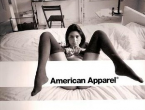
The photo above is an advert campaign by the American brand American Apparel. Visually the image is very controversial and has received some critical comments about the ethics that surround it. At first glance we see the brand name on a thick white stripe that is partially covered by some black shapes, however up close you start to see the wider image of a woman who is partially naked laying on a bed in a very sexual position, only wearing what I think are a pair of their knee-high socks with the white stripe being the only part to cover her. Just a glance at this image you wouldn’t think anything of it, but if it were to be plastered across billboards and buses I can see where people are finding issues with it. Being a huge retail brand they reach a lot of people and subsequently a lot of young people who are generally known to be very impressionable. The image is very sexually suggestive and could imply ‘if you buy these socks, you could be in her position’ as if the socks give you a sexual desirability. At the same time – socks have connotations of innocence as they are a parts of a school uniform, which there ‘aesthetic is built on’ [Ferrier 2015].

These are two very juxtaposing ideas but they are often used in conjunction with each other due to them being controversial and taboo to talk about. This then brings up the issue of sex sells. As questionable as the topic is, it does work as it gets people talking which is ultimately what brands want. The more people talk, the more exposure they get and subsequently their revenue goes up. Many see it as a cop-out to get money quickly and that it breaks moral code on many levels, However the blunt truth is that it happens so much in today’s society, we are accustomed to it that we don’t really notice when it happens anymore even though it’s a frequently talked about debate.  That being said, American apparel filed bankruptcy in 2015 and again in 2016 due to plunging sales and their advertising could be the reason. As wrote in Emotional Fashion Retail “An unethical advertising activity will also affect the economic dimension of a company, because some stakeholders may see this advertisement as irresponsible. This may lead to harmful publicity for the company or damage their relationship to the customers. Even the long-term survival is jeopardized” [StrĂ€hle 2015].

This could definitely be one explanation among many possible others as to their disappearance and the downfall of their public image. However, just through an internet search its clear the brand didn’t see how damaging their advertising was becoming as on Esquire.com they have adverts going back to 1995 showing the development of over-sexualized adverts. They still have stores in the US after selling the company out, but as an article in The Guardian writes that Dov Charney, the founder of brand and the man subject to many sexual harassment allegations within the company, had “sapped the company’s morale and took its sexualized image too far for young shoppers” [Farrell, S 2015].

                                                 Bibliography

Ferrier, M. (2015) American Apparel goes out of fashion and into bankruptcy https://www.theguardian.com/business/2015/oct/05/american-apparel-goes-out-of-fashion-and-into-bankruptcy   Accessed: 30 November 2017

StrÀhle, J. (2015) Emotionalizing Fashion Retail (page 95) Nordstedt, Books on Demand

Farrell, S. (2015) American Apparel files for bankruptcy https://www.theguardian.com/business/2015/oct/05/american-apparel-files-for-bankruptcy    Accessed: 30 November 2017


Task 7/8- Reflective writing in Fashion and textiles

After reading chapter 1 of ‘Fashion Media: Past and Present’, it seems to me that Sanda Miller believes the emergence of the “fashion magazine” to have begun in 18th century France and it heavily depended on art as a driver for success. She talks about the period of enlightenment, particularly in France, which allowed for the expression of opinion without judgement, which then gave individuals the ability to have a ‘taste’ in contrast to the “‘dark’ middle ages” [1]. This allowed for early fashion plates that “were also representations of ‘real life’”. [2- Source 2] showing a link to the arts, and the ‘first’ women’s fashion magazine to be published by Le Brun Tossa until 1793 due to the French revolution.

Miller then questions whether it was a magazine at all due to fact it had “coincided with the French Revolution” [3] which could imply that the combination of art and fashion was and is still equally a blessing and a curse as it proved how much the magazines relied on the industry to bring its status up. It could also suggest that with their being such an abundance of opinions, that is what caused tensions to rise in the lead up to the revolution itself.

However, after a period of reflection on what Miller described as “the bloodiest revolution in European history” [4], the 20th century saw another rise in the fashion magazine industry, particularly in 1912 with Henri Bidou’s Gazette du bon ton. It’s clear he felt that art needed to collaborate with fashion again, but he “was not prepared to leave anything to chance or indeed to the couturiers.” [5] supporting the idea Miller believes art is what makes or breaks the fashion industry as from then onwards Europe had been influenced by France to create similar zine’s.

Many other people do agree with Miller in that France was where ‘Fashion’ began and this can be seen in in ‘Fashion Brands’ where “Everything began in Paris. – From the days when the couturier Worth designed dresses for Empress EugĂ©nie”. [7- source 3]. However, France couldn’t have been the only country to produce these types of zines? I found an article that suggested this as “The women’s magazine as we know it—a lavishly illustrated celebration of consumption and beauty aimed at a popular audience—emerged in England in the 1870s.” [6- Source 2]. Although this is just an article I found on the internet, it’s clear there is an ambivalence towards what a fashion magazine is and how it is identified and this could explain why Miller questioned Le Brun Tossa. Furthermore, the fact other countries had prints with similar content does suggest that France wasn’t the birth place, but rather it could have been the first depending on what critics considered to be fashion, as can be seen in the discussion about etymology in source 4.

Overall, I agree with Miller that although being separate identities, art and fashion do go in hand-in-hand but I don’t agree totally that France was the birth place of fashion media. I rather believe that depending on how you see and interpret the word fashion itself, will determine where fashion media started, for it can mean so many things as whilst not all art is fashion, all fashion is art.

Bibliography

[1-]Szalay, J (July 2016) What Was the Enlightenment? https://www.livescience.com/55327-the-enlightenment.html Accessed: 23/11/2017

[2- source 1] Bartlett, D. Cole, S And Rocamora, A. (2013- reprinted 2016) Fashion Media: Past and Present. London, NY, Bloomsbury Publishing Plc. Page 17 Line 14- 15.

[3] Bartlett, D. Cole, S And Rocamora, A. (2013- reprinted 2016) Fashion Media: Past and Present. London, NY, Bloomsbury Publishing Plc. Page 18  Line 17

[4] Bartlett, D. Cole, S And Rocamora, A. (2013- reprinted 2016) Fashion Media: Past and Present. London, NY, Bloomsbury Publishing Plc Page Line 17 25- 26

[5] Bartlett, D. Cole, S And Rocamora, A. (2013- reprinted 2016) Fashion Media: Past and Present. London, NY, Bloomsbury Publishing Plc Page 19 Line 30

[6- Source 2] Gershon, L (December 2015) The Birth of Fashion Magazines https://daily.jstor.org/birth-fashion-magazines/ Accessed: 24/11/2017

[7- source 3] Tungate, M. (2015) Fashion Brands: Branding style from Armani to Zara- third edition. First Published in Great Britain & the US by Kogan Page Limited. Chapter 1 page 5

[Source 4] Barnard, M. (2002) Fashion as Communication. 2nd edition.  London, Routledge. Chapter 1. conclusion.

Task 5/6- Visual Research

Screen Shot 2017-11-02 at 14.56.39

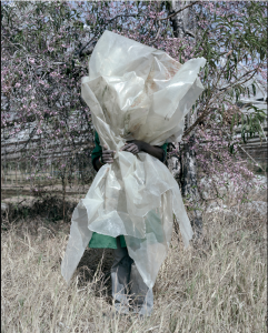
Jackie Nickerson- Gift, 2013

Jackie Nickerson Gift, 2013

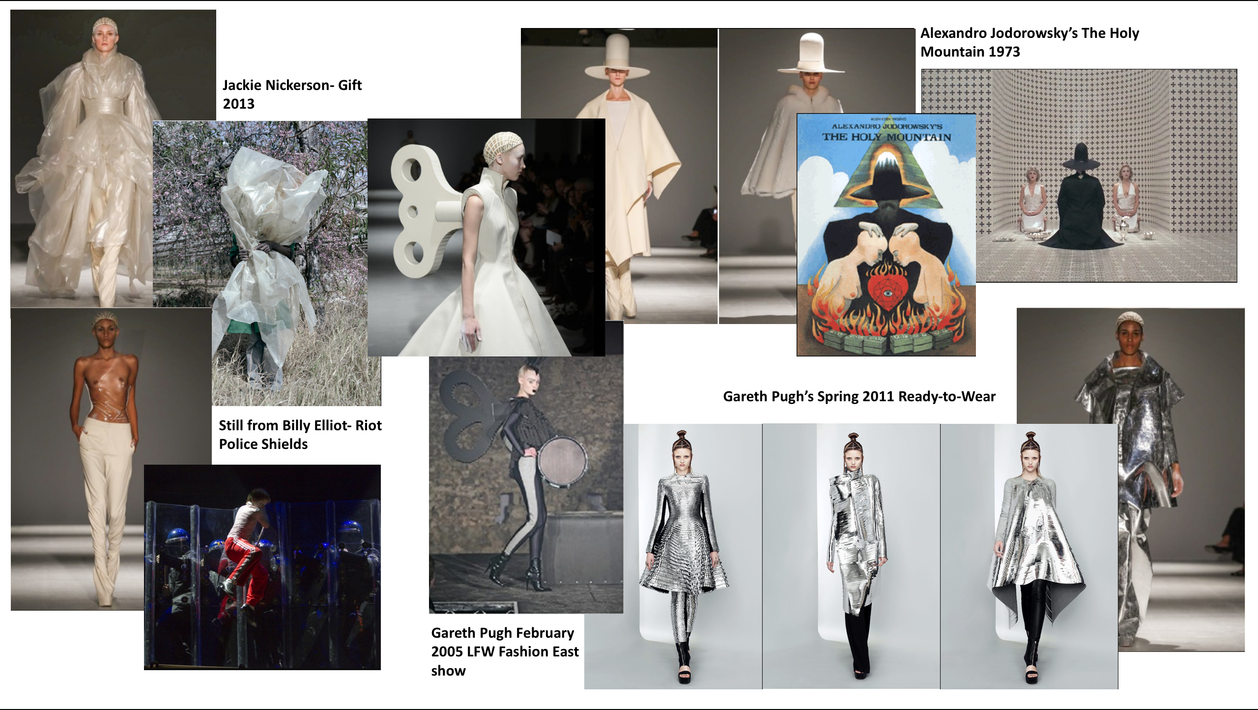
I came across Gareth Pugh and his AW14 Paris Collection and was immediately drawn to the materials and shapes he had used like the plastic, calico and creamy beige tones that aren’t usually used on the catwalk. When researching for his influences I came across an article [1] that cited a photograph (Gift, 2013) taken by Jackie Nickerson as one of his influences. The photo was taken from her ‘Terrain’ series which was based on southern and eastern African farms and focuses on the ‘materiality of labour’ as mentioned on her website [2]. The particular image was of a woman who was obstructed by plastic sheeting standing in the middle of a farm, and it was this context that I think inspired Pugh. Nickerson did this to describe the relationship between the farmworker and their environment, which to me could suggest she was trying to convey that for many workers, their work is entirely consuming and their identity as a human outside of the farm is very unknown. I feel Pugh picked up on this and portrayed this using those materials as he stated in an interview with Lou Stoppard that “It was a bit like hitting the reset button this season” [3] almost like he wanted to re-identify with how he worked so that it was more raw and untouched and showed a different side to his design process, which can be seen through the use of very similar materials in this collection. Also in the image the plastic is offset by the natural farm surroundings and gives a stark contrast. Plastic being a man-made product, links exactly to what she was trying to convey and I feel it works perfectly in the image to show how much the materials these people are making, have an impact on the environment but also themselves. Pugh then translated this onto the body, a very natural being, for fashion design and shows how much she inspired his work.


Bibliography

1) Brandes, B (July 2014) Gareth Pugh’s Labyrinth  http://www.dazeddigital.com/fashion/article/20252/1/gareth-pugh-s-labyrinth  Accessed: 1st November 2017

2) O’Toole, P. Moving between Land and Subject                  http://www.jackienickerson.com/work.php?pid=1&mode=3   Accessed: 1st November 2017

3) Paris Women’s Wear A/W 2014 Gareth Pugh http://showstudio.com/collection/gareth_pugh_paris_womenswear_a_w_2014     Accessed: 1st November 2017

Task 3/4- Acadmeic Integrity and Plagiarism

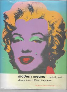
For my theme of Urban Pattern’s, within my knitwear project, I chose to look at the movement of constructivism and found the book below [1]. I focused in on the chapter called “Reductive” that briefly spoke about the movement and showcased artists that fitted that theme. Alexander Rodchenko was an artist that interested me from task 1 and in this book it showcased more of his work. Seeing all the geometric forms that he and others made, made me want to research fashion design in 1920’s Russia because this was where Constructivism was born.

[1]

I found a Russian fashion blog [2] that talked about Rodchenko and Popova and that constructivist designers liked to work with simple geometric shapes in bright colours and grand designs. They re-imagined the flapper dress and it was clear there was an influence of ‘production’ based, specialised clothing. The images on the website showed a lot of triangles, stripes and clean lines were used and inspired later fashion collections.

[2]

[2]

When looking for fashion designers influenced by constructivism, I came across an obituary for André CourrÚges on The Guardian [3]. It showed examples of his work for Balenciaga and went on to say he was deeply interested in the constructivist era and it heavily influenced his work. Although only briefly mentioned in this article, the fact it wrote he went against the fabrics and yarns used then, made me more inclined to research him further. Just by searching his name, it was clear that this era had in fact influenced him. Stripes and geometric forms dominated [4], just like the clothes on the fashion blog and although not knitwear, he will definitely help develop my designs.

[3]

[3]

[4] Coat, André CourrÚges, 1967. Museum no. T.102-1974. Victoria and Albert Museum.

[4] Coat, André CourrÚges, 1967. Museum no. T.102-1974. Victoria and Albert Museum.


Bibliography

[1]Wye, D and Weitman, W (2004) Modern Means: continuity and change in art, 1880 to the present. Highlights from the museum of modern art. NY, Published by the Museum of Modern Art

[2] Dorofeeva, E. (2013) Construction in Russia in the 1920’s. Available from: http://www.russianfashionblog.com/index.php/2013/06/constructivism-russia-1920s/#axzz4wMt1nPna.    Accessed: 22/10/2017

[3]Horwell, V. (2016) Andre Courreges Obituary. Available from: https://www.theguardian.com/fashion/2016/jan/08/andre-courreges   Accessed: 23/10/2017

[4] Andre Courreges. Available from: http://www.vam.ac.uk/content/articles/a/andre-courreges/   Accessed: 23/10/2017

Task 1/2- How to use online resources

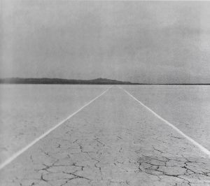
For my first project, Deconstructed Geometry, I want to look at deconstructing the urban things that surround me like signs, road markings and general industrial patterns to see how they can be translated into knitwear for fashion. I went ahead and brought in some of what I had done during the summer project as I had picked a similar theme’s because it interests me deeply. Towards the end of that project, I homed in on the patterns that are used to warn and symbolise specific meaning on the roads. For example, road signs, road works, double yellow lines, road work fences, warning signs for unauthorised areas etc. I decided to revisit this and research further and inevitably I came across a photo of two parallel chalk lines drawn on a dry desert lake, in the book “After Constructivism” [1- Taylor, B]. Although slightly contrasting to my initial inquiry, the unnatural urban nature of the lines in that specific environment is what interested me as it showed a different take on the relationship between photography and place I had looked at earlier. The lines from my perspective give an urban and regimental feel to an otherwise isolated and bare environment. They give direction in an open field, almost like a road would in an urban area and this links hugely to the theme of geometry.

Walter De Maria, Mile-Long Drawing, 1968.
Two parallel chalk lines 4 inches wide, 12 feet apart and 1 mile long

This idea of structure in an urban area lead me to research the period of constructivism in art and design. I searched the internet, which proved to be the most helpful for finding a lot of information that was already filtered, and found the artists in this period didn’t necessarily believe in the abstraction of ideas, rather they wanted to link their ideas to tangible outcomes. A lot of the work dealt with social and economic problems and so art then became more practical and geometric. The outcomes of this were very much products of linear meaning, aka signs and posters guiding an individual to do something specific, like the road signs and warning signs I am interested in. To help add some context to this I found some constructivist artists through the Tate website [2], Alexander Rodchenko, and this then led me to an article on an artist turned Textile designer by the name of Liubov Popova.

http://www.tate.org.uk/whats-on/tate-modern/exhibition/rodchenko-popova/rodchenko-and-popova-defining-constructivism

[2] http://www.tate.org.uk/whats-on/tate-modern/exhibition/rodchenko-popova/rodchenko-and-popova-defining-constructivism

http://www.tate.org.uk/research/publications/tate-papers/14/liubov-popova-from-painting-to-textile-design

[3]http://www.tate.org.uk/research/publications/tate-papers/14/liubov-popova-from-painting-to-textile-design

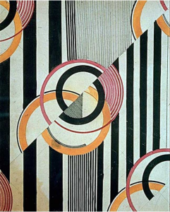
The article [3] I looked at explained her struggle to bridge between constructivist art and textiles but it’s clear she succeeded in her own way. The image of her textile design in 1924 [4] shows her work heavily concerned overlapped geometric forms that were practical to aid the constructivist ideal, yet more desirable to the consumer so fashion in soviet Russia could make an eventual comeback. The element of ridged structure was still there, but more commercialised. The limited colour palettes of the constructivist time still made an appearance but in a more aesthetic way and overall her deconstruction of the constructivist ideal has influenced my design ideas for my own project. The information and research I found from this task has proved helpful but I definitely feel I need to research further so that my project is fully developed, and I can now do so with the range of sources that has opened up since.

Textile Design, 1924 Pencil and Ink on Paper 234 x 191 mm Private Collection Found on: http://www.tate.org.uk/research/publications/tate-papers/14/liubov-popova-from-painting-to-textile-design

[4] Textile Design, 1924
Pencil and Ink on Paper
234 x 191 mm
Private Collection
Found on: http://www.tate.org.uk/research/publications/tate-papers/14/liubov-popova-from-painting-to-textile-design


Bibliography

  1. After Constructivism- Brandon Taylor. Yale University Press, London and New Haven. 2014
  2. http://www.tate.org.uk/whats-on/tate-modern/exhibition/rodchenko-popova/rodchenko-and-popova-defining-constructivism  Accessed: 17/10/17
  3. http://www.tate.org.uk/research/publications/tate-papers/14/liubov-popova-from-painting-to-textile-design  Accessed: 17/10/17