Author Archives: Julia Mosqueda

Task 11/12 – Summary

The outcome of the tasks given each week was to produce a digital journey on the WSA blog post. I found the lectures to be really helpful and completing the tasks has helped me to gained new research and critical thinking skills. When I started Research and Communication I wasn’t sure how I felt because I knew that this module consisted of writing essay based tasks and written work is not my strong point.

Writing the first task about how to use online resources encouraged me a lot to go to the library because the aim of the task was to research primary and secondary materials. Searching on the internet for other sources was also easy and time efficient but I had to keep in mind that some sources found may not be as reliable as I thought. I found that going into the library physically motivated me to get the work done quicker as I get pretty distracted If I was to use the internet.

The next aim for the next task was how to reference sources properly using the Harvard Referencing System. I found this pretty straight forward, I’ve never used this way of referencing other than copying and pasting the link. As a result, I can confidently use this way to reference sources for my other projects.

I found that my strongest area in the module was writing the Visual Research and the Ethical Issue tasks. For the Visual Research task, I felt confident talking about the designer I chose due to admiration, and for the Ethical task it showed I had strong points and analysis on how men objectify women, I was quite shocked by the image that we used for the advertisement. We were encouraged to use a different range of sources to gather references and quotes, as a result it led me to use the resources in the library which was eminently useful, it directed me to find more information about my chosen designer and well suited academic quotes. 

Working on the Reflective Writing task was quite a challenge for me. Reading the chapter was a long process because I had to go back and re-read some paragraphs again in order to gain full understanding. As a result, I printed out the whole chapter to highlight and annotate the sentences I understood and wrote down a few points to make it clearer for myself. As well as reading the academic chapter I had to find a book which relates back to the task, this task wasn’t hard as I thought because I had an idea of what topic I needed to extract and in searching of a few books, I finally found one that was best suited.

Overall this semester has helped me understand the process of contextual writing, by breaking down to weekly tasks it gave me enough time to understand and respond to the theme. Also by being the on top of the work it became less stressful. This module has widened my knowledge on finding sources with different platforms, this will be beneficial to me in the future as I can relate it to my other ongoing projects.

Task 9/10 – Ethical Issues

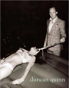
The ad I chose was for a tailoring advertisement by Duncan Quinn who is a luxurious British tailor. This ad caused a major controversy in the media because of its provocative view on women. I felt that the image had no relation to the main subject of the advertisement, to me the image is disturbing.

I thought that this ad was very controversial, as it shows a lifeless woman in her underwear dragged across a bonnet of a car while the man holds a neck tie around her body. The image seems to call out male domination over women because of how both are dressed very differently and also how they are positioned, the man being above the woman shows power whereas the woman’s position is seen as being submissive. The man in the image is dressed in a full outfit with a smug smile to his face and in comparison to the woman she wears nothing but her bra and pants. This clearly shows how women are used as sex objects for men. As well as the man’s facial expression the image gives off a sinister feeling due to the whole image being black and white, the background being in pitched black suggests that this was taking place at night-time where it would have been quieter and fewer people around. The ad overall shows a misogynistic and sexist approach towards women in which pushes ethical boundaries.

Furthermore, I read a book which talks about gender and culture and under a section on ‘Women as Victims and Sex Objects/Men as Aggressors’ the beginning of the paragraph states that “in media’s representation of relationships is that women continue to be portrayed as sex objects for men’s pleasure. In this representation, the very qualities women are encouraged to develop (beauty, sexiness, passivity, and powerlessness) in order to meet cultural ideals of femininity contribute to objectifying and he dehumanizing them.” With the pressure of having the ideal beauty and body in society for women, it encourages them to change their appearance in order to look like the “perfect woman” as they feel they don’t look good enough and as a result women feel like they’re finally part of the “cultural ideals”. This then adds to the factor of men objectifying women to seeing them as perfect women. As well as advertising for men, the goal or image that is associated would be based around hyper masculinity and violence. Additionally, games and music video show portrayals of objectifying women on a high scale. Popular video games tend to use violence as a way to win at the end. An example, Grand Theft Auto V is known for its violence and high crime game plot, the women in this game play a part of being strippers in which they get money thrown at or being prostitutes to be picked up and get killed. As well as music videos especially in rap videos women are seen dancing provocatively and wearing less clothes. These are the kind of factors that insinuate men to think it’s okay to objectify women, to an extent where young teenagers may even be influenced.

Bibliography: 

[1] Wood, J.T., (2009) Gendered lives. Communication, Gender and Culture. Boston, Wadsworth.


Task 7/8 – Reflective Writing

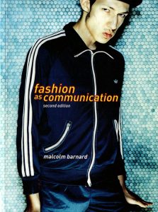
For the reflective writing task, I chose to read a chapter about ‘Etymology and the definitions of fashion and clothing’ from the Fashion as Communication book. This chapter explains the etymology of the word ‘fashion’, which comes from the latin word ‘factio’ which means making or doing something. The introduction of the chapter gave me an in-depth explanation of how the word ‘fashion’ relates to different terms. It looks into how associating words like “adornment”, “style” and “dress” can change the meaning of ‘fashion’.

Reading through the chapter I came across the section about ‘Fashion and Anti Fashion’, which explains some of the aspects in which fashion takes place in the social and cultural status. The Royal family shows a good example of how they dress in a fashion and anti-fashion way. Taking into account Queen Elizabeth’s coronation gown which is an example of ‘Anti Fashion’. Polhemus and Procter suggests that it was ‘traditional’ and ‘fixed’ (Polhemus and Procter 1978). This is because the gown was designed for the “continuity” of her reign. Due to her high status, it is important that she is dressed anti fashion to show her position in the social scale, and remaining the same throughout the years to give a message of “continuity”. Whereas Princess Diana was described as “a one-woman advertisement”, she was seen as wearing “fashion”. I agree with the statement that she wears “it” as she has built an identity through the use of her own style and consistent image of a modern woman throughout her lifetime. I found a book that talks about dress and gender with a quote, “An emblem of peer, one’s position may be communicated by a crown, a staff, or a robe” which link quite well with the Queen’s “anti fashion” and her place in the social scale. I found another quote from a different book ‘Fashion Theory: An Introduction’ n it stated that “we have to use something with which to communicate and we must use something with which to construct ourselves as unique and individual member of cultures.” This also relates to Princess Diana as an example of someone who was widely known for her unique style and in which she used fashion to communicate with people around her.

Furthermore, a quote in the chapter that I thought was important “a garment is not an item of fashion until someone uses it to indicate their actual or ideal place in a social structure”, I feel that this stands in today’s western complex society, people who are in a higher status tend to use luxury fabrics and branded clothing. I noticed this links to Simmel’s idea of “primitive” and “civilised” society. In a place where there are social cultural groups there’s pressure in dressing right as opposed to “primitive” society where there is little pressure on expressing their individuality and in a way they’re all equal, therefore the way they dress would not be fashion.

Analysing further, I came across a part of the chapter which talks negatively about fashion, this was a quote written by Elizabeth Wilson found in The Guardian. “Fashion is trivial and ridiculous and serious minds need not to be detained by it”, this quote clearly dismisses fashion and doesn’t believe that it is a serious topic which I completely disagree with because fashion largely contributes to the UK’s economy.

Bibliography:

[1] Bardnard, M (2002) Fashion As Communication, London: Routledge

[2] Barnes, M and Eicher, J. B. (1992) Dress and Gender: Making and Meaning in Cultural Contexts. Vol 2. Oxford: Berg.

[3] Barnard, M., (2014). Fashion theory: An introduction. Routledge.

Task 5/6 – Visual Research

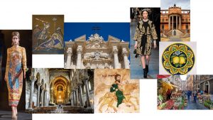
Dolce and Gabbana Inspiration Moodboard:Dolce and Gabbana


A moodboard of Sicilian inspiration in Dolce and Gabbana collections.

My chosen designers are Dolce and Gabbana. Throughout their collection between 2012 and 2015 shows a rich and bold traditional Sicilian inspirations from the Sicily mountain view, this created the colour palette for the Men’s Fall 2016 to Palermo’s vibrant vegetable market which inspired them to create the print for the Spring 2012. An interesting Sicilian inspiration was the designers looked into the history of the Sicily where the Spanish ruling took place.

_DOL0028.1366x2048 [1]


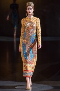
This image is from their 2013 Ready To Wear collection which was inspired by the mosaic pieces in Sicily’s Cathedral of Monreale. The garments in this collection had a loose shaped style with puffed sleeves, they are all embellished with sequins and jewels to insinuate the mosaic tiles. The whole collection had a strong vibrant feel of holiness with the use of pigmented colours like red, green, blue and golden-yellow. I admire Dolce and Gabbana’s attention to small details creating intricate designs throughout the years. The designers love to incorporate ancient Sicilian culture to their collection to show who they really are as designers. They explained that their success as designers is through the investigation and celebration of their roots and their passion of Italian culture [2]. I feel like this also has a similar connection to Oliver Rousting with this Balmain’s Fall 2012 Read To Wear with his baroque inspired collection. Although his colour palette was lighter with a use of soft pastels along with golds and silvers. I thought that both collections are similar in a way of how both designers have looked into historical culture but differentiate in styles one being quite boxed and the other loose shaped. Overall, I feel that Dolce and Gabbana’s use of fabrics and materials to create the Sicilian influences give such a rich and extravagant aesthetic outcome to represent the Italian culture.


[1] Vogue (2013) Dolce and Gabbana Fall 2013 RTW. Available from: https://www.vogue.com/fashion-shows/fall-2013-ready-to-wear/dolce-gabbana/slideshow/collection#3 [Accessed 05 November 2017]


[2] Radaelli M. (2016) The Sicilian Connection: Dolce and Gabbana’s Inspiration has gone Global. Available from: http://www.italoamericano.org/story/2016-8-12/dolce-gabbana [Accessed 05 November 2017]


Task 3/4 – Academic Integrity & Plagiarism

IMG_4728 

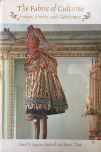
Paulicelli, E. and Clark, H. (2009) The Fabric of Cultures. Abingdon: Routledge.

I went to the WSA library and picked up this book which explores cultural case studies in fashion and how culture shapes the identities of each nations and cities. The book contains images of different styles across the world, from fustanella in Greece to the art of dressing in Soviet Russia in the 50s and 60s.

Screen Shot 2017-10-28 at 11.34.24

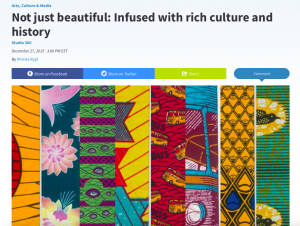
Rypl, K. (2015) Not just beautiful: Infused with rich culture and history. Available from:

https://www.pri.org/stories/2015-12-27/these-beautifully-colored-textiles-have-been-infused-rich-history-and-culture [Accessed 28 October 2017]

I took the internet to further my research and came across this article about African textile. The rich coloured fabric featured in the article were products of a dutch company called ‘Vlisco’ which were designed and produced in Netherlands. Vlisco have remained popular in Africa since the 1800s, this is due to their design in which they keep in mind for each countries, creating specific cultural meanings.  Scrolling through the prints, one of my favourite piece is the “Fan Ventilateur” this print really catches your attention with the use of bright colours contrasting with black outlines, the patterns create an illusion in the eye creating vibrations.

Screen Shot 2017-10-29 at 01.44.54

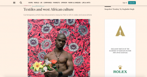
 Le Brun, L. (2016) Textiles and west African culture. Financial Times, 24 June. 

Lastly, this article on Financial Times looks into contemporary artists discussing the ways in which they use textiles. Yinka Shonibare explains how he is “fascinated by the cultural confusion” and why he chooses his fabrics carefully. Malian artist Abdoulaye KonatĂ© mentions how he started using cloth in his work.


Task 1 & 2 How to use online resources

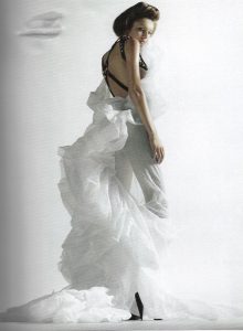
Scan 1The image I have chosen was from a book ‘House of Viktor & Rolf’ By Caroline Evans and Susannah Frankel. This book shows the collections throughout the years in which designers Viktor Horsting and Rolf Snoering have created. Reading the book about the “Upside Down” collection fascinated me as to how they showcased the couture pieces. They had garments presented that was worn by two models showing one upright and one upside-down, on the catwalk they first showed the correct way and then the other. The whole collection was presented in reverse. Starting the show with the final parade of the models.  It was also characterized by satin flowing shapes contrasting to masculine tuxedos. The most important part that really stood out to me was when they presented the show in reverse, Viktor and Rolf breaking boundaries and really standing out as unique designers.  [1]
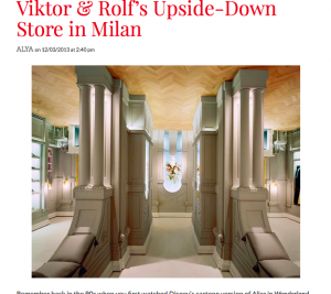


Further research, I found an article relScreen Shot 2017-10-18 at 00.21.33ating back to the ‘Upside Down’ Collection. Viktor and Rolf as designers they always like to take their collection to another level which I’ve always admired them for that. Siebe Tettero was an interior designer who worked on the upside-down store basing it on a traditional Parisian couture salon and had a 19th century French boudoir interior. The colour palette for the design successfully worked to balance out the strong upside-down architecture, balancing the calm colours with the bold shapes. I wanted to research into other artists and designers that have done the similar concept of turning objects upside-down. Although when I researched it not much came up with the result. However, I found a photographer named Martin Tremblay who also worked in the upside-down concept capturing models in a non traditional way of posing, the idea brings the fashion to the foreground which is forcing the viewer to focus on an unusual juxtaposition. [2]
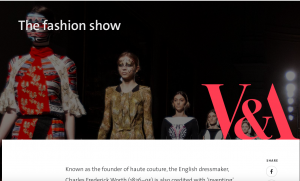
 

Finally, we were asked to identify a museum or archive that broadens my understanding of the
image and object. Using the internet, I was able to access the archives of the V&A which I found
a page about the founder of haute couture. It was said in the archive that Charles Worth is known for creating the fashion show, in which he presented his clients with collections of his designs around 4 times a year. He is an English dressmaker who has made dresses for Queen
Victoria. With the help of this online source, it allowed me to extend my knowledge of how the world of fashion shows started. It was interesting to know that fashion shows have been around for so many years dating back to the 1800s. [3]

Screen Shot 2017-10-18 at 21.48.31

References:

[1] – Photograph of upside down garment, House of Viktor & Rolf, Photograph by Mario Sorrenti, Published in V, No 9, Spring 2006

[2] – Photo: http://khaleejesque.com/2013/03/art-design/viktor-rolfs-upside-down-store-in-milan/

[3] – https://www.vam.ac.uk/articles/the-fashion-show