Author Archives: Iona Tweedie

R.C.S. Ethical Issues

The setting for this advert appears to be outside with a luxury car. The male in it is fully dressed in a smart tweed suit, as though he could be outside a drinks party or restaurant. His appearance also suggests he is a respectable, upstanding man – perhaps someone with a high powered job. The women however is only in her underwear and being pulled across the bonnet of the car. The difference in the fact he is dress and she isn’t already indicates a difference in respectability or maybe even social standing.

This firstly flags up the ethical issue of social class differences and the fact the image appears to be supporting this.

The body language also hints towards this. He is standing over her and almost throttling her with his tie. An ethical issue as well because of the on going issues of domestic abuse from domineering men. You cannot tell from this image her facial expression as well as where this is her choice or not. Obviously some people like this sort of ‘role play’ but wether there is enjoyment or not in this image it is impossible to tell. So it begs the question why is it used? What other message is the mage trying to put across to the public?

The use of that look like a luxury car also plays a part. It had to the feeling of the man being strong and powerful and the women one of his play things – like the car.

Domestic violence, sexual violence, social standing are all ethical issues that need to be taken into account when looking at this image. Of course it is just a harmless image in the fact the women isn’t actually being throttled. But what message could it be suggesting to the public as a whole. It seems to be normalising dominance of women and quite possibly in a sexual manner. A study of ‘Sexual violence in the Media’ “suggests that certain cultural factors (including mass media) and individual variables interact to affect some people’s thought patterns and other responses that may lead to antisocial behaviour, including aggression” (Malamuth, N. M. and Briere, J. (1986). This article certainly seems to suggest that constant exposure to sexual violence in the media may actually be being repeated in the actions of real people.

Although this is just an advert, the ethical issues behind it are quite severe. The need to have this composition in an advert is unclear. There are a million other ways to promote a brand. What is clear is the possible harmful message it is conveying – the normalisation of male domination and sexual violence.

Reference

Malamuth, N. M. and Briere, J. (1986), Sexual Violence in the Media: Indirect Effects on Aggression Against Women. Journal of Social Issues, 42: 75–92. doi:10.1111/j.1540-4560.1986.tb00243.x

R.C.S. Reflection Task – Fashion Media

In Sandra Miller’s chapter on ‘taste, fashion and the French magazine’, the concept of the first magazine is introduced. They are described as “mirrors of their time” (Miller) referring to the fact they contain archives of the current fashion trends, as well as the “social, political, cultural and artistic” (Miller, 2013) changes happening at the same time. The ‘birth’ of the fashion magazine is thought to be as early as 1672 with the publication of ‘Le Mercure Galant’ with the link between fashion and art first becoming apparent.

Additionally this was believed to be when the first form of advertising was seen in fashion magazines. They began appealing to the masses, telling the public what to wear, advertising everyday fashion. Bringing fashion out of the realm of “merchants, tailors, shopkeepers” (Miller, 2013) and making in accessible to everyone. It was not really until the late 18th century though that magazines truly began to do this. With the Industrial Revolution printing costs were dramatically reduced and publications could reach both rural and urban areas. “Affordable printing presses with machine-made parts were readily available, even to rural communities” (Hill, 2004: 2). This meant that the audience of people “voraciously eager for the news of current affairs” (Hill, 2004: 2) was hugely expanded.

It is argued that this was the beginning of what was to become the link between fashion and the “development of merchantile capitalism” (Wilson, 1985). The idea that capitalism needs to grow and fashion was an avenue for doing so. And the medium for allowing this to happen was through fashion magazines and the advertising within.

Fashion magazines, even in their humblest origins were a platform for showing the public, or even telling the public, what the latest trends are. Once the magazines had reached the general public, as early as the 18th century, they had become public adverts.

Hill argues that by the late 19th century there was now a “tripartite relationship” (Hill, 2004: ix) between fashion magazines, the capability of mass production of clothes and advertising. As with the earliest publication of ‘Le Mercure Galant’, the fashion magazine os the 19th century were “mirrors of their time” Keeping up with current trends and commentary on the social and political changes happening in the world. But they had now become tools for “mass-media” (Hill, 2004: ix) advertising and thus “fuelled capitalism’s need for perpetual expansion” (Wilson 1985).

Doris Langley Moore (Moore, 1949) states however that this is somewhat too conspiratorial, that fashion is not as clear cut as this. Either way though the birth of the fashion magazine and the subsequent commentary that came with it must surely play a part in directing the public on their opinions on what the latest fashion trends and ‘must haves’ are.

References

Barnard, M. (2010). Fashion theory : a reader. London [etc.]: Routledge.

Bartlett, D. (2014). Fashion media. London [u.a.]: Bloomsbury.

Belloc, H. (1967). On. Freeport, N.Y.: Books for Libraries Press.

Moore, Doris Langley (1949) The Women in Fashion, London: Batsford

Wilson, Elizabeth (1985) ‘Explainging It Away’, in Adorned in Dreams: Fashion and Modernity 1985 I. B. Tauris. Reprinted by permission of I. B. Tauris.

R.C.S. SUMMARY


There were a variety of different tasks set as part of the R.C.S. module. All of which I found to enhance my thought processes for the course as a whole as well a teaching important academic points. Skills such as analysis, comparison and researching were all learnt.

The research element was possibly the most important and valuable. Learning to use online resources along side the library. To have to find relating sources as well as conflicting sources was a great skill to be introduced to. This skill can be transferred for use when researching for a fashion design project. All sorts of sources can be found that build on your initial idea. The Visual Research task made me realise that designers with true integrity use a huge, varying portfolio of sources. Analysis of these sources was also a good skill to exercise. Going deeper into an image than just the initial glance.

The Ethics Task also required this level of thinking about an image. It means you get so much more out of an image than you first realise. The other side of the Ethics task was interesting as well. As designers we have a responsibility in the industry and to really think about ethics was essential. There are many different elements and god debate to be had about a lot of aspects of ethics.

The writing side of all of these tasks required a certain level of thinking and made a difference to the largely very creative side of the course. The Reflective Task in particular required a bit of brain work. It was good to try and write with a certain level of academic input as well as read fully academic text. I enjoyed doing this at secondary school in subjects such as history and politics and it was good to exercise it again. The philosophy and history in the text we were set for the Reflective Task was a good basis to think about the subject of fashion as a whole. Having to think about the bigger picture makes for a better designer.

What was a bit of a struggle was the academic integrity, I understand the need for it – plagiarism is a very serious subject. Putting the explanations of this subject area was difficult, I also feel I have covered this area rather too much in the past.

All in all the different elements of this module covered a good spectrum of thinking. The research and getting into the habit of collecting references I feel will be the most beneficial for enhancing my other modules which are more creative. Finally the module has made me think about the fashion industry as a whole more and in a broader and more in depth way.

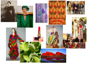
RCS Task 4&5 – Zandra Rhodes inspiration mood board.

Task 4&5 RCS

Screen Shot 2017-11-01 at 19.57.31

References:

20th Century Designers. (2017). Zandra Rhodes. [online] Available at: https://chelseajordanfidm.wordpress.com/zandra-rhodes/ [Accessed 1 Nov. 2017].

BBC News. (2017). Zandra Rhodes’ design online archive. [online] Available at: http://www.bbc.co.uk/news/av/uk-england-kent-21947354/zandra-rhodes-design-archive-launched-online [Accessed 1 Nov. 2017].

collection, T. (2017). The Conceptual Chic collection. [online] Zandrarhodes.ucreative.ac.uk. Available at: http://www.zandrarhodes.ucreative.ac.uk/2013/02/the-conceptual-chic-collection.html [Accessed 1 Nov. 2017].

LoveToKnow. (2017). Zandra Rhodes. [online] Available at: http://fashion-history.lovetoknow.com/fashion-clothing-industry/fashion-designers/zandra-rhodes [Accessed 1 Nov. 2017].

Pinterest. (2017). [1970s] ~ floaty fashion. [online] Available at: https://www.pinterest.co.uk/pin/292522938267865493/ [Accessed 1 Nov. 2017].

R.C.S. Task 4&5

 1970s vogue

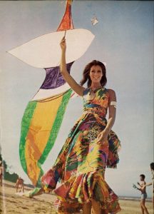
This photo is from Vogue December edition, 1971. An image found related to what influences Zandra Rhodes designs. It is a happy colourful image, The tones are warm but vibrant. The main focus is on the dress which is full length and with more frill at the bottom. Lots of floaty fabric, the pattern is quite abstract and full of colour. The angle of the photo is maybe trying to suggest that it is a holiday snap, taken by the women in the photos partner. The kite also has a feel that it is at a festival – the time of free living and love.

Vogue during that time and many similar photos. Lots of maxi dresses, models with long flowing hair. The colours are all quite varied and vibrant and yet warm. The fashion at that time was for floating dresses. A time when women wear was becoming more and more unreconstructed. Music and festivals and young people were beginning. Many of the photos in Vogue seem to emulate ‘hippie’ and ‘gypsy’ styling. The models looking happy and wistful, Sandra Rhodes was a popular designer at this time, her designs being very floaty, colourful, vibrant. Jean Muir was also popular, again with designs that were loose and colourful.

Other articles in that edition of Vogue are slightly different. Just as colourful but set in a built up setting such as a house in Marrakesh. Some of the clothing is also a bit different. Still some images of loose dresses but some of straight line trousers and tightly draped tops.

R.C.S. TASK 3&4 

For the second task on plagiarism and the importance in referencing I first chose a book called Weaving Textiles: That Shape Themselves that I had used in my weave project. It was of interest to me as it was about the structure you can get in weaving from simple techniques. Wet finishing was a technique that the Egyptians used (Richards, 2012 p 24). Another technique is twisting (Richards, 2012 p 26) where a pattern of weaving is quit simple but the yarn is highly twisted so it creates a structured texture.

I then wanted to look into the technique of shrinkage using the internet and found a website (weavezine.com) with more information about this technique. It had similar samples and explained ‘differential shrinkage’.  The things I was interested in in the book.

There wasn’t really any decent articles either from a newspaper or a magazine to find. The only articles I was finding were from very basic craft magazines. But this lead me to think I should look into fine art textile artists who used structure as their basis. I found Mairanne Kemp who pieces are woven with horse hair often in large loops and create a very structural woven art piece. Although they are not created using either of the techniques specified above, they do represent the use of structure in textile weaving.

References.

Anon, (2015). Influence and Evolution Introduction: Marianne Kemp. [online] Available at: http://arttextstyle.com/2015/03/20/influence-and-evolution-introduction-marianne-kemp/ [Accessed 25 Oct. 2017].

Richards, A. (2012). Weaving textiles that shape themselves. Ramsbury: Crowood.

Weavezine.com. (2017). Plain Weave Variations | Syne Mitchell. [online] Available at: http://www.weavezine.com/content/plain-weave-variations.html [Accessed 25 Oct. 2017].

R.C.S. | TASK ONE & TWO | SKIN UNDER THE MICROSCOPE

This research task has been focused around the subject of haptic and the influence for this project is skin, quite a broad beginning. My initial research began with thinking about skin and  what different aspects there were to researching skin other than the simple fact that it is where our touch sensors are. Thinking about touch made me think about nerves and nerve endings. Which obviously lead to me looking at skin under the microscope and therefore books about anatomy and the human body. I found many images in a book called Super Vision (Amato, 2003, p126) about human skin but I also came across this fascinating image of a dogs skin under the microscope.

Photo of dog Skin infiltrated by cancer. James E. Hayden in 2003 [1]

Photo of dog Skin infiltrated by cancer.
James E. Hayden in 2003 [1]

 This then inspired me to look into other animals and what their skin would look like under the microscope. Which immediately resulted in finding fascinating images of sharks skin under the microscope and how textile and pattern like it looked. In particular this image of a tiger shark’s skin.

Photo of Tiger shark skin from cracked.com 2017. [2]

Photo of Tiger shark skin from cracked.com 2017. [2]

 I then wanted to find further information about the structure of shark skin. Why it was made up of scales. Firstly I found a BBC article about a scientist George Lauder, who has replicate the structure of shark skin (made up of dermal denticles) with a  3D printer. Both to gain a a better understanding of how it helps them manoeuvre in  the water but also for the potential to develop  innovative textiles for swim wear. As well as this I also found and information on the Smithsonian National Air and Space Museum  (https://airandspace.si.edu/exhibitions/outside-the-spacecraft/online/image-detail.cfm?id=9823) about how shark skin was being used to develop space gloves to give a better sense of touch and grip.

The printed replica of 3D printed denticles from BBC News 2017. [3]

The printed replica of 3D printed denticles from BBC News 2017. [3]


Further online research produced a different train of thought, that of textile weave structures – actually called Shark skin. A type of weave for a particular design of suit found on a blog called Department of Textilesmithing [4] (https://textilesmithing.com/2011/02/22/weaves-with-animal-names/). It is described as having a ‘shimmering’ effect.

Sharkskin weave pattern diagram from Seth Winner blog 2011 [4]

Sharkskin weave pattern diagram from Seth Winner blog 2011 [4]

From a relatively simple search into the structure of the human skin, my research as evolved into scientific 3D printing and innovative textile development. This sophisticated replication of shark skin is something I won’t achieve but it is good to look into how the structures are replicated and be used as inspiration. It was good to get a more in depth inside into the subject of ‘skin’. It was quite difficult to find any museum exhibitions on the subject of shark skin replication but I did find some very interesting articles. And quite varied. I can use this in weave development work as using the very 3D representation of shark denticles but also can use the pattern of the Sharkskin weave.

References

[1] Amato, I. (2003). Super vision. New York: Harry N. Abrams

[2] Cracked.com. (2017). 8 Ordinary Things That Look Insanely Cool Under a Microscope. [online] Available at: http://www.cracked.com/article_20386_8-ordinary-things-that-look-insanely-cool-under-microscope.html [Accessed 16 Oct. 2017].

[3] BBC News. (2017). 3D printing used to model shark skin. [online] Available at: http://www.bbc.co.uk/news/science-environment-27409836 [Accessed 18 Oct. 2017].

[4] Winner, S. (2011). Sharkskin, Herringbone and Houndstooth. [Blog] Department of Textilesmithing. Available at: https://textilesmithing.com/2011/02/22/weaves-with-animal-names/.

Airandspace.si.edu. (2017). Shark Skin Close Up. [online] Available at: https://airandspace.si.edu/exhibitions/outside-the-spacecraft/online/image-detail.cfm?id=9823 [Accessed 18 Oct. 2017].

ArtsThread. (2017). eXTENDING THE BODY, hAIR aND sKIN – Swatch Collection – ArtsThread. [online] Available at: http://www.artsthread.com/portfolios/extendingthebodyhairandskin-swatchcollection/ [Accessed 16 Oct. 2017].

Ewing, W. (1996). Inside information. London: Thames & Hudson.

Muttermuseum.org. (2017). Our Finest Clothing: A Layered History of Our Skin. [online] Available at: http://muttermuseum.org/exhibitions/our-finest-clothing-a-layered-history-of-our-skin/ [Accessed 16 Oct. 2017].