Author Archives: Georgina Selway

Summary

Throughout the research and communication lectures I have learnt a great deal of information. Each lecture we have learnt about significant movements throughout the years and furthermore, introduced me to new artists. Each week I have been able to see how art has evolved and its connection to current 21st century art. Personally I have a keen interest in Graphic Design however, these lectures have also introduced me to other mediums of art and allowed me to gain a great deal of inspiration from them. In addition It has also help me with my analysis skills and further encourage me to utilise the facilities that I have access to such as the library. Moreover, writing blog posts has also allowed me to progress in my essay writing as well as working on my time management skills.

These lectures have enabled me to progress within other aspects of this course as I have been able to see connections when I’m in lessons. I’m able to refer back to knowledge that I have gained within my research and communication lectures and response to work more clearly. This has been immensely helpful as it has allowed me to see how art is continuously inspired by past movements and artists. Furthermore, It has also shown me how current situations inspire art. To create and design something that is successful an artist needs to ensure that they’re fully aware of the context and purpose of what they’re designing. A clear and comprehensive understanding of theory allows artists to accomplish a successful design practice outcome. This is evident within the  postmodernism movement work, artists are aware of previous work and re appropriate it or create something new in the style of it – pop art for example.

Each lecture has been significant for my progress within this whole graphic arts course however, week 5 lecture regarding the ‘Underground Culture’ was one of the most inspiring. It motivated me to consider how I would design a piece of graphic design work. The work produced and shown during this lecture was all very vibrant and innovative. I could see various elements within the work that inspired me. Primarily the typography, it was playful and decorative which was ideal for the message that was being portrayed. What I gained from this lecture was the importance of ensuring you have a clear understanding of what you’re trying to communicate. Furthermore, it also encourages me to be more inventive with my design work. When I consider graphic design I think about clean, clear, sophisticated work mostly computer based. However, I now deliberate on whether I could create my own typeface. If it doesn’t confuse the message that I am trying to convey then I don’t necessarily have to with default use a font found on computer design software. Moreover, the lecture also inspired me to think about layout and composition. The alignment of elements of the artwork can help the final outcome as it can make or break how successful the work is. For example if a piece of design is primarily text then you can play around with that and manipulate the text to mimic shape.

Overall, the lectures have given me important knowledge and allowed me to work on my research and writing skills. I’m able to take what I’ve learnt into my other lessons to expand on my practice work.

Publish or perish

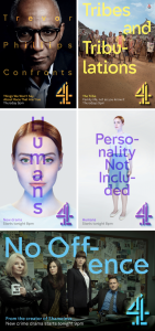
Having a keen interest in graphic design when Channel 4 rebranded their identity I was very interested in the outcome. What stands out most on the images is the typeface. It’s an extension of Channel 4. This custom typeface was designed by Brody Associates to portray what the channel is all about. Horseferry is “designed to reflect on the sharp, disruptive and aesthetic of this unique British Institution.”Cadwick “reflects the modern and informative nature of the public service broadcaster at information level.” [1] The harsh angles and inverted slab serifs on the Horseferry font immediately hits the viewer. On the images you can see its alignment is above the image, this is interesting as it encourages the viewer to read the text first. Furthermore, the position of that text is again very interesting the ‘Humans’ two posters for example, in the second image the text is broken up by the hyphens. Almost as if it was done to mimic the style of a robot (What the program is about.) As you read the text you take these small breaks/pauses which is very similar to the typical robotic voice. The overall layout of all the posters is consistent, clean and clear.

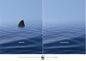
WWF poster advert is a piece of published work that is simple but very effective. It’s almost like a ‘stop the difference’ game, the viewer is drawn in to read the text. The text itself is short as it’s made of up a one word adjective. The important information is placed on the bottom of the poster where the eye is naturally drawn down. The typeface is a sans serif font which is ideal for this as it’s portraying a clear stern message. A serif font would have been confusing as it would conflict with the text. I’ve also noticed all the text is in capital letters again reinforcing its strong message.

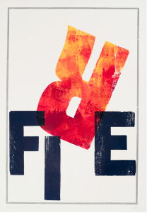
Finally is a piece of work by Alan Kitching who is a British graphic designer, animator, architect and software developer. This piece of work was created through letterpress. I enjoy this artwork as it really plays on the word ‘fire.’ The typography is playful whilst being in a sans serif font. It’s interesting to see how he has changed the format of the word, using the ‘r’ to mimic visually a flame. furthermore, the rest of the letters aren’t placed uniformly in a straight line. This piece of work is great inspiration for me as It reminds me that typography doesn’t always have to be created on a computer. In addition to this it also makes me consider the placement of the letters.


Underconsideration.com. (n.d.). Four-ward Looking. [online] Available at: https://www.underconsideration.com/brandnew/archives/new_identity_and_on-air_package_for_channel_4_led_by_4creative.php [Accessed Nov. 2017].

 Debut Art. (n.d.). Alan Kitching: type design, lettering, letterpress – Artists – Debut Art. [online] Available at: http://www.debutart.com/artist/alan-kitching [Accessed Nov. 2017].

The postmodern condition

Postmodernism within art refers specifically to ‘a reaction against modernism which has dominated art theory and practise since the beginning of the twentieth century.’ [1] Guerrilla Girls is an anonymous group of radical feminist, female artists devoted to fighting sexism and racism within the art world.’ [2] The idea to be anonymous is bold and allows the issue to be the focus  rather than the artist. The group formed in 1985 and are still producing work now, throughout all those years their work is distinctive. The use of bold san serif fonts being a prominent part of their design is easily recognisable. Furthermore, the classic and iconic monkey masks and banana images used within their projects. A piece of work they have created that I find very intriguing is ‘Dear art collectors – boys will be boys.’ The design is overly ‘girly’ the pink backdrop background against the calligraphy typeface juxtaposes with their other work which is brash and audacious. This piece is bold in its own way. It’s funny and patronising as such which contrasts with how women are viewed. Its a critical piece of work especially considering the era it was created – 1985. I have a keen interest in graphic design and its important for me to considering designing work regarding an issue. Therefore, this piece of postmodernism is great inspiration.

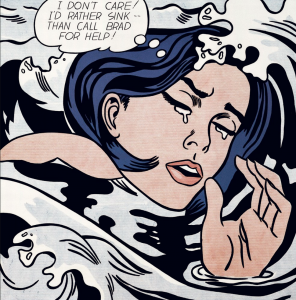
Roy Lichtenstein was a pop artist who’s work defined the premise of pop art through parody. Although Lichtenstein work mocks pop art his work in undoubtedly iconic and work you can be  inspired by. He re-appropriates work from comic books to recreate a whole new piece of art. Drowning girl is an example of this. This piece uses the conventions of comic book art, thought bubble and ben-day dots.  He deconstructs the original artwork to create something new. Similar to graphic design, you’re continuously inspired by movements and artists. Influenced by past work enables artists to create something new.

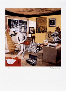
Richard Hamilton’s ‘Just what was it that made yesterday’s homes so different, so appealing?’ Is among the most famous in British post war art. Hamilton began this collage by planning categories he would incorporate into the work. So he typed out a list: ’Man, Woman, Food, History, Newspapers, Cinema, Domestic Appliances, Cars, Space, Comics, TV, Telephone, Information’ (quoted in Richard Hamilton, 1992, p.149) The finished collage presents all the multiple ways of communicating information available at the time, reflecting Hamilton’s ironic interest in popular culture and modern technology. [3] Through this piece of work Hamilton is mocking materialist fantasies fuelled by modern advertisement. Photomontage is a interesting style and something I could consider myself when creating work. I could apply this same concept of collecting materials from other mediums and combining them with computer software to create a unique mixed medium outcome, combining the old with the new.

1-Tate. (n.d.). Postmodernism – Art Term | Tate. [online] Available at: http://www.tate.org.uk/art/art-terms/p/postmodernism [Accessed Nov. 2017].


2-Tate. (n.d). Guerrilla Girls | Tate. [online] Available at: http://www.tate.org.uk/artists/guerrilla-girls-6858 [Accessed Nov. 2017]

3- Tate. (n.d.). ‘Just what was it that made yesterday’s homes so different, so appealing? (upgrade)’, Richard Hamilton, 2004 | Tate. [online] Available at: http://www.tate.org.uk/art/artworks/hamilton-just-what-was-it-that-made-yesterdays-homes-so-different-so-appealing-upgrade-p20271.

Underground culture

During the 1960’s op art was a major development within painting it involved using geometric forms to create optical effects, capturing the imagination of the public. ‘The fashion, design and advertising industries fell in love with it’s graphic, sign-like patterns and decorative value.’ [1]

Bridget Riley ‘untitled [fragment 3/11] is an interesting piece of op art, Riley was considering the tensions found in the tight and loose undulations of lines. The raw edge sides contrast against the top and bottom edges so the viewer is immediately drawn to the pattern. The weight of the ragged lines prompts me to think of typeface and how they also vary in weight.

Untitled [Fragment 3/11] 1965 Bridget Riley born 1931 Purchased 1970 http://www.tate.org.uk/art/work/P07106

Victor Moscoso is best known for his psychedelic work during the 1960’s and 1970’s. It was during the 60’s that he started his own company, Neon Rose. This venture allowed him to have complete artistic control over the posters and the series ‘is noted for some of the most iconic images of the psychedelic era.’ [2] The series is so vibrant and intriguing you can definitely see the sprit of the 60’s within the posters. One of my favourites is ‘Neon Rose #12’ interestingly Moscoso only printed one of these posters however, it is his ‘most popular and iconic image.’ The contrast of the catalogue like image of the woman against the typography is engaging. The typeface is playful and placing the typography in the frame of the glasses is successful. The overall piece is fun and captivating without being too busy and overwhelming.

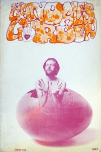
During this era young people were liberated and they found their voices. Music, films, art, politics and culture shifted to celebrate this new era. The ‘underground press/papers’ was a result of this. Gandalf’s Garden was a magazine that emerged during this era and ran to 6 issues. It differed from the distinctive black and white pages seen in the International Times and OZ. Its design approach was much gentler than some psychedelic magazine covers. The image here is from their first issue, the overall design is refreshing. The contrast of the photograph of the man (Muz Murray) against the typeface is pleasing. The colours chosen work well with one another and aren’t overwhelming. Furthermore, I think the typography really encompasses the sprit of the 60’s.

These three images are very interesting as they’re all very different but they’re important when considering my interest in graphic design. Graphic design involves various elements and these three images are something I could be inspired by. The composition and design layout of a poster, the typography and the shapes and patterns.


Is it possible to be truly authentic?

To be authentic is to be genuine ‘undisputed origin and not a copy.’ Forgery and plagiarism surround this word how do you know if something is ‘true’ or ‘real’ Denis Dutton refers to this as nominal authenticity, the deceptive intentions to recreate or claim work as your own. ‘Expressive authenticity in contrast refers to how much the work possesses original or inherent authority. “Committed, personal expression, being true musically to one’s artistic self, rather than true to an historical tradition.” [1] This quote hints and picks up the principles of modernism – ‘deliberate rejection of the styles of the past’ to make new, start again, refresh and move one.

To be unique and original is difficult within the arts as you’re constantly inspired by past movements and artists. As Jim Jarmush claims ‘nothing is original’ furthermore stating ‘authenticity is invaluable; originality is non-existent.’ However, I personally believe you can be authentic if you’re creating work that isn’t a replica of something else. You can pick up on what you find successful within a piece of art but it’s what you do with that, that defines it as genuine and authentic. Select only things ‘that speak directly to your soul’. As Jean-Luc Godard states “it’s not where you take things from – it’s where you take them to.” [2]

Within contemporary practice I think it’s clearly evident that the principles of modernism are valuable. Artists emerge who’re inspired by past movements, artist etc however, they’re defining their own era. Focusing on materials, techniques and processes to create abstract art.

Technology is the mortal enemy of art

With the world evolving and being introduced to new technology, graphic design also evolves alongside it. Graphic design possesses an integral role in the modern world as many consumers are subconsciously becoming critics to what constitutes great and effective design. As designers, we are continuously pushed to improve and innovate thanks to information being easily accessible through various media such as books, internet and consumer demands. Technology is a prominent aspect of creating and allows the art to get more innovative over the years.
‘Artist yesterday constructors today’ [1] is a very interesting way to view todays artist, constructors imply building. Which I suppose you could say is true – today’s artists build on their artwork through technology and with the help of technology. Technology also allows you work on your artwork through different mediums but also you’re able to create mixed medium outcomes and combine them with computer design software resulting in an overall design that is unique without ruining of altering the original. It is with the use of technology that art has become more efficient and in a way easier as technology assist the artist. For example, typography has come along way from its origin. Computers turned typeface design into a rather simplified process. There are now thousands of typefaces available.
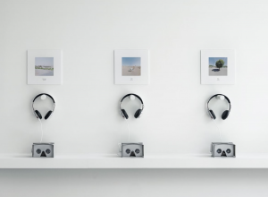
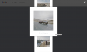
Furthermore, technology really helps an artist get their work out there. Its accessible and easy to promote your work through the use of technology. Not only this but in some case the use of technology is vital as it becomes part of the art work. Jacqui Kenny experiences agoraphobia which is a fear of being in situations where escape might be difficult or that help wouldn’t be available if things go wrong. For her, the thought of leaving the house is enough to generate stress and panic attacks. It was with the help of technology that she managed to feel “more connected to the world than  ever before.” [2] With an interest in photography Google Street View allowed Kenny to see various parts of the world but also “gave her the opportunity to be a photographer but without having anxious feelings.” She has taken thousands of screenshots which have enable her to find her voice. ‘Her photos, evoking something deeper than just a well-framed photo.’ Therefore, I think technology is not the enemy of art but an asset to art. Art inspires technology as much as technology inspires art.

Comparing two images

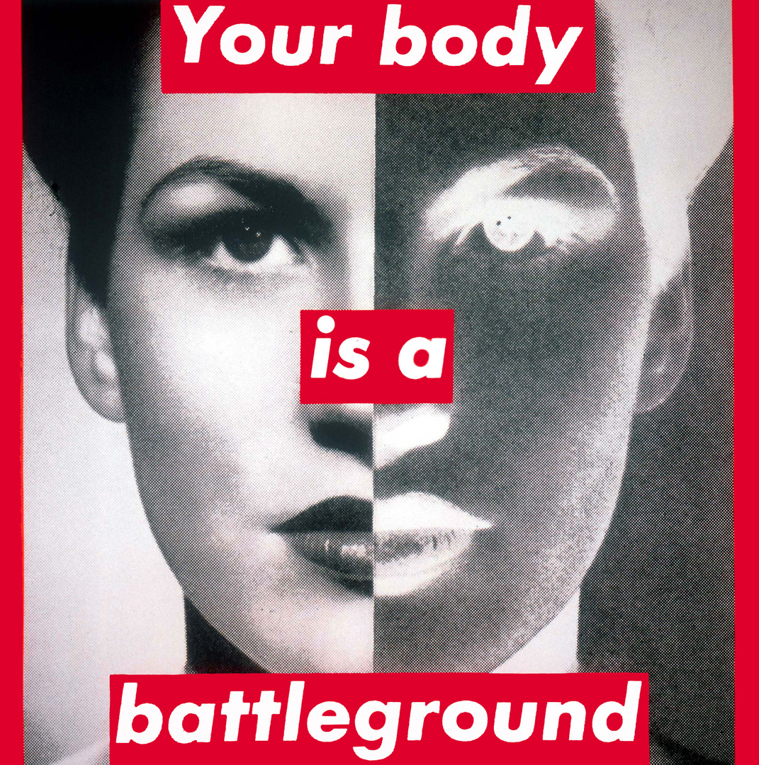
Barbara Krugers ‘Your body is a battleground’ is a piece of artwork I find very intriguing. The red typography against the black and white image creates a powerful piece of artwork. Kruger is portraying a message through this work and its emphasised with having her subject directly stare straight ahead through the print. She combines the gaze of the subject with the words across her face to address the issue of the continued feminist struggle. It’s reinforced with the text speaking directly to the viewer ‘your.’

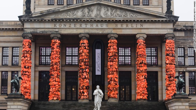
Ai Weiwei like Kruger is an activist however, he uses a different medium for his work. For example the image on the right is a piece he installed regarding the refugees fleeing Syria. He collected over 14,000 life jackets and tied them together on the columns of Berlin’s Konzerthaus. The life jackets demonstrate the amount of lives being risked to find peace.

Both pieces of work by these artists showcase an important message, it’s evident that neither of them are afraid to speak up for what they believe in. Furthermore, I think it’s very interesting to see how you can portray a message in various mediums and how you can combine these mediums. In addition, looking at both images I’ve noticed how the artists have created work that isn’t too overdone. The message is clearly taken from how simple they are and isn’t confused.

Image result for barbara kruger your body is a battlegroundImage result for ai weiwei life jacket installation


Terminal Bar

Terminal Bar is an expeditious photo driven documentary short film by Stefan Nadelman showcasing one of America’s most notorious bars. The short film is made up of majority still photographs which were accumulated between 1972-1982 furthermore, the photos are predominately portraits and more importantly the photos are all black and white. Alongside these images newspapers/magazine clippings are used throughout. Each time the clippings appear on the screen they’re enlarged therefore allowing the audience to read along with the narrator (Tom Clifford.) Clifford is a prominent part of the film and interestingly he himself has a very strong New York accent which coincidentally is where the bar is situated.

Sheldon Nadelman is also seen within the film where he discusses the people in the photos, each time this happens the photos are zoomed in. Moreover, there is an atmospheric sound in the background which mimics the sound of a bar – people talking, glass clinking. Music by Dick Zved, Steve Rossiter and Michael Reid breaks up the talking within the film. The rhythm of the music works alongside the photos entering the screen – each beat adding a new photograph. The short film flows between past, present and future however, the film is broken up by a rapid photomontage half way through creating a quick pause as such.

The way the film is edited is very interesting and something I could consider when producing my own work. For example, the images aren’t thrown straight onto the screen instead they enter in a unique way. In addition to this I noticed how there is a black background/boarder throughout the film ensuring the focus is on the photographs. Consistency is very important for a cohesive flowing film.