Author Archives: Emily Watts

Summary

Over the course of these lectures, it has expanded my contextual view of the relationship between historical events and the impact this has had on people and their work within art and design. Itā€™s been specifically interesting to hear more about the response and retaliation from certain movements such as counterculture ideas in psychedelia and pop-art, or the underground and alternative movements that give an idea of viewpoints within history that aren’t particularly well-known and I definitely hadnā€™t heard about till this series of lectures. From these variety of sources and information, Iā€™ve found myself taking inspiration from a wider variety of artists, such as architects and illustrators, when usually I would stick quite rigidly to graphic designers. The Abstract documentary was also incredibly interesting to see how within a variety of disciplines, the design process has a lot of similarities, and those differences can be taken across disciplines to take people in directions not seen before in their work. The episode that I was most engaged with was featuring Es Devlin and her stage design process as I liked the way you could see that she started off in a different area of design before experimenting and finding the work that she loves and now makes a living completing.

I think getting this basis of information together to form a wider view of the situation can really help develop your practise as you can identify what has or hasnā€™t worked previously and then try to recreate your own version of this. Also, it can help you to understand which certain looks or colours to perhaps avoid if they have negative connotations, or at least a different association to what you are trying to portray. The introduction of critical theory has helped me to view other media and art with an evaluative thought process to see if the work may be subtly presenting ideas and opinions that I donā€™t agree with, and therefore make sure my work could not be misinterpreted to be offensive.

(Glaser, 1964)

One of the designers that I was introduced to in the Underground lecture in week five, was the typographer Milton Glaser, who created interesting typefaces that are very boldly constructed. You can see a very clear link between his work, particularly the typefaces ā€˜Babyteethā€™ and ā€˜Glaser Stencilā€™, and my work during the motion rotation brief. I have taken his idea of reducing letters done to very simple lines, curves and shapes and applied them to the letters I was working with. I found the abstract forms that I was left with had a strong basis in the solid design principles he had been working with, and from there I was able to develop them further to create moving pieces that I was very happy with.

(Glaser, 1970)

Bibliography
Glaser, M. (1964). Babyteeth Typeface. [image] Available at: http://containerlist.glaserarchives.org/138/a-brief-tour-of-milton-glaser-s-typography [Accessed 4 Dec. 2017].
Glaser, M. (1970). Glaser Stencil typeface. [image] Available at: https://www.linotype.com/89171/glaser-stencil-family.html [Accessed 4 Dec. 2017].

Story, Message, Feeling, Connection

ā€œStoryā€¦ Messageā€¦ Feelingā€¦ Connectionā€™ ( Platon, Abstract, 2017)

(Merendino, 2013)

The first image that I chose was a photograph from a series titled ā€˜The Battle We Didnā€™t Chooseā€™ by Angelo Merendino. It documents and presents the ā€œintimate moments of his wifeā€™s fight with breast cancerā€ (Murray, 2013) to tell her story and make a connection with the audience. He felt that family and friends werenā€™t understanding the truth of everything they were going through, the reality of her experience, and thought that realistic and almost intrusive photography could be a way to battle this. The images feel uncomfortable, as if they are moments we should not be seeing, giving us a real feeling of the uncomfort in their situation even if we may not have experienced anything like it ourselves. The black and white tones of the images really help to highlight the fact that these were moments in history made even more poignant by the final image consisting of her gravestone as a finality to her story and battle.

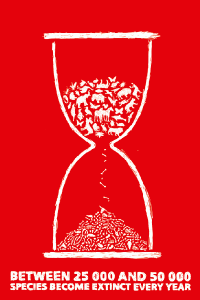
(Dovnorovics, 2008)

The second image that I chose was an illustration by Karlis Dovnorovics showing and representing how little time we have left when it comes to preserving the animals on our planet. It gives you an impending feeling, as if they are slipping right through our fingertips as well as the hourglass, compelling us to make any sort of action that we can so we donā€™t feel as though we have contributed directly to the pile of bones gathering at the bottom of the illustration. The scratchy scribbles that have been used to create this also give you that sense of urgency which allows the piece to be so straight to the point, not trying to be clever or side-step the focus, but telling you it straight with the fact at the bottom.


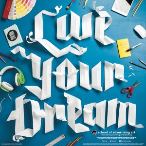
(Evans, 2014)

The final picture I chose is a piece of physical typography created by Danielle Evans for the School of Advertising Art. It is created with pieces of cut and curled paper arranged to create a type reminiscent of a more modern blackletter. Once finished, it has been presented together with other tools and instruments that are typically used within the graphic design course, trying to connect with the studio environment of university whilst also giving a message to potential students that they should live out and follow the dreams they wish to become a reality.


Bibliography

Merendino, A. (2013). Jennifer Merendino waits to speak to a radiologist about treatment of her cancer. [image] Available at: http://www.nydailynews.com/life-style/health/husband-photos-wife-breast-cancer-battle-article-1.1315041 [Accessed 25 Nov. 2017].

Murray, R. (2013). Husband documents wife’s battle with breast cancer through photo series. [Blog] NY Daily News. Available at: http://www.nydailynews.com/life-style/health/husband-photos-wife-breast-cancer-battle-article-1.1315041 [Accessed 25 Nov. 2017].

Dovnorovics, K. (2008). Global Warming Illustration. [image] Available at: https://www.behance.net/gallery/103980/Global-warming [Accessed 25 Nov. 2017].

Evans, D. (2014). Live Your Dream Paper Type. [image] Available at: https://www.behance.net/gallery/18902107/Live-Your-Dream-Paper-Type [Accessed 25 Nov. 2017].

Abstract. (2017). (Documentary) Directed by M. Neville. Netflix.

Postmodernism

“Showā€¦ revealā€¦ deconstruct” ( Es Devlin, Abstract, 2017)

(Shabazz, 2013)

Based on these three words, I haveĀ selected a variety of images representing the postmodern mindset. The first shows an insight into the new hip hop subculture erupting in the 1960s through photographing people experiencing and representing this new shift of expression. Iā€™m interested by the documentary style of this piece, as it doesnā€™t seem to be shot in such a way that the photographer is putting forward a negative viewpoint of this culture. Shebazz seems to be impartial, just observing and showing this scene to the world, giving it visibility and a human nature through the natural expressions on their faces.

(OBEY Giant, 2015)


The second reveals the idea that media can be a tool to stop people thinking about their current circumstances. This is a very postmodern idea as it is doubting and questioning a culture that has been put up with and accepted for years. In terms of the style, I am really interested in the minimal and dull colour palette that allows the poster to convey that almost autonomous and blind following being commented on. The use of bold text and decoration involving a border is reminiscent of retro 1920s design which gives a nice symmetry and order to the piece.


(McCoy, 2015)

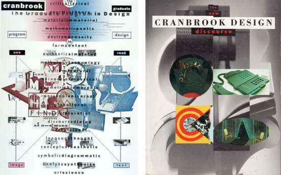
The final image deconstructs different design elements by cutting up images, overlaying themĀ with text into a design that is verging on difficult to read. These two posters are very visually engaging, drawing you in and capturing your attention to try and look at every element of the poster. I really like this style of working as it is so different from my work that is usually clean cut with each element sticking to its place in the grid with very little overlapping. McCoy says ā€œduring my college years there was a big cultural shift, a revolution of sortsā€¦ā€ (McCoy, 2015) which can be really shown in the work that is taking elements already being used in design and using them to try and create something new and interesting.


Bibliography

OBEY Giant (2015). Sedation Pill Metal. [image] Available at: https://obeygiant.com/fine-art/sedation-pill-metal/?tax=1&tax_name=medium_art_category&term_id=101 [Accessed 14 Nov. 2017].

Shabazz, J. (2013). Recapturing the infancy of hip-hop in New York. [image] Available at: http://www.nytimes.com/2013/08/02/movies/jamel-shabazz-street-photographer-a-new-york-portrait.html [Accessed 14 Nov. 2017].

McCoy, K. (2015). [image] Available at: https://designtraveler.wordpress.com/2015/04/19/katherine-mccoy-thoughts-on-design-writing/ [Accessed 14 Nov. 2017].

Abstract. (2017). (documentary)Ā Directed by M. Neville. Netflix.

Counter Culture – Sensibility, Spirit, and Meaning

(Anon, 1969)


For my first image, I found this image from EYE magazine in the late 60s that incorporates photography and typography which are both disciplines that Iā€™m very interested in. This represents the counterculture movement within this period after the second world war where people were protesting the violence of war with the slogan ā€œMake Love, Not Warā€. This image, with the wide eyes of the model, flowers blooming so close to her, has a spirit of innocence within it that draws you in – causing you to lower your guard. The typography looks folded out of paper, giving it a handmade feel that contrasts the realistic photograph, but aids to the idea of a community of revolution that comes together to make a difference to the world they live in.

(Are You Experienced, 1967)

This second piece is an image of a silk screen printed design for the Are You Experienced Jimi Hendrix Experience. I was really drawn in by the use of a neon sunset gradient contrasted with a muted camo green colour. I think this helps the colours, especially the blue outline, to intensify even further and give that sense of psychedelia. The crisp outlines paired with the fantastical subject matter that might’ve been regarded as childish gives a feeling of almost being out of this world. As if he has developed to a more accepting and experimental mindset than the normal culture surrounding him, perhaps represented by the girls in the back that appear to be whispering.


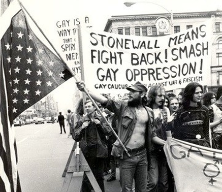
(Image from the Stonewall Riots, 1969)

This last image is a photograph from the Stonewall inn riots in 1969 that were a major turning point within the fight for equal rights for people of varying sexualities and genders from the norm. This was truly going against the main attitudes in society due to being LGBT still being a criminal offence in nearly all of the USA. Within this picture, the poles holding up these banners and flags give a strong geometry to the image that breathes the sense of passion and intense belief that these protestors have for the cause. All of the people in the image have such determination on there faces, complimented by the forceful phrases on the banners that really make a statement.


Bibliography

Anon, (1969). EYE magazine.

Image from the Stonewall Riots (1969). (n.d.). [image] Available at: https://labod.weebly.com/timeline.html [Accessed 7 Nov. 2017].

Are You Experienced. (1967). [image] Available at: https://us.culturelabel.com/products/jimi-hendrix-are-you-experienced-1967-hapshash [Accessed 7 Nov. 2017].

Is it possible to be truly authentic?

Authenticity is a term that is discussed very frequently in terms of a piece of art or design being genuine and original, having ā€œa unique existence in the place it happens to be.ā€ (Tate, 2017). It is concerned with being trustworthy so worries about plagiarism and piracy can be put aside to experience the piece with a more open and respected view.

However, looking past the idea of people recreating fake pieces of artwork for profit, as this can be easily recognised by professionals, there is a more fine thread of authenticity in regards to influence. At what point do you consider the line between taking inspiration and not being creative/authentic yourself? This is a very grey area, as even people that are known as being some of the most interesting and unique artists today, take inspiration from other artists and their environment – even if this is only sub-consciously.

Due to the history we have documented, there is a wealth of reference material that people can take and apply to their own work. This is why you can see links between different movements as they flow into one another; even, for example, in Modernism where the influence they took was one of disregard, knowing that they didnā€™t want to create anything like what was already being made. This lead to a lot of interesting work, but also confusion for some as work without a basis that we understand and can relate to things weā€™ve already experienced can be overwhelming.

Bibliography
Tate. (2017). Authenticity ā€“ Art Term | Tate. [online] Available at: http://www.tate.org.uk/art/art-terms/a/authenticity [Accessed 30 Oct. 2017].

Technology is the Mortal Enemy of Art

The Constructivist Manifesto, written by Aleksandr Rodchenko, Varvara Stepanova & Aleksei Gan. in 1922, includes some very strict ideals/rules about the interaction between technology and art. They frankly say that ‘technology is the mortal enemy of art’ (Rodchenko, c. 1922) and that they, the Constructivists, declared ‘irreconcilable war against art’ (Rodchenko, c. 1922). Despite being very attracted to their style of design, I believe their ideas to be very limiting, especially in the realm of modern technology that we have today. I think that due to the strong geometric shapes and photo-realistic elements, they could be helped rather than hindered by modern pieces of software such as Adobe Photoshop and InDesign.

(Rodchenko, 1924)

In a wider sense, I believe that the introduction of new technologies has been incredibly interesting as new art forms and approaches are developed. For example, light painting is an eerie form that has been refined to create images that look far too modern for even today, and this draws the viewer in to question how it has been down and really evoke an interaction.

(Wƶllert&Miedza, 2008)

However, despite the entrancing forms that come with advancements in technology, sometimes we can get carried away with these and forget the work we are actually creating. ‘I do see a challenge for artists to be simultaneously more open to new technologies that lead to novel forms of expression, and also staying truly creative and imaginative.’ (Gever, 2017). No matter how much technology is advanced,Ā there will always be interest in learning from the preciseĀ work and techniques of the past, such as letterpress and calligraphy which are being brought back in specialist forms.

Bibliography:

Who We Are: Manifesto of the Constructivist Group. (2014). [ebook] Des Moines. Available at: https://issuu.com/rachelgweeks/docs/manifesto_issuu [Accessed 26 Oct. 2017].

Rodchenko, A. (1924). Soviet Poster featuring Lilya Brik. [image] Available at: https://theredlist.com/wiki-2-24-525-770-810-view-1920s-4-profile-lilya-brik.html [Accessed 26 Oct. 2017].

Wƶllert&Miedza (2008). Super Natural Breakdancer. [image] Available at: https://upload.wikimedia.org/wikipedia/commons/9/9a/SuperNaturalBreakdancer.jpg [Accessed 26 Oct. 2017].

Gever, E. (2017). Tech & art: Engineering the future. [online] BBC News. Available at: http://www.bbc.co.uk/news/entertainment-arts-19576763 [Accessed 26 Oct. 2017].

Comparing Juxtaposing Images

(Sagmeister&Walsh, 2008)

(Sagmeister&Walsh, n.d.)

Firstly, IĀ looked at a piece of Stefan Sagmeisterā€™s typographic work ā€“ ā€œObsessions Make My Life Worse but My Work Betterā€. Initially youĀ readĀ the phrase, and agree that it has aided his work due to the delicate floral embellishments and the use of 250,000 Eurocents that must have taken much rigorous (obsessive) layout planning.
I think that equality and accessibility of design is being represented in this work. Once it was completed, the piece was left open in Waagdragerhof Square in Amsterdam to encourage interaction from the public.Ā Alternatively, I think it reflects the thoughts of designers being apprehensive to share their work with people that donā€™t have the same vision for design. In this instance, itā€™s shown through the fact that the cents started to be taken by the public, before being swept up completely to ā€œpreserveā€ it by the Police.

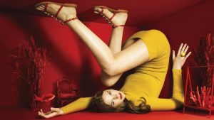
In contrast, I looked at some fashion photography directed by Jessica Walsh titled ā€œBy The Seaā€ which aimed to look at the crossover of fashion and art. Using bold, primary colours and angular shapes provided by the modelā€™s body position, it feels almost like a painting with the monotone background. The intense eye contact she has with the camera gives power to her despite being in such a cramped room.

Space is a strong theme in both these pieces of work due to the small, filled room that the model takes up in the By The Sea shoot, making you feel overwhelmed and nauseous, compared to the 300m2 open space that the Obsession piece covers which allows room for the viewer to breathe.

Bibliography

Sagmeister&Walsh (2008). Obsessions Make My Life Worse But My Work Better. [image] Available at: https://sagmeisterwalsh.com/work/environmental/obsessions-make-my-life-worse-but-my-work-better/ [Accessed 18 Oct. 2017].

Sagmeister&Walsh (n.d.). By The Sea Campaign. [image] Available at: https://sagmeisterwalsh.com/work/advertising/by-the-sea-campaigns/ [Accessed 18 Oct. 2017].

Terminal Bar

‘Terminal Bar’ (2002) is aĀ documentary-style short filmĀ created by Stefan Nadelman of touristpictures.com. It incorporates hundreds of stills taken by the filmmakers father (Sheldon Nadelman) of the variety of visitors to the seedy bar he worked at for years. His motivation was to document the patrons and stories alongside them, to create a social narrative thatĀ otherwise would be lost without a trace as history moved forward and developed. “If you don’t put it down on paper, nobody knows.” (Nadelman, 2002)

(Nadelman, 2013)

This sense of time that is being displayed is an extremely important part of the film as these photographs have been taken over a decade,Ā yet you can see someone ageing through years in a second. This brings an element of impermanence, the reminder that the world is ever changing with people coming and going all the time. This theme is echoed at the end of the film when they revisit the sight of the Terminal Bar to see it has been repurposed as a video store, with little to recognise it had ever been there other than old memories and these photos.

Despite the film being almost completely made up of still photographs, the editing and fast-paced music brings a strong kinetic energy as the photographs slide across the screen and hit the beats of the music. The music, flow of editing and scratchy voice-over provide a strong narrative that gives youĀ the almost overwhelmingĀ feeling of being in a crowded bar with loud music, coupled with newspaper pieces andĀ filmed interviewsĀ that give that extra detail.


Bibliography

Nadelman, S. (2013). Terminal Bar. (short film) Available at: https://www.youtube.com/watch?v=xfWBbZBqYjo [Accessed 28 Oct. 2017].