Author Archives: Emily Fernandez Birchwood

Reflective Summary

Throughout this module, I have found many aspects useful and interesting. Having completed this module, I find that I am more confident when doing research for my projects. Both individually and as a whole, the tasks have aided me in many ways. Task 1/2 helped me understand both the meaning and distinction between primary and secondary research. Making me aware of the importance it is to vary your research. Academic Integrity, stated the importance and the issues with plagiarism and the importance of referencing. It has helped me think about my work and where I get my ideas from, how I use these ideas. It has taught me how to reference my work in the correct manner. Visual referencing, allowed me to recognise where designers get their inspiration from. By understanding how to break down a piece of work to see where they got their ideas, how these ideas link to their work, will allow me to take my research to a more in-depth level. Reflective Writing was one which at the start I really struggled with. It takes me a while to sit down and read something, therefore at first, I felt a bit intimidated by the text. It took me a while to get use to the style and wording of it. Once I read it over for a second time; analysed the text, it was unexpectedly thought-provoking and stimulating. The issues and points it raises, made me contemplate and understand the meaning of fashion, how it can be seen in many ways.  I have learnt a lot from writing about the text, in a way which I thought about what points/ issues raised more concern and how to break down and evaluate the reading. The last task of this module; Ethical Issues, was the most fascinating and thought provoking for me. It allowed me to think beyond an image, see what the industry is advertising and the measures it takes in order to sell its products. I felt that I had passionate and strong views on the image (Duncan Quinn).

Things that I need to concentrate and improve on, is that I need to work on my time management, not leave tasks to the last minute. Furthermore, I need to get more familiar with the way the blog works so that I can make my work more visually pleasing. Now that I feel more confident with looking and collecting research, I need to make more use of the libraries resources.

Overall, I have enjoyed this module and I have benefitted from it.  I now consider many aspects, such as ethical issues, plagiarism, primary/secondary sources when doing my research for projects.

Task 9/10 Ethical Issues

Duncan Quinn

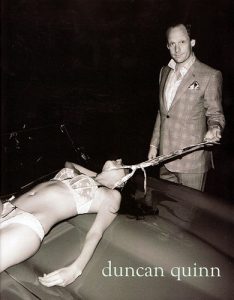
Duncan Quinn, is a well-known tailoring company in the USA. By looking at some of their ads, such as the one below, they sometimes tend to use women as a symbol to reinforce the effects their products have on the consumers. This specific ad, is openly showing a well-dressed middle-aged man, pulling a young lady in her lingerie across a bonnet of a car. I believe it is clear to state the obvious, this image shows many ethical issues which need to be tackled. This photograph is both sexists and completely inappropriate; not only could this be provoking the idea of rape and sexual slavery, but what looks like a smirk on the man’s face and looking at the camera confidently may give some the relief that it is fine to do such a thing. The woman is clearly not in control, showing that she probably cannot defend herself from this situation. The fact that she’s also in a public place would make it even more unlikely that she has made the choice to do such a thing. This imagery is completely exploiting the female figure, as if to represent that she’s a dog on a leash, or even worse; an object that can be dragged around and controlled by men. By just concentrating on the fact that she has his tie round her neck is discomforting, but when you notice that there’s a man holding on to it, just makes it a horrifying and a disturbing piece of imagery to look at.

Being in the 21st century, where most of us like to believe that gender inequality is being fought for and becoming scarcer in the developed world, this imagery contradicts all that we stand for. It takes me back to when women had no rights to even vote, back when they were housewives and slaves to their men.  There is no space for equality in this photograph, it evidently states who’s got the power and there’s no way round that.

Duncan Quinn, (2008), Advert [ONLINE]. Available at: https://www.trendhunter.com/trends/duncan-quinn-suit-ad-depicting-strangled-woman [Accessed 4 December 2017].

Duncan Quinn as a label is almost sparking an idea to the viewer, that if you wear their products you will be able to control and ‘hunt’ women. It is reinforcing the ‘male dominance’ and the idea of men being superior to women; that any women will surrender to man who wear their suits. Not only does this image shout out sexual aggression and violence, but is also emphasises the male stereotype, that men want women, sex and power and that that’s what all men are like.  The fact that there is a photographer behind this image and the fact that they are showing it is acceptable to some extent, makes me think about what this brand is really all about.

‘Women are put on display like pieces of commodities or ‘merchandise’.  One can say that it sells like peanuts. The more nudity or sexual reference depicted, the greater the sales generated in an exploitative and profit-driven media industry.’ (Le Mauricien: 2013) this quote, from the article: Women as sex objects, 2013, is showing the fact that in our society the more naked and perceived as sexy women being shown in adverts, the more likely it is for a company/brand to sell their products. But if it’s the women who reinforce the sales, it is either to attract men to want them, or to make other women have the desire be like them and have the ‘ideal’ body/face. So, what message are we sending to the younger generation? That its ok to have half naked women everywhere as if they were selling themselves and showing a desire to be wanted and controlled by men?

Advertisement such as this one should not be seen acceptable in this day and age. You shouldn’t have to show a sexual and harmful environment in order to sell your products and be successful as a whole.

  • Oonaizah Peerbux B, 15th March 2013, Le Mauricien: Women as sex objects, http://www.lemauricien.com/article/women-sex-objects


Task 7/8 Reflective Writting

Fashion as Communication, Malcolm Barnard

Chapter one of ‘Fashion as Communication (2002); Etymologies and definitions of fashion and clothing’ by Malcolm Barnard, explores the etymology of fashion and clothing and how this can be perceived in different manners. Bernard explains different opinions and explores how “things that people wear give shape and colour to social distinctions and inequalities, thereby legitimating and naturalising those social distinctions and inequalities”.  He explains that in our complex societies, we have the desire to behave and dress in a manner which is seen acceptable for the rest of our civilisation or social group, in a way in which “we want to look like our friends, but not to be clones” (Wilson 1992a:34).  As part of a western culture, we feel the need to follow certain fashion trends in order to secure a membership in a social and cultural group within our society. Fashion is not only used to state one’s persona, but also unites to form a social assemblage. However, in primitive societies it is argued that they ‘will have little if any fashion’ (Simmel 1971:302), as they have the lack of need to express their individuality and ‘because the need of new impressions is far less pressing’ (Simmel 1971:302).

Polhemus and Protector explore the political connections between fashion and ‘anti-fashion’, explaining their view on how the upper class and societies such as the monarchy and The British Empire present themselves in a traditional, fixed-costume manner designed to represent continuity; none, if little change at all (Polhemus and Protector 1978:12). An example used, is Queen Elizabeth II’s coronation gown, used as a symbol to express continuity. In contrast Dior’s ‘Tulip line’ dress is used; representing a latest collection, a new era, a fresh look and a transformation to a nation. Dior wanting to define discontinuity and change. This explaining how an individual or social group’s understanding of time and how they see themselves in the future, whether they want things to stay the same or change; fashion and anti-fashion can be used to show this. A social climber who would like to see a change in their position would use fashion to express this (Polhemus and Protector 1978:13). On the other hand, a land-owning, traditional aristocrat would like to see things to be consistent and not much modification (The Princess of Wales Fashion Handbook). This can then lead to FlĂŒgel’s view on how ‘fashion demands a certain kind of social organisation’ it needs to be one in which social classes are existent (FlĂŒgel 1930:140).

Throughout this chapter there has been a couple of points made which have stood out the most to me. One being; when Barnard discusses a constant mentioning in the The Guardians Woman’s Page section of The Guardian in 1992, which goes along the lines of stating that fashion is ‘irrelevant to serious- minded persons’ how it is trivial and ridiculous. Quite rightly Barnard disagrees with this statement and I agree when he states that ‘fashion seems to be necessary, given the social and economic organisation of most of the world’. Fashion is part of a society once a society; a capitalist, modern society exists fashion follows. The way ones presented is fashion, no matter how serious-minded you are. One final point that Barnard explores is how the word ‘design’ is comprehended in a European culture to be understood as less grand than ‘art’. Wilson has suggested that ‘fashion is the degraded or unacceptable face of art’ (Wilson 1990:209), the best way that fashion could be presented is to call it art. However, it is then explored further that any creation made by man is more likely to be seen as ‘art’, but made by women its more likely to be seen as ‘crafts’ or ‘design’, and that word ‘genius’ cannot be transferred from man to woman very easily, it simply doesn’t have the same effect (Old Mistress 1981). Who or what you are shouldn’t affect the level of your creations. Especially not your gender.

To conclude, I agree with the views put out by Barnard throughout this chapter. It has uncovered key issues about fashion and facilitated me to explore and understand factors to take into consideration when thinking about what is fashion and all the components which go alongside it. I have found interesting and amusing the different statements and opinions which have been studied during this chapter, allowing me to see different judgements and thoughts on the matter.

  • Barnard, M. (2002) Fashion as communication; 2nd edition, Routledge.
  • Wilson, E. (1985) Adorned in Dreams: Fashion and Modernity, London: Virago.
  • Pollock G and Parker R (9181) Old Mistress

Task 5/6 Visual Research

Matty Bovan: Fall 2017 Collection

the_black_horns_by_allagar-d99fw5kfd81ce478c326abac8f076d3a089251atumblr_mm11aacATk1rtjmi5o1_1280imagesimages-1

7da216aeef6e38d8b3b747a272924d09--title-page-martin-game-of-thrones

v1.bTsxMTE2NjkzODtqOzE3NTA3OzIwNDg7ODAwOzEyMDA

98be34913227ed111f3efe6663bfc6c8

Matty Bovans Fall Collection 2017

Blade Runner Film: 1982 Fantasy/Science Fiction Film

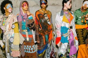
In Matty Bovan’s Fall collection of 2017 he has many inspirations and referencing which have been used in order to come up with a visually appealing and a successful knitwear collection. One of his inspirations is the film made in 1982; Blade Runner, staring Harrison Ford. This film is a science fiction/ fantasy film. It is about eliminating four escaped Replicants from colonies who have returned to earth. Being an alien based film, it has many interesting features to it which have rubbed off on Matty Bovan’s designs. I believe that in his collection he has been inspired by Blade Runner in many ways. One of which could be with the shapes and colour he has chosen to use throughout his collection. But not only this, in some of his designs, you can see how he has taken inspiration from the costumes used in the film. He has included in his garments many alien/ sci fi elements by using metallic thread and sequins.

The theme of the film; about eliminating replicants coul have rubbed off onto Bovan’s collection; as some of his garments are seen in a very similar style and with somewhat constant theme, yet they all differ in many ways, such as colour, shape, pattern and the techniques used. This could link to the topic of the film; about not being able to replicate humans, you will always be able to tell whether its a human or something else. So therefore, I believe the Matty Bovan could be suggesting and wanting to translate a message in his collection, by saying that he is unique and you can’t replicate his designs, as you will always be able to tell whether it is his design or someone else’s; i believe he is putting a stamp on all of his garments.

Bibliography:

  • Fall 2017 ready-to-weat, Fashion East: vogue.com
  • Brooke Bobb, B.B, February 18, 2017, How Rising London fashion Week Star Matty Bovan Crafts his Crazy Cool Clothes www.vogue.com/article/fashion-runway-london-fashion-week


Task 3/4: Academic Integrity

Task 3 & 4: Academic Integrity; Gaudi research

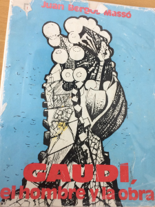
fkf Bergos Masso, J.B.M, 1974, GAUDI, El Hombre y la obra, General, Barcelona, Universidad Politecnica de Barcelona.

I have chosen to look at this book, as one of the artists I am researching and getting inspiration from, is Antoni Gaudi. Therefore I thought that this book, which provides information all about his life and his work would be very useful to look at. Gaudi, is one of the greatest Catalan architects, his work is a grand inspiration, the shapes and patterns throughout is of great detail and inevitable to pass by without a second glance.

mjb Collins, G.R.C, May 25 2010, Encyclopaedia Britannica, https://www.britannica.com/biography/Antoni-Gaudi, Accessed: 19th October 2017

This website, is very useful to find information of artists and other specific areas. I decided to use this website as it also provides information of Gaudi’s life, projects, past creations and allows you to assess yourself in order to make sure you have learnt and understood what you have just read. This way your knowledge will expand and be broadened with the articles provided.

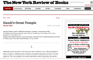
juedjf Filler, M.F, June 25 2015, The New Yorker review of Books, Gaudi’s Great Temple

This being a News Paper article, is showing a different resource which could be used to research Gaudi. I chose this article, as not only it gives information about Gaudi and his work, but it also informs you about what his work has brought to the citizens and to Barcelona, such as tourism, rise of the economy and other aspects which need to be considered when researching an artist and the impact their work has had.

Bibliography

  • Filler, M.F, June 25 2015, The New Yorker review of Books, Gaudi’s Great Temple
  • Collins, G.R.C, May 25 2010, Encyclopaedia Britannica, https://www.britannica.com/biography/Antoni-Gaudi, Accessed: 19th October 2017
  • Bergos Masso, J.B.M, 1974, GAUDI, El Hombre y la obra, General, Barcelona, Universidad Politecnica de Barcelona.

Task 1/2

Task 1&2: Latkowska-Zychska, Creative exploration of Fibre & Fabric

Book: Surface Design Journal Volume 41. No 2. Making our mark: SDA at 40, Summer 2017. Creative exploration of fibre and fabric.

untitled

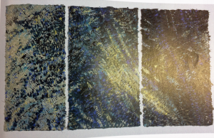
Latkowska-Zychska. Good morning-good night 2015, plant fibres, handmade paper 67″x113″. Photo by: Piotr Mastalerz.

Leading a great interest in textile and surface design, I started looking up books which would relate to this affection. Having found this book, I then looked further at its content and aspects of it which made it more appealing to me. I found an artist within the book, which for several years was working in the style of ‘Gobelin Tapestry’. The photo above represents one of her pieces of work. Ewa Latkowska-Zychska works with handmade paper in order to create a variety of textures and intricate surfaces. I admire her use of material and the way in which she can transform a surface completely having a chosen theme in mind.

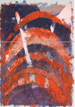
Agra Art: http://www.agraart.pl/nowe/artists, Rozowo-Czerwony, 2013, Ewa Latkowska-Zychska, 51″x34″

jh

Having looked at a book which contained Ewa Latkowska-Zychska’s work. I then went and looked at some websites which would allowed me to find some exhibition pieces of Latkowska-Zychska’s work. This website does not only advertise and exhibit artists and designers work, but you can also see what’s up for sale and auction. Alongside with this artist many more can be found on this website and you can see and explore the different styles, techniques found in each piece, it also contains information of each piece and how it was made.

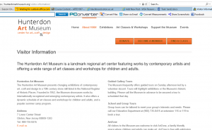
Hunterdon Art Museum-Tapestry, New Jersey. https://hunterdonartmuseum.org/visitor-information.

kkjk

By carrying out some further research online, I found a Museum in New Jersey in which Ewa Latkowska-Ztchska’s work had been shown. In the Tapestry section of this Museum, I found this information. The Hunterdon Art Museum, centre for art &craft design showcases a variety of work from a range of contemporary artists.

I found this task especially useful as a whole, it allowed me to expand my research and resources. It made me see how I can link and develop my findings to a further level, which will not only allow me to learn more about an artist, exhibition, piece of work, but also develop my projects and learn more about my chosen themes. I now feel more confident when doing research and broadening my resources.

Just by starting out at the library and choosing a relevant book to my topic allowed me to discover a new designer and her work. Which then made me intrigued into finding out more about that designer and to see where her work can be presented and experienced in person. I will make sure I use this process for my future projects in order to start off with a good body of research by using a variety of resources, but also by looking at different things. You can look at their life, their exhibitions, previous work, items for sale.

Bibliography:

Book: Surface Design Journal Volume 41. No 2. Making our mark: SDA at 40, Summer 2017.

Creative exploration of fibre and fabric. Agra Art: http://www.agraart.pl/nowe/artists

Hunterdon Art Museum-Tapestry, New Jersey. https://hunterdonartmuseum.org/visitor-information