Author Archives: Emily Coates

500 Word Summary

Within both my practise based and essay based research I have found that the work of Christoph Niemann has helped me considerably for multiple reasons. A large amount of inspiration comes from how he develops an idea from simple graphic drawings into interesting and charismatic designs, his approach to observing and drawing inspiration from the murmur and constant shuffle of people watching and taking elements and designs that come forward from this process have helped me to simplify my ideas as well as relax my approach so that character can find its way into a brief to provide a more colourful vantage point than before.

So far, I have found this to be my most enjoyable learning experience due to the approach of the tutors and the briefs, my experience of each pathway within Graphic Arts has been enlightening and exciting as to the new possibilities alongside the ability to combine each discipline to create future projects. I find that even within workshops and small adventures into private research that the short documentary episode on Christoph Niemann comes to mind, whether it as to how I can approach a new topic, brief or attitude within Graphic Arts or if it is in regard to new practise based skills that be transferred from each discipline and reapplied to create new designs and more progressive responses.

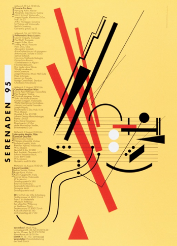
My approach to research is unlike my approach to practise based challenges, within research I try to absorb as much information on a topic whether it is relevant to the current task presented to me. . Out of the topics that have been taught to us I found that the strongest influence on my work came from looking into the counter culture movement and looking at post modernism as it is still very relevant and visible in design today.

Being able to look into images and work that are relevant to my interests is especially new as it enables me to discover different artists and how they work independently alongside how they work within their correlating movements or time periods, being encouraged to look into areas and movements of art that I may not have interacted with is particularly useful as it enables me to discover styles and issues that are discussed as well as celebrated that can potentially aid my work and encourage my practise based research to be broader and more eclectic.

When combining my approach to practise and essay based work alongside my inspiration from the works of Christoph Niemann I have discovered new movements and styles to incorporate into my work in a way that collaborates multiple styles so that I can completely understand my own individual style. Theory and practise can sometimes provide conflicting ideas that affect how a project moves forward, having the background research completed for a brief can better your approach to a final outcome, practise can consistently and continuously be improved whereas an approach to research stays more or less the same if the person completing research doesn’t see the benefit in their final outcome.

Week 8 – Publish or Perish!


Even though the following quote is spoken about designers who work with digital graphics, the photograph pictured is a key example of how artists communicate feeling as well as provoke feeling within their audiences, “The designer’s mission was simple: to create the simplest, most harmonious, most neutral form, thereby enabling communication to the widest possible audience.” (Helfand,J. 2009). The colours and effects used within this piece allow for multiple feelings of mystery, nostalgia and curiosity to be expressed as well as encouraging the viewer to reflect on what the subject or photographer may be trying to communicate through the feeling captured.

This published image combines strong design and story, the above poster is part of a fashion shoot based off of Stanley Kubrick’s adaptation of the Clockwork Orange, this quote summarises how two sides of design can exist simultaneously without overpowering each other, “Design that strives for neutrality, that seeks to extinguish its relationship to the human condition, risks removing itself from the very nucleus of its purpose, which is, yes, to inform and educate — but also, to enchant.” (Helfand,J. 2009).

Multiple mediums from design are used to create the ‘Call for entries’ megaphone, the combination of collage, print and digital typography allow for a more dynamic and interesting composition working in a way that is similar to that described in the following quote, “They used a variety of resources and approaches to make sure their graphics translated to their audience.”(Anon, 2013).

I personally think that making sure that the piece is clear to its selected audience is important and a fundamental within Graphic Design as visual art can communicate many things to its audience that other mediums might not be able to communicate to the same standard.


References

Helfand,J. (2009) Can Graphic Design Make You Cry? Available from:  https://designobserver.com/feature/can-graphic-design-make-you-cry/9737 [Accessed 2 December 2017]

Anonymous. (2013) How to tell a story using Graphic Design. Available from: http://www.harrington.edu/student-life/blog/july-2013/graphic-design-how-to-tell-a-story-using-graphics [Accessed 2 December 2017]

Images:

Ingledew,J. (2011) The A-Z of Visual Ideas. London: Laurence King Publishing.

Pages (Fraser Hudson) 59, (David Abrahams) 122, (Thea Swayne) 137.


Week 6 – Post Modernism

Show – Editorial Spread

Focusing on the image labelled ‘3’, I found that this work showed that a magazine spread or in fact any type of organisation of information can; as an individual presentation, be Graphic Design and Graphic Art in its most contemporary form as well as showing how post-modernism is being embraced in modern Graphic Design. This particular piece features the work of multiple designers embracing the abnormal within design and in some pages of the editorial (from which the image is found) the almost illegibility of the typography shows how communicative Graphic Design can be.

Reveal – Wet Magazine Cover

The secondary image combines media, in this instance it provides an almost psychedelic affect to be integrated with the aesthetic of the brand “WET”. This design allows for photography, illustration and graphic design to create a complete scene that reveals something to each viewer; I see the image as a metropolis and as a shrine to a celebrity, this is an effect I particularly enjoy as it encourages a private moment between the image and each viewer in an interaction summarised here “…our connectedness as humans to one another in the globalizing world and with fictional characters as representations of ourselves.”(Gibbons, A. 2017).

Deconstruct – Music Poster

The first image showing a concert poster not only allows for eye catching design through simplistic shapes and colour pairings from deconstruction, but also design that encourages you to think as is emphasised here “The postmodern denial of this viewpoint—which follows from the rejection of an objective natural reality—is sometimes expressed by saying that there is no such thing as Truth. “(Duigan,B. 2014). After dabbling in trying to learn musical instruments and how to read sheet music as most have, I can understand that this piece is a deconstruction of sheet music and instruments. Using the strong shapes and repetitive patterns the designer has been able to not only communicate the purpose of the poster but also entice the target audience of concert attendees to look closer.


References

Duigan,B. (2014) Postmodernism and Modern Philosophy. Available from: https://www.britannica.com/topic/postmodernism-philosophy [Accessed 3 December 2017]

Gibbons,A.(2017) Postmodernism is dead, Now What? Available from: https://www.the-tls.co.uk/articles/public/postmodernism-dead-comes-next/ [Accessed 3 December 2017}


Images:

Anonymous.(2017) Early Swiss Postmodern Design. Available from: http://www.historygraphicdesign.com/the-age-of-information/postmodern-design/765-early-swiss-postmodern-design [Accessed 2 December 2017]

Poynor,R. (2011) Did We Ever Stop Being Postmodern? Available from: https://designobserver.com/feature/did-we-ever-stop-being-postmodern/30798 [Accessed 2 December 2017]

Nariman-qizi,S. (2016) Postmodern Movement in Design. Available from:         https://www.behance.net/gallery/32508169/Postmodern-movement-in-design-Editorial [Accessed 2 December 2017]

Week 5 – Counter Culture

This image represents spirit through the smaller details of the image where the artists life is displayed, not only as an embellishment to the focal image which is communicating what the artist feels is the death of his work but also as a timeline for the artists life. The image and overall message wouldn’t have been communicated as well if the style of the 1960’s and 1970’s wasn’t as psychedelic and visually vocal. Artists often wish to affect the ‘now’ within counter culture,“They stress so much happened to them by chance. There were no contracts, no career plans. But the era’s pioneering and radical graphic design influenced everyone who came afterwards – punk was only a few years away with its DIY graphics.“(Hoggard,L 2016).

Within this image, the contrast between the type and the visual art is vivid and noticeable for both symbolic and design reasons. The bullet facing the barrel of the gun suggests the damage done from war is more significant than who claims victory, a very relevant part of counter culturism is how it came to be “The counter cultural movement started on the background of Vietnam War. It was a post-war generation as a result of baby boom. The young people were frustrated due to racism, gender issues, consumerism, and the conservative nature of the society in general.“(Anon 2016). This is supported by the almost illegible white ‘victory’ on the yellow background. The frustration and exhaustion that this image displays is relevant to my world views regarding political topics, however I wouldn’t be as eloquent as this image.

As with counter culture work, this piece shows how distorted some world views become because of the repercussions of war and politics that affect how protest is voiced through art. Marginalia 1 is a collection of text, which was common in counter culture “There were feminine writers such as Gloria Steinem and Slyvia Plath who fought for the equality of women. In the long run, it led to the rise of political activism on the part of women. One such example was the formation of National organization for Women (NOW). “(Anon 2016), Marginalia 1 was influential to the Brazilian counter culture movement (Tropicalism), what I enjoy about this cover for counter culture text is how the visual can voice a message just as clearly.


References:

Anonymous.(2016) The Counterculture Movement and its Effects. Available from: https://brainmass.com/history/cold-war/the-counter-culture-movement-and-its-effects-285642 [Accessed 5 December 2017]

Hoggard,L. (2016) The revolutionary artists of the 60’s colourful counterculture. Available from: https://www.theguardian.com/artanddesign/2016/sep/04/revolutionary-artists-60s-counterculture-v-and-a-you-say-you-want-a-revolution [Accessed 5 December 2017]

Images:

Novin,G. (2016) A History of Graphic Design: Chapter 33. Available from: http://guity-novin.blogspot.co.uk/2010/06/chapter-33-pop-art.html [Accessed 2 December 2017]

Anonymous. (2017) Art and Design. Available from: https://www.manystuff.org/?p=20047#.WiUgmUpl_IU [Accessed 2 December 2017]

RCS Wk 3

 “Technology is the Mortal Enemy of Art” – Alexander Rodchenko

“Johannes Gutenberg invented the printing press with replaceable/moveable wooden or metal letters in 1436 (completed by 1440). This method of printing can be credited not only for a revolution in the production of books but also for fostering rapid development in the sciences, arts, and religion through the transmission of texts.” (Bellis. 2017). Art and technology have always been linked one encouraging the other and allowing for more forms of expression, creativity and imagination to come forward and inspire new artists and art styles.

From prehistoric paintings to illustrations in educational textbooks, art has been not only a form of expression but a way to document and preserve moments in history as well as information that can improve society “…everything from woodblock printing to the camera obscura, from portable tubes of oil paint to photographic film, and from silkscreens to personal computers have led to new forms of art since.” (Anon. 2017).

Technology in some respects has harmed the progression of some disciplines within art such as fine art, where hyper realism is no longer the peak of the field and now more interactive and questioning styles are coming forward and challenging how technology can aid or hinder art.

In other respects, art has been launched by technology so that it may be enjoyed and consumed by the masses from printing presses to the more modern graphic styles that adorn every magazine, billboard and some fashion aesthetics. “I do see a challenge for artists to be simultaneously more open to new technologies that lead to novel forms of expression, and also staying truly creative and imaginative.” (Gever. 2012) by having such an accessible platform art has now been encouraged in most and therefore allowed for more creators and imaginings to be shared and inspired rather than only being accessible to the elite and upper classes.

Art and technology have consistently co-existed­­, have done, will do and will continue to whether or not it is decided or defined as an enemy of art or as the strongest encouragement as design develops throughout time.

References

Anonymous. (2016) Arts Council England [online] Available from: http://www.artscouncil.org.uk/art-and-technology-what-does-it-mean-visual-culture [Accessed 22 October 2017]

Anonymous. (2017) Collusion: News [online] Available from: http://www.collusion.org.uk/News/Post/467/Art-and-Technology-an-artist-s-journey [Accessed 21 October 2017]

Bellis, M. (2017) Johannes Gutenberg and the Printing Press [online] Available from: https://www.thoughtco.com/johannes-gutenberg-and-the-printing-press-1991865 [Accessed: 21 October 2017]

Davies, J. (2016) Nesta: Blogs [online] Available from:https://www.nesta.org.uk/blog/state-art-analysing-where-art-meets-technology-using-social-network-data [Accessed: 22 October 2017]

Gever,E. (2012) BBC News: Entertainment and Art. [online] Available from: http://www.bbc.co.uk/news/entertainment-arts-19576763 [Accessed 21 October 2017]

What Happens When Art, Technology and Nature Meet Head-On (2015) Video. Banff Centre for Arts and Creativity. Available from: https://www.youtube.com/watch?v=Si4Vd9fnkRo [Accessed 21 October 2017]


RCS Wk 4

Authenticity

The ability to be truly authentic is perceived rather than presented, as almost all actions are subjective it is difficult to dictate what something is or isn’t and authenticity is no stranger to this way of thinking “Authenticity” picks up meanings that range from originality to legitimacy, from a sense of generative or instigating force to a quality of genuineness.” (Sherry 2007).

Authenticity is a paradox, as work made by someone is their own authentic self-presented whether that’s a conscious decision or purely sub-conscious both actions and pieces are authentic to the creator. In today’s world of social media and constant pressure to be original and authentic the irony is held in how similar styles have become for those striving for ‘true authenticity’ “… we need to interpret aesthetic processes with the same lens because we infer similar social anxieties, and economic pressures and political needs are brought to bear on these processes in any period.” (Leach 2009), a better pursuit would be to be influential or honest when presenting work, in these confident and risky gestures can authenticity in a new mould be found.

Modernism and contemporary practise argue on multiple levels and can both harmonise and distract each other, however it is debatable as to how post-modernism has developed so that it can work to develop contemporary practise so that the more traditional ideals behind modernism can be brought forward in a more contemporary manner.


References

Sherry, V. (2007) Project MUSE [online] Available from: https://muse.jhu.edu/article/222318 [Accessed: 28 October 2017]


Leach,R. (2009) Consuming Traditions [online] Available from: https://www.timeshighereducation.com/books/consuming-traditions-modernity-modernism-and-the-commodified-authentic/407859.article\ [Accessed: 27 October 2017}

RCS Wk 2

Dan Mountford.                                                       Marco Goran Romano

The first image, produced by Marco Goran Romano, is a piece that I see as relevant to my own style and applied visuals when working with graphic techniques and mediums. To me the image is showing how the current generations are over run with worries surrounding energy and making sure that the planet can flourish without having all resources depleted; the use of yellow within this piece allows for a somewhat poisoned effect, I chose this image as it has such a clean and clear visual that communicates a narrative.

The second image that I selected, produced by Dan Mountford, shows a more photography orientated technique however manages to communicate a similar message to Romano’s, to me this piece communicates the relationship people can have with a place or a memory in a certain location. Even though I wouldn’t personally work with photography as a medium I appreciate how it can heighten certain series or images to make the narrative and atmosphere clearer to the viewer in comparison to other mediums.

Its always insightful to view and research a variety of mediums and practitioners who often use them, being able to see the comparisons and contrasts between pieces can influence my own work for the better and help me gain understanding on the infinite styles, techniques and visuals that make up the graphic design world.


Mountford, D. (2012) Flickr.[online] Available from: https://www.flickr.com/photos/danmountford/6761416497/ [Accessed 14 October 2017]

Anonymous. (2015) Partfaliaz. [online] Available from: http://www.partfaliaz.com/illustrators/minimalist-vector-illustration-by-goran-factory/ [Accessed 14 October 2017]

Terminal Bar – 8/10/17

During the lecture on the 5/10 we watched a short film called ‘Terminal Bar’ by Stefan Nadelman (2002), the film centred around a small bar in New York that had a ‘rough’ aesthetic to match its customers. The film also focused on a series of portraits that had been photographed by someone who worked behind the bar and therefore shows two forms of documentation through media between generations.

The processes involved in creating a short film like this would be centred around the photographs taken and displaying them in a way that paired with the filmed narrative provided by the photographer. Another element to consider would be the transitions and being able to use a quality programme so that it didn’t come across as an amateur film, the way in which Nadelman has presented the photo’s in the final cut works in a way that uses the photographs to create moving sequences that feel extremely  close to that of a panning shot and also manages to create three-dimensional sets through the images.

Another area to consider would be the chronological presentation of groups of people who would have visited at the same time as each other, and whether or not there would be a fluidity from the beginning of the documented images to how the bar is now or if the focus would be on how the bar was when the images were taken. The difference in directions and choices that Stefan Nadelman took allowed for the documentary to have a lighter and more fluid feel than if it was a point blank presentation of the portraits and scenes photographed.