Author Archives: Ciara Hinchey

Task 12


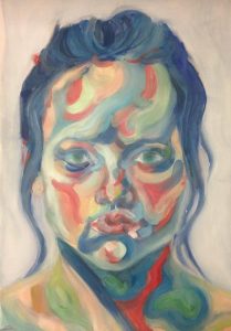
I made this portrait for the contemporary project when I was exploring emotions and connecting them to colours. Reflecting on this piece I was tame in terms of scale as I only went to A3 but I would like to scale it up to a portrait 3 meters high. As my practice is beginning to involve abstracted shapes I would take the vague areas of colour in this portrait and make them more definitive as they scaled up. To extend it further I might abandon the flat plane and suspend the shapes in a mobile structure to let them move, overlap, and twirl reflecting changes in mindset and mood. Also as it would be large and suspended apart from each other people would be able to walk within it and interact, maybe gravitating to colours and shapes they are emotionally attracted to. Therefore, it wouldn’t just be a piece presenting my ever changing emotions but showing other peoples as well. If the shapes were made of translucent colours it would add another element to the piece because the different coloured shapes would overlap creating new colours which would fit better because there would be multiple colour combinations to convey different moods.

Task 11


Natural

Ecological

Emotional

Colour orientated

Detached

Circles

Patterns

Imperfection

Symmetry


My practice has yet to be developed into a definite set of ideas and methods, rather I have come to university with experience in oil painting and printing, but I want to exploit the resources here and gain skills in sculpture, new media and printing before I refine into a practice. I have a keen interest in the natural world, exploring natural objects, patterns and phenomenons especially through printing processes. My intention is to discuss the relationships between humans and nature and how it can be improved.

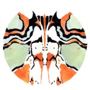
The image I’ve chosen is a recent piece that represents my current interests in the natural world and how humans perceive it. It is a circular print of abstracted markings on a butterfly. The symmetry was particularly important because I am inspired by how organisms have evolved to be more symmetrical to increase attractiveness for reproduction. Although I made each stencil symmetrical when they printed there would be mistakes making the print imperfect. This felt right because in nature there isn’t 100% symmetry no matter how much humans genetically modify organisms. The words I chose are words I use to describe my work and support the image I’ve used. 

Task 10

Due to the variety of the tasks I have been exposed to different ways of talking about art and the vocabulary of the subject. The tasks most useful for this aspect were tasks 3, 5 and 7 as these were the ones asking me to review pieces or compare texts and therefore read how others spoke about art. The task I found most engaging was task 3 where I researched the context of Barkley L. Hendricks and his piece Tyrone [Tyrone Smith], 1976. By reading articles written on this I was inspired to analyse each feature of the painting and understand the meanings behind the symbols and how the painting was groundbreaking for the context of the time in America. Tasks where I had to reflect on my own work or my practice made me realise that my practice is not finalised. I have concepts and mediums that I’m interested in like nature and printing, but my style and studio practice needs development. The hardest was task 7, I struggled with the art terminology and had to reread both texts and make notes before I fully comprehended them and was able to summarise and compare. I’m now aware that I need to read  more to become more fluent when talking about art pieces and movements.

Task 9

Jason deCaires Taylor is a British contemporary sculptor using his art to draw awareness to environmental issues. He casts statues from pH neutral materials and submerges them underwater in places like Lanzarote. The concept is that these sculptures increase the surface area that coral can grow on. In addition, he hopes that these art installations will provide an attraction for tourists to distract them from further damaging the existing reefs. His pieces provide a gateway encouraging the audience to explore the ocean which hopefully will inspire them to protect it. As well as drawing attention to environmental issues, he has recently done a piece called “The Raft of Lampedusa” showing people crammed into a boat referencing the Syrian refugees who have died trying to escape the conflict in Syria. This piece is not a tribute to those who died but a statement of the responsibility we have for our global community.
A place that is a tourist attraction is also the place where so many died trying to reach a better life. The contrast of joy and grief in the same location emphasises the lack of balance and the need for Taylor’s notion of global responsibility.

Bibliography

SEGAL,C. (2016) Europe’s first underwater museum offers a stark reminder of the refugee crisis. PBS NewsHour. Available from: https://www.pbs.org/newshour/arts/europes-first-underwater-museum-offers-a-stark-reminder-of-the-refugee-crisis [Accessed 1 December 2017]


Task 8

Appropriation can involve taking another artist’s work and assimilating it into your own work or changing the context to give it a new perspective. This reminded me of a section of meme culture called medieval reactions where renaissance paintings have been given captions to change the piece’s context. This type of meme often juxtaposes the medieval characters with modern place settings, like a nightclub. For this task I photographed  a sketch from Picasso and re-captioned it. I altered his picture twice by cropping it and giving it a caption which changed the context, therefore I’m not presenting Picasso’s sketch as my own even though it was clearly his drawing. The original context for this sketch is that it was a preparatory sketch for the piece, Guernica, representing the grief of the Guernica bombing during the Spanish Civil War. By changing the tone from grief, to light hearted drama, I don’t seek to undermine the seriousness of the Spanish Civil War, only to highlight how strange the sketch looks out of context. Many of these memes contain features to show it’s social media influence, like having captions in the format of twitter or snapchat. To make it clear that it is not my sketch I took the photo on snapchat and wrote the dialogue  with the characteristic grey bar and white text of the app. 

Bibliography

FREEMAN, J. (1994) Picasso and the weeping women. Los Angeles, Calif: Rizzoli.

Task 7

Steinberg, L. From other Criteria. Pg. 948-953

Leo Steinberg in the 1970s observes how a concept, that works represent a worldspace and operates on a vertical plane to correspond with a standing human posture, survived many art movements like abstract expressionism and Cubism since the Renaissance. A change was seen with Robert Rauchenberg and Dubuffet in the 1950s. Steinberg wrote that “we can still hang their pictures – just as we tack up maps and architectural plans, or nail a horseshoe to the wall for good luck. Yet these pictures no longer simulate vertical fields, but opaque flatbed horizontals.” Steinberg (1972, p.949). The horizontal represents table tops , charts, bulletin boards where information is stored and received therefore, these works are about thought processes rather than depicting something the artists have seen.

Serra, R. From the Yale Lecture. Pg. 1124-1127

Serra compares his site specific sculptures in the 1970s and 80s to artists of the Modern era like Picasso, Gonzalez, Smith, Calder. He criticises their tendency to make pictorial marks with the material and their lack of understanding of how steel needed to be engineered and constructed. Therefore, Serra relied on steam mills and workers from the industrial sector to build his site specific works. Conceptually Serra would have the site and piece operating on two different languages with the piece criticising the site. This is different to Modernist works which were generally autonomous with the environment. However, he recognises the contextual issues of site specific works as those built in the context of religious, governmental, corporate or educational institutions can be seen as validating the values of these institutes.

Both texts convey how art movements are continuously moving forward, however Serra seems more critical about the modernist artists who came before him. This could be because he is making direct comparisons with his own work so the comparison is more personal and he may want to justify his choices by explaining what those who came before him were lacking. On the other hand Steinberg is detached from the situation as he is talking about other artist’s pieces so he has a more objective view of how artists respond and oppose the art that precedes them in order to move forward. 

Bibliography

HARRISON, C. and WOOD, P. (1992) ART IN THEORY 1900-1990 An Anthology of Changing Ideas: Blackwell Publishers


Task 6

My proposed practice is an evolved form of land art exploring the forces of erosion. Land artists like Andy Goldsworthy investigate the ever changing natural world, but I want to examine how erosion is constantly altering the landscape by rolling out clay over a coastal rock. By pressing the clay into the rock it would make a relief of the holes and marks that the waves have made. In time the waves will batter the clay, showing the strength of erosion. I’m confident the clay would show the forces of the waves quickly, because it’s a lot softer than most coastal rocks and I wouldn’t run the risks of the material drying out as it would be getting soaked by the sea. During its time on the rock it may also record footprints from crabs seagulls and people clambering over it to go rock pooling which would capture another method of erosion and give the clay piece a wider variety of marks. Once its reached a decent level of erosion the clay would have to be peeled off carefully then dried and fired. This would make this practice different to land art, because where products of land art are allowed to disintegrate, the products of my practice would preserve the effects of erosion.

Task 5

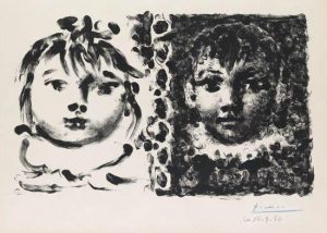
Whilst visiting the exhibition ‘Picasso on paper’ at the Compton Verney I saw a lithograph ‘Paloma et Claude’ that depicts two of his children by Françoise Gilot. The lithograph is unusual as he applied the ink using his fingertips and diluted it with saliva. The piece is divided into two (one half for each child), which could communicate how his attention was divided and that he struggled to focus on either one. Claude’s half is much more built up than Paloma’s and given more of the finger marks, possibly indicating that at this time he was thinking more about Claude. The fact that the marks are made of Picasso’s fingerprints makes the piece personal and shows an acknowledgement that these are his children and that his DNA that is shown in his fingerprint is also visible in his children. If this is the case then Paloma having fewer marks could be Picasso communicating that she takes more after her mother and that he can see more of himself in Claude.


Task 4

In November 2016 I visited Compton Verney and their exhibition on Picasso’s prints – Picasso on paper. The exhibition contained over 70 prints that Picasso produced between the 1920s and 1960s, accompanied by some of his written poetry. The exhibition showed a timeline of his experiences printing. The interesting aspect of this timeline is that every time he chose to learn a new printing technique it would coincide with a new love interest. By learning from master printmakers he became proficient in etching, lithography, aquatint and lino printing, however he often broken the rules to gain new successful prints. This is especially the case with a reductive lino print  where he presented the plate as a piece of art. The exhibition space took a chronological flow, starting at his earlier prints and observing how his techniques and style developed as you walked through the exhibition. The prints shown depicted a variety of subjects- his love interests, his children and many scenes of bullfighting. In a series of prints shown of love Jacqueline, each print included less visual information and became more abstract until only the basics of her features remained; her curly hair, large eyes, choker and a mole.


Barkley L. Hendricks

Misc. Tyrone [Tyrone Smith], 1976

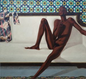
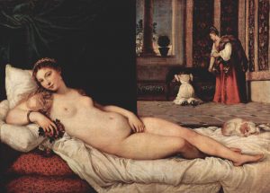
The painting depicts the slender black male reclining on a white sofa holding a pipe. The backdrop is a brightly coloured patterned wall and a floral rug lies on the floor. His expression shows a casual confidence with his head tilted backward and the positioning of the pipe in his hand. The body language is open with legs partially spread apart and an outstretched arm, making the sexuality of the painting more direct than that of a classical nude like Titan Venus of Urbino, 1538 where the model had crossed legs and placed a hand over her vagina, possibly to indicate shyness and a virgin status which may have been more desirable to the men who viewed her. Although the subject’s homosexuality was not discussed during the sitting, his sexuality confronts the heterosexual male gaze that painted nudes typically served. Interestingly the painting contains a woman on the shirt hung on the sofa. The fact that she is dressed and featured on an item of clothing confronts the need to consistently show a woman nude to objectify her body. In addition, as the woman is a repeated pattern, the artist could be communicating how often the Western culture has painted women and that he is consciously painting a black male to challenge this. This was painted in 1976 following the civil rights era and during the 1970s activism, so a painting of a black male nude, challenges the racial and gender norms of this time. There is a visible tilt between the tiles on the wall and the sofa, possibly showing the artist’s intention to break away from parallels to classical nudes.

Titian

Venus of Urbino, 1538 [oil on canvas]


Bibliography

ARABINDAN-KESSON, A. (2017) The Painting.In Focus: Family Jules: NNN (No Naked Niggahs) 1974 by Barkley L. Hendricks, Tate Research Publication. Availiable from http://www.tate.org.uk/research/publications/in-focus/family-jules/the-painting [Accessed 22 October 2017]