Author Archives: Abigail Foster

Research and Communication Skills: Reflection and Review

Over the last semester I was tasked to produce essays on topics covered in lectures. With a 500 word limit per essay, I was terrified from the get-go, however the experience, not without its difficulties, has been enlightening in regards to my understanding as a game designer.  

The first issue I had was that I would tend to choose the question pairs that I had the fullest understanding of without much research involved. Retrospectively I would have like to push myself a little more instead of staying in my comfort zone – it might have resulted in really interesting research that brought to light subjects I hadn’t considered before. That said, as the semester progressed, the quality of my research increased and deepened as I became more enthusiastic about what I was doing.  

My process from lecture to end product was as such: I would take notes during the lectures (despite the slides being readily available to me I find I absorb more by re-processing what’s being discussed, and it gives me the ability to note down topics that I found particularly interesting), and then take to the internet when it came to doing the research. Admittedly, I never once used the library facilities, which is something I would really like to do in the future as I think it could unearth some unusual commentary on different subjects. By the last few essays, however, I was looking less at Wikipedia pages and more at scholarly articles and credible newspaper reports, which helped to further deepen my understanding through absorbing other people’s opinions.  

Two subjects that took my particular interest, which are close-enough related that I’ll discuss them together, were HCI and AI. Whilst other topics such as the history of indie gaming really helped me to appreciate the context in which I’m currently playing and designing games, HCI and AI unpacked the actual logistics of the games I’ve played in the past – purely for fun – and helped me consider them in a more critical, intelligent way. Learning about HCI specifically helped me to appreciate what it is that makes a game “flow” for me, after all, “a well-designed interface makes the video game experience more fun” (Fox, 2005). My hope is that having a deeper understanding of these things will increase my integrity as a designer, having the ideas and opinions of other people in the industry under my belt.  

The referencing of other’s work, however, was a bit of a challenge for me. I’m wildly opinionated, and while I am perfectly capable of crediting others for their contribution to those opinions, it’s not a habit for me, so this project was challenging in the way that it required me to back up my ideas with specific examples from others. If I were to do it again, I would include references from the start to achieve a more airtight argument. 

I enjoyed this project. I think it stretched and challenged me, and while there are areas I could improve on I’m proud of the work I’ve produced and all the research that went along with it. 


Reference list: 

Fox, B. (2005) Game Interface Design. Thomson Course Technology PTR. 


Helpful links: 

https://pdfs.semanticscholar.org/4869/a9cc94292332faee0b9e741bc93419d155a5.pdf 

The Problem With Copyright

What do you see as the positives and negatives around copyright? Is it possible to make anything new?  

My initial, knee-jerk reaction when considering copyright is towards the negative. The origin of copyright itself was an attempt by the authorities in 1662 which “sought to control the publication of books by granting printers a near monopoly on publishing” (Eshgh, 2015). Not exactly an encouraging start. Since then there has been a continual tug of war performed on copyright laws dragging it across a spectrum which favours the every-day creator one one end and media giants on the other.  

The Statute of Anne, 1710

Before I jump into this, it’s worth clarifying that I am on the side of the every-day creator, meaning my perception of the positives and negatives of copyright will be skewed by personal biased. Nonetheless, let’s take a look at the different aspects of copyright and their relative worth.  

Copyright, at its best, should allow control of the creator over their work until no longer necessary, at which point the work is given to the public domain. The Statute of Anne, implemented in 1710, “prevented a monopoly on the part of the booksellers and created a “public domain” for literature” (Eshgh, 2015) by allowing a fixed term of copyright protection with the ability to renew if the creator was still living once it expired. It meant that the creator could have autonomy over their work for a set time, but meant that other creators down the line wouldn’t be punished for referencing or taking inspiration from that work.  

The next big change I’d like to focus on is almost three centuries down the line, in 1998, when a 56-75 year term put companies like Disney at risk of having their 1920’s creations fall into the public domain. The argument at the time was that by further extending the copyright protection term, it encouraged other creators to make new things. However, as expressed by Senator Hank Brown, “The real incentive here is for corporate owners that bought copyrights to lobby Congress for another 20 years of revenue—not for creators who will be long dead once this term extension takes hold.” However, the people who opposed this proposal of extending the term were in the minority. The proposal for an extension was passed, and “life plus 70” (Lee, 2013) became the new copyright term. 

Disney’s Steamboat Willie, copyright due to expire 2024

So it feels like copyright laws were made for sour purposes, and have been reclaimed by those with sour purposes over the years, despite the public occasionally trying to claw back restrictions on other people’s work, and sample and play with ideas from those that came before them. That said, to claim that this inhibits creators for making anything is absurd, as is the proposition that making something new is impossible. Whilst we are all creatures moulded by our experiences, our experiences themselves are unique, and by drawing from them and not necessarily the work of people around you, I do believe it’s still possible to make something new and individual, if only you have the courage to try. 


Reference list: 

Eshgh, A. (2015) Copyright Timeline: A History of Copyright in the United States, Association of Research Libraries 

Sen. Brown, H. (1996) Senate Judiciary Report on S.483, July 10, 1996 

Lee, T.B. (2013) 15 years ago, Congress kept Mickey Mouse out of the public domain. Will they do it again? The Washington Post 


Helpful links: 

http://www.trutv.com/shows/adam-ruins-everything/videos/how-mickey-mouse-destroyed-the-public-domain.html 

https://www.washingtonpost.com/news/the-switch/wp/2013/10/25/15-years-ago-congress-kept-mickey-mouse-out-of-the-public-domain-will-they-do-it-again/?utm_term=.53755560ef8b 

http://homepages.law.asu.edu/~dkarjala/OpposingCopyrightExtension/legmats/s483rep104-315.html#Brown 

http://www.arl.org/focus-areas/copyright-ip/2486-copyright-timeline#.WigVerGnyhA 


Emotional AI in Gaming

Behavioural modelling is an important part of NPC development for games. Should emotive modelling be part of that development?
Consider your favourite video game. If it contains AI controlled agents how individualistic are they and their behaviours, and how might you set about improving them? 

The purpose of AI, by definition, is creating technology that can “to perform tasks normally requiring human intelligence” (Oxford Dictionaries, 2017). So when games designers are creating non-player characters (NPCs) the focus is on the emulation of human behaviour. At this point, game designers are getting pretty good at it, NPCs can move, talk, and over-all behave like human beings on a relatively superficial level. But in order to truly capture the human condition, I believe it should be vital to include emotive modelling in the development process, as all decisions we make are based on varying degrees of emotion. If we take into account that “emotions are an essential part of the believability of embodied characters that interact with humans” (Bartneck, 2017), if a designers goal is to evoke an emotional response towards their NPC, then emotion is vital to the equation.

Take The Last of Us, for example (again, I know). With a game that relies so strongly on a character driven plot, its essential to the experience that the NPCs are tangible, believable characters. In the first half of the game, focusing on NPCs Ellie and Tess, both are standout, individual characters who’s constant dialogue makes their personalities distinct. I personally connected with Ellie immediately, but it took me a while to connect to Tess, because her character is written in such a way that makes her stand-offish, sharp tongued and a little petty. Their emotional modelling is fantastic, however. They are both real, believable characters that the player acknowledges as separate entities, and proves the point – at least in my personal opinion – that if a designers goal is to evoke an emotional response towards their AI, emotive modelling is key to that experience.

The Last of Us 2013, Joel and Tess arguing

That being said, there’s a lot about The Last of Us AIs that aren’t perfect. There are plenty of moments, in my experience, in which I have been caught yelling at my TV screen because one of the NPCs has followed me into a dangerous territory that I was sneaking through and just started firing shots at the NPC enemies. Moments like this undermine the intuition and innovation of putting a stealth mechanic in the game to begin with – if an uncontrollable entity is going to compromise your position the game becomes somewhat frustrating to play. It’s a good example of when a programmed “humanistic” behaviour goes awry: the player does want the NPC to follow them, but they don’t want to be tripping over said NPC every time they turn around. In this specific instance it might be helpful to have the AIs recognise that the character was in stealth-mode, activated by a specific button, and lag behind just a touch more instead of charging into the fight guns blazing.

The Last of Us stealth mechanic

So despite AIs and NPCs having come so far in terms of behaving like humans both physically and emotionally, there is still a way to go in creating a truly believable AIs that blend so seamlessly into their surroundings you could forget they were there.

Reference list:
Anon, (2017) Oxford Dictionary, 3rd ed
Bartneck, C. (2017) The Relationship Between Emotion Models and Artificial Intelligence

Helpful links:
https://en.oxforddictionaries.com/definition/artificial_intelligence

Click to access 1706.09554.pdf

Human Computer Interfacing

Select one game of your interest and explain why it has good/bad game UI. Discuss how technology augments human abilities. Reflect upon the implications of the future of HCI. 

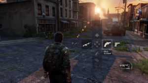
When I think about the games that became the cornerstone of my understanding of just what a game could be, The Last of Us is always the first one that comes to mind. The UI of the game was almost obnoxiously intuitive, there wasn’t a moment in game that pulled me out of the experience. So how is it that a game that only started focusing on the UI of their game in the last eight months of a four year development ended with an interface so seamlessly intuitive that you barely notice it’s there?

Breaking down the whole UI of The Last of Us is obviously a heavy task, so I’ll focus mostly on the HUD. The HUD felt like an extra limb that I’d spent my whole life learning to use, it stayed out of the way and it never overcomplicated anything. Naughty Dog UI designer for The Last of Us, Alexandria Neonakis, said herself that “the main thing you generally hear people complain about with UI is not how it looks, but that there’s too much cluttering the screen” – and taking that on board she eliminated that clutter almost entirely. Another thing that works beautifully is that the position of elements of the HUD relate to their controlling buttons on the controller, e.g. the weapon selection area is at the bottom right corner and is changed by the d-pad. All of these design features combined make for an intuitive, non-distracting user interface, in which the controller is simply an extension of your hands, merging you together with the game that you’re playing.

But video game controllers are just the tip of the iceberg when it comes to technology that augments human abilities. Innovega, a small start-up company, have been working on a pair of contact lenses that work in conjunction with glasses to produce its very own Heads Up Display. The technology works by putting a screen on the inside of a pair of glasses, but unlike a lot of VR set-ups that require the screen to be a certain distance from the wearer’s face in order to focus on it, it incorporates a pair of contact lenses which are “outfitted with dual focal planes similar to bifocals, let wearers focus on the screen without its having to be set inches away from their eyes” (Lerman, 2017).

What makes this idea particularly innovative is that the company recognises the issues with current human-augmenting technology and works to make it more intuitive, closer to the human body itself. It seems to me that the further time goes on, the more designers are starting to realise the key to incredible HCI is to make the technology a further extension of the human body, rather than a fresh piece of technology that requires fresh learning of its nuances to properly experience. If it’s possible to do with contact lenses, what other possibilities could there be?


Reference List:

Neonakis, A. (2014) How We Made The Last of Us’ Interface Work So Well, kotaku.com

Lerman, R. (2017) Startup Sees Contact Lenses as the New VR Screens, The Seattle Times


Helpful links:

https://kotaku.com/how-we-made-the-last-of-uss-interface-work-so-well-1571841317

https://www.cnet.com/news/augmented-reality-contact-lenses-to-be-human-ready-at-ces/

http://www.govtech.com/products/Startup-Sees-Contact-Lenses-as-the-New-VR-Screens.html

https://www.theverge.com/2013/1/10/3863550/innovega-augmented-reality-glasses-contacts-hands-on


The Integrity of Indie

Why could you say that the “Indie” game scene is not a new thing? Has the term indie become meaningless?
Being only twenty-one years old, the term “indie” only entered my sphere of awareness when I was about ten, and it was being applied to music. I didn’t know what it meant, all I knew was that it felt edgy and a little exclusive. I carried that attitude with me when I discovered that the term “indie” was also applied to video games, and I started scarfing down titles like Super Meat Boy, Journey, and later, games like Oxenfree and Stardew Valley. It took time for me to learn the true meaning of indie in the gaming sense, which was actually about small, independent teams making (generally) low budget games. It no longer referred to the style or content of the game, but rather the way it was made.
It followed, therefore, that indie games were not a thing that popped up in the late 2000’s, but rather is a scene that has existed since the 1960’s, when video games first started being made.
Logically, this makes perfect sense. Before the games industry was an industry, it’s inherently misinformed to assume that vast teams and high budgets were being thrown at the creation of games. Spacewar! for example, was a game predominantly designed and programmed by Steve Russell, with help and in collaboration with only a handful of people in 1962. If, like me, you’ve never heard of the game Spacewar! before, a better example might be Asteroids. Created in 1979, it was designed by Lyle Rains, and programmed by Ed Logg and his co-worker Dominic Walsh while working at Atari. The game has been changed and adapted since, and now there’s barely a person on the planet who hasn’t at least heard of it, but at it’s core it was an indie game, designed by a select few for an ever-expanding market.

Now, bearing in mind that indie games have technically existed since the 1960’s, it’s worth re-examining whether the term “indie” has any real relevance or meaning today. Despite the industry now being massive and full of big-wig companies like Bethesda, Ubisoft, EA, and Naughty Dog, there are indie games being produced all the time. As I previously mentioned, Stardew Valley was designed by one individual, Eric Barone, and was initially just an experiment to build on his own game design skills, and has now become a game available on almost every platform imaginable.

Ori and the Blind Forest, whilst being published by Microsoft Studios, was developed by Moon Studios, a small team of developers. My opinion of these games is that they are both wonderful, immersive, well made pieces, that have stuck with me in ways that certain AAA titles never could. So I believe that the term “indie” is far from meaningless, in fact, indie designers and the indie games community should be nurtured so it can continue to thrive, in order to provide games to gamers that were not made because they had to be, but because their developers wanted them to be.

Helpful links:
www.stardewvalley.net
www.gamasutra.com/view/news/267563/The_4_years_of_selfimposed_crunch_that_went_into_Stardew_Valley.php
www.steamcommunity.com/app/261570/discussions/0/492379159710714117/
www.gaminghistory101.com/2012/03/19/asteroids/

Interactive Narratives and The Stanley Parable

Select one example to outline the key concepts of the interactive narrative genre. Does interactive narrative still have a role to play in video games today?
The use of interactive narrative, whether it be in games or literature or any other form of media, is in my opinion one of the most powerful ways to place a story into the hands of the one experiencing it.
In order to explain this better, let’s use The Stanley Parable as an example to examine the genre. While being one of the most obvious examples for this sort of discussion, I believe it’s made itself so by the pure volume of choice making given to the player. The player controls Stanley from a first person perspective, submerging them in the idea of autonomous control and making them feel heavily involved in the gameplay from the get-go. The game’s narrator explains that Stanley works in an office building in a mindless job as a data monitor, until the screen turns off and Stanley is forced to explore his surroundings.

The Stanley Parable 2011

From this point on in the game the player is presented with possibility after possibility as to the choices they make. The narrator throughout suggests what Stanley should do, but it is ultimately up to the player to decide the route they take. This gives the player power over Stanley’s subsequent “destiny” – they carve out the narrative themselves instead of remaining relatively passive in the progression of the plot. Choosing to completely obey the narrator will result in a certain ending, whilst choosing to completely disobey the narrator will result in something entirely different. But what makes the Stanley parable so memorable within the interactive narrative genre is that there is an entire spectrum of choices to be made between these two polar opposites, and each one yields a different result. The game is self-aware, and highlights this by presenting the player with a god-like character in the form of the omnipotent narrator, only to reveal to the player that they are in fact the god of this world.
Interactive narrative still has an integral role to play in the games industry today. The Stanley Parable, after all, was only released in 2011, and pushed the boundaries of what could be done with interactive narrative with the added help of advancing technology. That aside, other games featuring an interactive narrative to a greater or lesser extent are rife in the industry. From Life is Strange, which relies heavily on choice making as part of the mechanic but ultimately presents the player with two final outcomes, to Oxenfree, an indie game with a fairly fixed narrative but a plethora of changes the player can make that affect the outcome with varying degrees of importance.

One of the many choices in Life is Strange

Choice-based dialogue in Oxenfree

Whether there is only ever a choice between two options at a time, or so many the player doesn’t even notice they’re making them, these games make the player feel involved. Interactive narratives help to place them within the universe the game is presenting, makes them feel less distant, and breaks down the barriers between the game-designers and the players themselves.

Postmodernism in Games Design

What are the key components of postmodernism, and what games do you think exemplify this in their design decisions?
Postmodernism is difficult to define, in the sense that its definition rejects long-held and traditional values that have helped to define society for centuries. Springing off the back of the modernist movement – which heavily featured elements of surrealism and abstraction – the essence of postmodernism was concentrated around scepticism and the rejection of big ideologies and grand narratives and allows for variation of opinion from individual to individual. The formal definition of postmodernism, therefore, leans towards an “eye of the beholder” attitude, but generally involves adherence to the idea that the human condition is a result of its past, rather than pieces slotting together in some “master plan”.
In terms of the arts, postmodernism presented itself as a counter to traditional narratives and ideas. Works of art and literature became purposefully redundant to make a statement in an ever-changing world. What was once “low-brow” work could be reinvented as something high-brow and introspective, something that reacted to the state of the world but rejected ideologies and frequently reason.
If we can consider games as an art-form, then it’s no surprise that postmodernism reared its head within this industry too, or perhaps was inherently tied to it as postmodernism rose up at the time that technology began to.

Bioshock Infinite 2013

An obvious and continually referenced example of postmodernism in gaming is Bioshock Infinite. The game introspectively and openly acknowledges the tropes and issues involved in interactive narratives, in the illusion of choice through choices, despite the fact that ultimately, all choices were manufactured and all outcomes were designed. Infinite openly remarks on the illusion of choice within the game; all choices made by the player end up being insignificant to the main narrative, effecting minuscule cosmetics of characters if anything at all, while the player is pulled along on a narrative that they have no control over. Instead of trying to convince the player that they are in control, the game almost taunts them in proving to them that they are not. Moments such as a coin flip resulting in the playable character Booker DeWitt calling out heads when the player themselves might be thinking of a different response is intended to highlight how technically out of control the player is in the grand scheme of things. When Booker chooses to throw a ball at a mixed race couple tied up on a stage the player (hopefully) disagrees with this decision, and they are made aware once again that they are controlling a character that has been written and designed by someone else. The whole game in itself becomes an introspective examination of the video-games industry by constantly self-referring to the techniques its using to create a brilliant and engaging narrative.

Booker DeWitt flipping the coin in Bioshock Infinite

While there are plenty of games that touch on postmodernism in their ideals or lack thereof, I think it’s Bioshock Infinite that truly exemplifies the movement in its design decisions, giving the player stark and uncomfortable moments where they are made aware of their lack of control, and their lack of involvement. Moments where they are shaken from well-written characters and beautiful, immersive visuals by a sharp reminder that they are only a person controlling a game, designed and produced by someone else, and their involvement in its play has no meaningful difference on its outcome. In my opinion, postmodernism at its finest: disconcerting and altogether redundant.
Helpful links:
www.allaboutphilosophy.org/postmodernism.html
www.screwattack.roosterteeth.com/post/51230202
www.the-artifice.com/three-postmodern-games-self-reflexive-metacommentary