Author Archives: Alice Elt

Task 7. Histories of Art

Steinberg, L. From other Criteria. Pg. 948-953

 Published in 1972, people were craving change culturally and politically, presumably accepting Steinberg’s writing with open arms because of this. His forward thinking, progressive tone discusses how art is changing, along with the way in which onlookers receive Modern and Contemporary art, controversially stating that the work of artists in the Renaissance period is ‘flat’.


Serra, R. From the Yale Lecture. Pg. 1124-1127

Richard Serra discusses materials and their properties in the world of sculpture. To Serra, location and materials matter. This contradicts the ideas of Steinberg regarding the way in which the audience sees the work, as opposed to what physical matter the audience sees. Common in both texts is the sense that society was not yet undisturbed by the content of the artists’ work. There was still an uncertainty from the onlookers because a level of shock was provoked.


HARRISON, C. and WOOD, P. (1992) ART IN THEORY 1900-1990 An Anthology of Changing Ideas: Blackwell Publishers


Task 12. The Importance of Scale


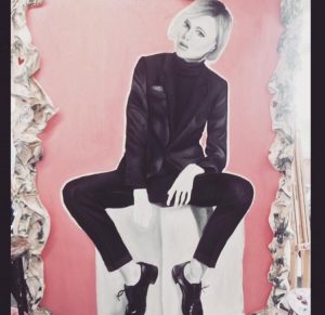
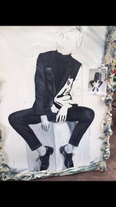
Above is a large scale painting I produced in 2015.It is oil on canvas and stands 2.2m by 1.4m. I wanted to portray a sense of feminine assertiveness, without the figure coming across as aggressive. I find this is often an issue that women with assured opinions face. I painted a woman in a suit in a comfortable, seated position. However, what makes her most confident is her eye contact with the audience, breaking the forth wall. She has an awareness that is being looked at, however, due to her posture, this seems no problem.

Regardless of the height of the onlookers, the painting causes people to look up. This domineering feature of the painting is achieved through the scale. The model is larger than life size and this effect certainly wouldn’t be achieved so successfully is she was even half the current size.


Task 11. Blog Summary

The ambiguity and freedom in each task has provoked my own reading of articles, books and critical opinions of artists. I have found out snippets that I may not have done if these tasks had not been set, and they have been a good introduction into the ways in which I work productively. I’ve learnt that the meaning and context behind the piece is often more important to me that the aesthetics of the image itself. Thus, I have emulated this approach in my own ideas, for example, my appropriation pieces, and Michael Craig-Martin inspired flower paintings in the Contemporary project.

Moving forward with extended pieces of writing, my shorter blog entries have given me some security regarding my ability to eloquently express my creative intentions. In particular, Task 4, to write a review on an exhibition I’ve recently visited, sparked considerable excitement. This I found, along-side Task 2- to consume a book summarising it’s content, the most beneficial. Seeing artist’s work in the flesh gave me a greater insight into their practice, offering impact via scale, richer colours and accurate side notes on the wall nearby. Similarly, reading a book written by the artist themself, it gave me the inspiration due to their contextual purpose, to create a section of work myself that I feel was successful in terms of meaning, also, perhaps less importantly a conclusive feel at the end of a project.

Task 10. Summary of Work Content

Task 10: Image Summarising Work’s Content


An Elective Setting Whereby White Males Dominate The Entire Democracy:


‘Hands of the very men that held them as slaves’

Throughout the Manifesto project, I concluded my writing was more powerful in an anti-manifesto format, as opposed to any positive claims of things advocated. I feel this is down to human nature as we often kick against what they’re told to do. Therefore, once given freedom of choice to decide if we agree with an outrageous and ill-informed statement, we are more likely to take the moral high ground independently.

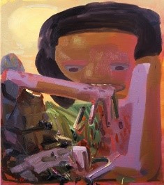
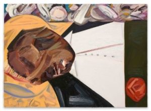
Similarly, work that I’ve produced whilst doing Research and Communication tasks has suggested a hint of irony, such as the appropriation task. Here, I placed the heads of black celebrities who have been successful in the eye of the public on the painted head of Emmett Till, produced by Dana Schutz called ‘Open Casket’ created in sympathy for Emmett’s grievous mother. The exposure was to broadcast grief and mistreatment, not to launch any kind of fame. Michael Jackson’s bleached white face over Emmett’s was the final outcome, raising a tremendous indignity on those who made Jackson, in his latter years, feel unhappy in the skin he was born with.

https://timeline.com/history-white-terror-black-voters-27fbf9a0d968

Task 9. Philosophy, Theory and Politics

Task 9- Philosophy, Theory and Politics

Carolee Schneemann Interior Scroll

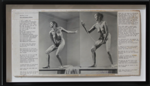
Below is a print of two photographs documented from a performance piece at an exhibition called ‘Women Here and Now’ in New York, 1975. In front of a largely female audience Schneemann undressed and brushed her limbs with dark paint. As part of the performance aspect, she would take ‘action poses’ as though she was a life class model. She then read aloud a scroll she pulled from her vagina. This was argued by Robert C. Morgan to be ‘a feminist exploration her own body’. The scroll’s content is written on the two sides of the print in columns. The text itself is powerful, addressing how men traditionally are ordered and rational, whereas women tend to work from intuition. Amy Newman writes in the New York Times ‘the art world wasn’t shocked, it was confused and embarrassed’ in the 1960s about art that was purely of a sexual nature.


I admire Shneemann’s outrageous performance piece ‘Interior Scroll’. When looking inward, over my first year I hope to grasp and tackle poignant current issues. She writes that ‘in some sense [she] made a gift of [her] body to other women; giving our bodies back to ourselves’. With such an ambitious belief, conceptually and visually in her work, included in other pieces of her work also, it’s hard not to notice Schneemann as a hugely important feminist artist, offering guidance to women who may struggle with their own bodies.


http://www.nytimes.com/2002/02/03/arts/art-architecture-an-innovator-who-was-the-eros-of-her-own-art.html

https://www.google.co.uk/search?q=interior+scroll+carolee+schneemann&source=lnms&tbm=isch&sa=X&ved=0ahUKEwjoh4y469_XAhVN_aQKHYyDCMUQ_AUICygC&biw=1269&bih=640#imgrc=vPQ3vcqdu3T7oM:

http://www.tate.org.uk/art/artworks/schneemann-interior-scroll-p13282

Task 8. Appropriation

Appropriation of Dana Schutz’s Painting ‘Open Casket’ Showing the Dead Body of Emmett Till- 1941-1955

What Dana Schutz creates intrigues me. Her political and racial fearlessness is something that I aspire to emulate, successfully and creatively delving into topics that cause discomfort when addressed. Her work is characterful and textured in pieces such as ‘Sneeze’, a collection produced after her graduating from Columbia, with layered paint and embodying “
what it feels like to sneeze”. Other work like ‘Self-eaters’, a fictitious group made up by Schutz, who eat themselves and can later revive their missing limbs, is for her stylistically and conceptually more common; she does not normally paint about reality or publicised events.

Held in the Whitney biennial in 2016, Schutz’s ‘Open Casket’ caused an uproar. Black protesters stood in front of the piece so as the white audience couldn’t easily consume the work. Furthermore, a letter by Hannah Black, an artist and writer, was written to the curators of the exhibition stating that the painting should be ‘destroyed’.

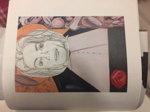
Throughout the process of my research I knew that I wanted to work with Schutz’s ‘Open Casket’. However, I decided to bring it forward to the contemporary issues that live on today regarding black oppression and racism. I took four black figures that have been popular in the public eye over the last few decades; BeyoncĂ© Knowles, Aretha Franklin, Ray Charles and Michael Jackson. I used their faces to cover Emmett Till’s, whose face led to so much grief and legal injustice. (Roy Bryant and J.W. Milam were acquitted of both murder and kidnaping, later admitting in an interview that they were the killers.)

My final appropriated piece is Emmett Till’s face covered by a pencil drawing of Michael Jackson. Jackson’s determination to remove his racial identity highlights the segregation that still is present in society. Born a black man, he died with the appearance of a white Caucasian male.


  1. https://www.newyorker.com/magazine/2017/04/10/why-dana-schutz-painted-emmett-till (last visited 10/11/17)
  2. https://conversations.e-flux.com/t/hannah-blacks-letter-to-the-whitney-biennials-curators-dana-schutz-painting-must-go/6287 (last visited 10/11/17)
  3. http://www.zachfeuer.com/exhibitions/dana-schutz-self-eaters-and-the-people-who-love-them-3/ (last visited 10/11/17)

Task 6. Inventing a New Mode of Practice

Task 6: Inventing a New Mode of Practice

Rembrandt’s painting in romantic solitude is largely what people thought what ‘fine art’ was when discussed. This was until modern and contemporary art hit the scene. When deliberating this with friends, we agreed that even our parents in their forties and fifties hold this traditional viewpoint regarding fine art being painting, life drawing, and for those feeling bold, sculpture. However, seeing an example like Francis Bacon’s studio in 1974, it made me think how common nowadays it is for contemporary artists to be working in this arguably chaotic, unordered way.
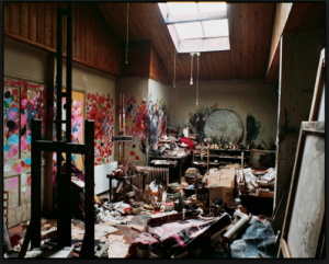


I looked inwards to the way in which I work. I feel thinking up a whole ‘new mode of practice’ doesn’t have to be done. No two people work in the exact same way; thus, I have already invented a new method over time. Firstly, I find a topic that enthuses me, normally a conceptual stand captured in a painting. Next, I read about the artist and why they may have been provoked to create work on their particular subject of interest. From this reading, I single out something; this may be a stylistic feature, or a conceptual argument that’s particularly touched me. As an example from this academic year, I read Michael Craig-Martin’s book ‘On Being An Artist’ and selected the quotation ‘our job was to create whatever it was that would come next’. I linked this to his acrylic paintings ‘Knower’ and ‘Learner’. I took photographs of what was in front of me, the first take being the chosen shot, because a shot from that present moment is the most contemporary what’s ‘up next’ angle I could find. Mimicking the ‘Knower/Learner’ contrast I took two shots; the first a vase of dead flowers, a bottle of wine to the right. The second is a vase of live flowers accompanied with a bottle of Evian. Simply from my ‘mode of practice’, I’ve been able to produce a body of work successfully.
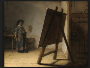


https://www.google.co.uk/search?biw=1269&bih=640&tbm=isch&sa=1&ei=BX8cWpK2Hcb1aI_BqNAI&q=fransic+bacon+stdio&oq=fransic+bacon+stdio&gs_l=psy-ab.3..0i13k1l5j0i13i30k1j0i8i13i30k1.61607.71495.0.71643.23.20.2.1.2.0.119.1205.16j2.18.0….0…1c.1.64.psy-ab..2.19.1170…0j0i67k1j0i10k1j0i13i5i30k1.0.d_uca-ASfmw#imgrc=13YQXVbH5_V3GM:

https://www.google.co.uk/search?biw=1269&bih=640&tbm=isch&sa=1&ei=9n4cWrr9MIrNaM6gptgI&q=rembrandt+artist+in+his+studio&oq=rembrandt+artist+in+his+studio%5C&gs_l=psy-ab.1.0.0i30k1.7787.11168.0.12827.8.8.0.0.0.0.407.751.2j2j4-1.5.0….0…1c.1.64.psy-ab..3.5.750…0j0i67k1.0.p5H91bJ2CQE#imgrc=idqgQmEFt0r-1M:

Task 5. A Painting in the Flesh

The Shore
Luc Tuymans
Oil on canvas (2014)

Luc Yuymans’ work first grasped my attention with its impressive, impactful scale, the painting being 1942 x 3573 mm. It would not have been a piece I’d have been exposed to if I hadn’t visited the gallery in person, so in that sense, the trip was invaluable. The Shore is held at Tate Modern, and was presented by the artist in 2015.

Within the painting, it seems the visual capacity is impaired for the onlooker, who perhaps are sailors in a boat. However, having read the paintings notes beside it, it’s revealed that the indistinctness masks what cruelties occurring in the scene. The painting was influenced by a scene in the film ‘A Twist Of Sand’ by Don Chaffey, (based on the novel by Geoffrey Jenkins) whereby civilians pleading to be saved from a beach were shot down a few moments after their calls. With the figures being the source of luminosity in the piece, visually the piece resonates with the idea of ‘seeing the light’ before death. Hung on a white wall in the gallery, it draws more emphasis to the contrast of the black and white tones.


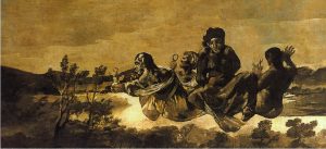
                                                                          Atropos 1823


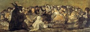
Witches Sabbath 1798


Francisco de Goya’s ‘Black Paintings’ can be seen to contain many similarities with The Shore. Landscapes of clustered figures, with muted tones are some of the visual similarities between the two artists’ work. A somber, yet chaotic setting is portrayed, aesthetically easy on the eye due to the symmetry of the works. However, the three paintings displayed here make the audience uneasy due to their ruinous content. Having been taken from a scene from a film, ‘The Shore’s’ blurry painting technique softens the happenings of the piece. The easy-blend nature of gradual black and white tones assist this alleviation.


The Shore 2014


https://www.theguardian.com/artanddesign/2015/jan/28/luc-tuymans-the-shore-cannibal-killers-exhibitions

https://www.quora.com/Why-did-Francisco-Goya-produce-the-Black-Paintings

Task 4. Reaction to Visited Exhibition

National Gallery Pre-Raphaelite Exhibition: Reflections
(Date visited: 21/10/17)

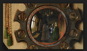
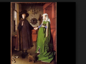
The intimacy of the Reflections exhibition is something that made it more exciting and exclusive to walk round. The boxed rooms, you feel contained in and more immersed within as part of the viewing experience. Holding heavy influence in the exhibition is Jan Van Eyck’s ‘Arnolfini Portrait’. Famous for its curved mirror in the background reflecting onlookers whom could be interpreted as the contemporary audience today, the painting hangs on its own private wall emphasising its presence. This is something to note when comparing this space to the paintings previous, relaxed bedroom wall placement.


A room to the right of the entrance door plays a film on loop on the origins Van Eyck’s Netherlandish work. It is welcomed knowledge regarding the roots of the artistic progression and the Pre-Raphaelite Brotherhood itself, before extending person opinions on the works within the exhibition. Classic composition of solitary women, royal groups and unfinished sketches gives an ample insight into how the Brotherhood worked. This disclosed viewing of the artists’ hands is a pleasure to witness.


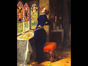
The vibrancy of Sir John Everett Millais’s ‘Mariana’ for me is the pinnacle of the show. The conscientious, and deliberate nature of the painting is something that is mesmerising and caused me to stand, in awe for the majority of my time in the exhibition.


http://www.themasterpiececards.com/famous-paintings-reviewed/bid/27677/Famous-Paintings-Arnolfini-Portrait

https://www.nationalgallery.org.uk/whats-on/calendar/lunchtime-talk-15-january-2018-1300

http://www.tate.org.uk/art/artworks/millais-mariana-t07553

Task 3. Brief Image Analysis

Family Jules: NNN
Barkley L. Hendricks
(No Naked Niggahs)
1974

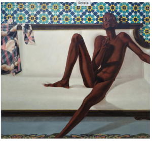
This painting struck a cord with me when I saw it placed next to Henri Matisse’s ‘Nu bleu’. With a white female sex slave as the subject matter of Matisse’s painting, it explains and supports Hendricks’ response on wanting to sexualise the black human form. The model in the painting particularly holds the characteristics of a slim conventional black figure: lean limbs and an athletic build. The painting doesn’t include the left lower arm, hand or foot. This gives a sense there may be more yet to come. Such dominance from the model causes a feel of discomfort for the audience. Perhaps this lack of visual conclusion adds to tis discomfort when viewing the painting. The white woman on the scarf gazing at the model could represent the eroticism and arousal that is associated with the naked black form. However, is made more poignant in this example as it is more common for men to be aroused by the female form in paintings, as opposed to white female onlookers.

The wallpaper shows the era in which this painting was meant. A sexual awakening in society in the 1960’s and 1970’s was rife, whereby the topic of sex was more openly talked about. The notion had reached a stage where sex was accepted between couples. However, the divide in society between ethnicities was less forward thinking. Racial prejudices had not been shaken at the same rate.  Below in this painting, exposure to the sexualised black human form was a progressive and modern way of painting in the 1970’s.


https://theartstack.com/artist/barkley-l-hendricks/family-jules-nnn

http://www.tate.org.uk/art/artworks/hendricks-family-jules-nnn-no-naked-niggahs-l02979