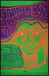
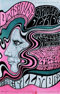
Wes Wilson is a famous American artist in 1970s, he was a poster designer for rock concert in the 1960s and was known for his psychedelic poster and type (Classic Posters, 2013), the wavy and melting look type style was inspired by the Art Nouveau masters (1). and his work influenced the next generation of designer until now.
The typeface is no doubt the most iconic elements in Wes’s posers, the waving strand of type and cryptic looking made them really suit with the meaning of rock music concert, making them a huge successful at that time. Also, the letters are filled with almost all the gap in the posters, which somehow looks like patterns and shapes and endue the spirit in the picture, I was really impressed by the way he make the type looks like shapes which break the grid of how front usually look like and made them more sensibility. Besides the typeface, the bright colors that he used was also another influential thing in his design. Inside of using harmonious colors, he had choosed to work with very contrast and clashing colors. This made the posters very eye-catching, since contrast colors are much more attractive compare to other colors combination and graphic designers are still using this theory nowadays. Moreover, I think he is a decisive designer, from the way he put colors and shapes courageously, you can tell he is unwilling to be ordinary and a thoughtful person. His work wasn’t just about how things will look good on a surface but also having their own story in each of them. Even though some artist disagree him at that time, but because of his persistence, he created his own style and standing as exemplar for modernism.
In a nutshell, I really like the way Wes Wilson design the front and making them collaborate with the color scheme. He is a designer who design with thoughtful idea and making his work impressibility which encourage me to think out of the grid more often.

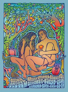
Hardly Strictly Bluegrass Festival, Golden Gate Park, San Francisco, CA poster by Carolyn Ferris & Wes Wilson
Reference:
“Wes Wilson”, Classic Posters, Jan 2013


