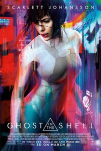
Here I am analysing two film posters both created for the movie series Ghost In The Shell. The left one is illustrated for the original animated movie, the right one is a film poster for the live action movie which contains both photography principals and graphical principals. The right one uses mainly a cool colour pallet, using bits of reds and purples only to highlight and bring focus to the main character, to make her stand out even more from the secondary characters in the background, in addition to placing her in the centre of the foreground. There are overlays of people and a pixel-esque backdrop effect, combining with the techno fluorescent blue scheme, creates a sense of people uniting with technology, which reflects the overall theme of the actual movie.
The poster on the right uses a multitude of both cool and warm colours bleeding in to each other forming a much more vibrant appearance, on top of what looks like a cityscape background as opposed to people in the first poster. Compared to the first image, this both makes the image capture more attention for marketing purposes, and creates a sense of chaos. The main character this time is enlarged to be the sole focus of the poster, which could be representative of the story which revolves around the character’s psyche and mental turmoil rather than the plot, which is further established by having the actress appear distraught as opposed to composed in the first poster. From a feminist’s perspective, the second poster may be exploiting the sexual attraction of the actress for marketing to male audiences, but could also be argued as portraying the character (an AI) in her authentic form.


