
The works that I choose to compare is an illustration and a poster, they were choosed because I am most interested in illustration and graphic design. Since I always look for inspiration on Pinterest and Instagram, there is a lot of artist that I admire with, these are two example out of them.
The illustration was created by a Japanese illustrator (@ryu1_origin), she had a fantasy style in her work. Most of her work are young girl portrait and she always mixed with several colors but harmonious at the same time. The reason that I choose this work is because I like how the bright and dark color react to each other in it. Moreover, I like how she draw eyes in an unusual way, the eyes were drawn with yellow, green, pink and blue and make it really eye-catching.
The poster that I choose to compare with is made for a huge electronic music festival. Having a same feature with the illustration, a lot of attractive colors were used in it. However, they were not blended which shown a plentiful and alive style. To add more, the theme between these two are very similar too, they both having a fantasy and fictional style.
Overall, they are both inspired work for me and make me think more about how colors influence audience’s thought. Also, thinking out of the grid while matching the theme can make the work become more unique and attractive, be able to communicate more completely with the viewers.
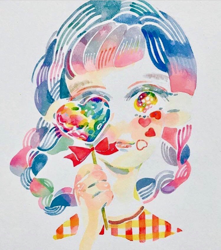
(Instagram: ryu1_origin, 2017)
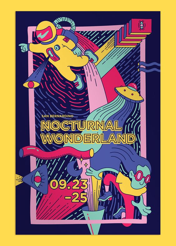
(Connie Van, Nocturnal Wonderland)