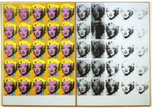
‘Marylin Diptych’
1962
Acrylic paint on canvas
2054 x 1448 x 20 mm each panel
Andy Warhols ‘Marylin Monroe’ works are incredibly well known, and it could be argued that they are the face of Pop Art. However, what some people do not know is the sheer scale of the work. More often than not, they are displayed with other very similar works (depicting Monroe), which only adds to the overall size. Warhol created the prints in the years following Monroes death, due to s a substance overdose, throughout Warhol’s work we can see two strong themes; death and the celebrity sect. Here we have an interesting union of the two, the repetition enhances the idea of over publicized and fame while the black fading signifies death. The strong colours and vibrant face on the left contrasts heavily with the distorted monochrome features on the right. If we take the space between the two as ‘death’ (and read from left to right) then the fading of the face could be suggesting that the world is going to forget Monroe. The scale of the work puts the themes right in the viewers face, to the extent of unavoidability. This again hints at the idea of fame, it is a large inescapable object that draws you in with its clean vibrant colours, and could almost be seen as advertising. So if we were to shrink the image down to a quarter of the size, 513.5 x 362 x 5 mm, we have a very different piece. We would still have the same themes of course, but we would look at them in a completely different light, firstly, and most obviously, it would be altogether subtler. The themes wouldn’t be screaming and shouting for attention. For me this is a large part of the work, so to take its size would in effect be taking its message.
Bibliography:
http://www.tate.org.uk/art/artworks/warhol-marilyn-diptych-t03093

