
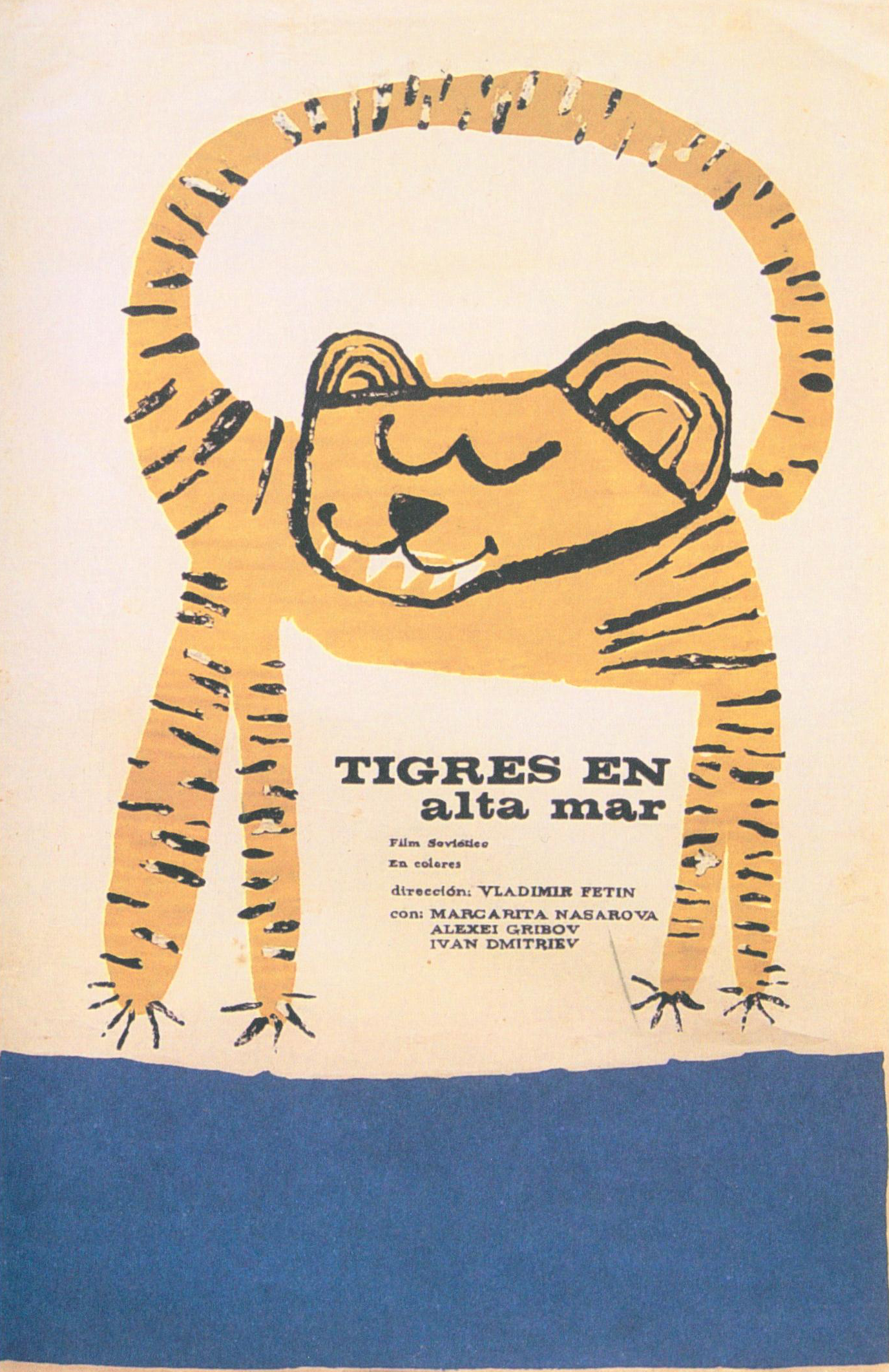
The first image is designed by Eduardo Muñoz Bachs who is a famous Guba designer. He is good at using powerful composition, bright and pure color, and beautiful handwriting type to organize a poster, and his screen printing poster became a beautiful and effective visual communication model. I really like this poster which was designed for a children’s book. There is a lazy and relaxed tiger, and it was drawn by simple and clear style of hand drawn but it is extremely vivid. In addition the poster r use complementary colors to make a visually intriguing but colors are low purity which are very soft. This poster is simplistic and naive, easily connected back to his background in children’s books, and he also do some marvelously intricate and free-flowing poster.
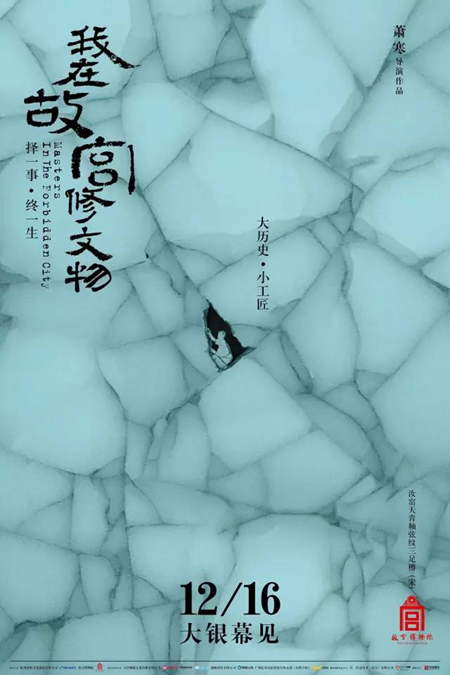
The second image is from a Chinese designer who is Hai Huang. This I s a movie poster for “Masters In The Forbidden City”, and the documentary shines light on the unsung life stories of restorers of cultural relics working inside the Forbidden City, together with the history of the antiques and the palace, the procedures of restoration and the development of cultural protection. The most important element of this movie is to show the craftsmanship spirit of restores. The poster express all the meaning of this movie, and it only one of the series posters of 6 precious cultural relics. This one is a part of “汝窑天青釉弦纹三足樽” . we can see this cultural relic was broken, and in the crack has a small restorer who is seriously repairing the cultural relics. This designer said that “I think the design poster is to do subtraction, to delete the scrap, to dig out the film’s core.”
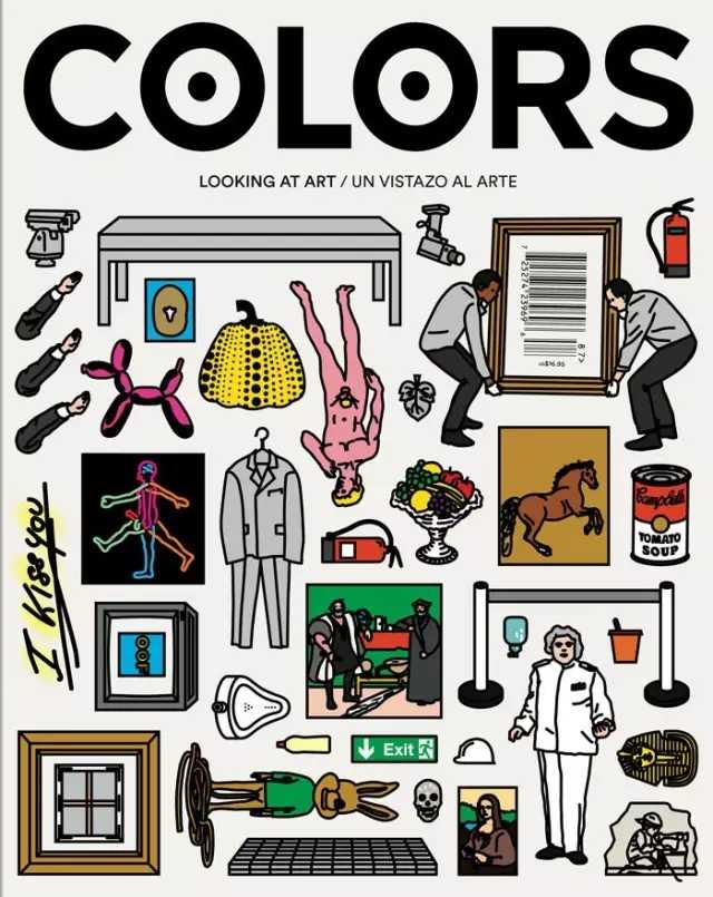
The third image is a cover of my favorite magazine Colors. The magazine was founded by photographer Oliviero Toscani and Tibor Kalman in 1991. It’s a magazine about ordinary people’s life, culture and customs. Quarterly newsletter in 40 countries with 6 different languages. It is a magazine that promotes the harmony and diversity of all races and tells a few real events in simple and humorous ways. This cover is from “COLORS 87 Looking at art”, and the most interesting element is that the cover is a series of stickers, each of which can be uncovered and affixed to your fridge.
http://blog.sina.com.cn/s/blog_7c9c28070102v4nc.html
http://www.madisonboom.com/2016/11/14/masters-in-forbidden-city-launches-six-movie-posters/
https://www.zhihu.com/question/19803170/answer/99999837
http://www.colorsmagazine.com/