
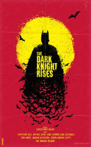
At the first glance, this movie poster of The Dark Knight Rises looks really captivating. In terms of the colors used in the poster, it has a balanced color contrast and temperature. The background of the image is dark orange which seems to give a dominant color contrast which matches to the title of the movie perfectly. The entire poster has the incorporation of triadic color scheme and analogous color scheme. The font used in the poster is bold and the font choice seems to be matching with the name of the movie and the way the character is displayed in the poster. In terms of visual mapping, I feel, that this poster does not match the correct visual mapping pattern, as the visual mapping is not starting from upper right corner and ending smoothly at the lower left corner. But, due to a good combination of colors, font choice and character design, it totally seems as if the dark knight is rising.
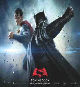
The poster I am comparing the first poster with is a still from a trailer, the colors used in the poster are bold and dark. The background with an exploding effect totally captures the movement and heat between the characters of the movie. The combination of color contrast, effects and motion used in this totally balance with the scene.