Select one game of your interest and explain why does it have a good/bad game UI:
I am going to go with a game that I am very fond of on this one, which is ‘Dark Souls 3’. Not all of the UI in ‘DS3’ is horrible, but it needs to be improved in a lot of areas.
This screen shot I took in game of one of my characters. This is the so called “statistics” screen. It displays to you all of your character statistics, but, I feel it is just too confusing. Especially for new players. It’s full of numbers, different names, weapons slots, and all these other confusing things. The worst part about it, is at no point in the game do you get a tutorial where it goes over any of these or what they mean.
They did include a help button at the bottom, however, it doesn’t help. It just describes to you in little details what a few of they stats are, mainly the attributes. It does not explain to you where the numbers come from, how to change the, what they mean for you, etc.
Example number 2; this is another screenshot I took. This time I am in the “Equipment” menu. This one is better in my opinion than the “status”. The thing that I think is bad in this is how it displays some status elements from the other menu.
On the right hand side you’ll see the same confusing words and numbers from the first one, I can see why they would have done this, but I don’t think it works. This is meant to be an inventory menu, so why not just have the inventory screen that is one the right hand site, the “additional effects”, “number held/stored” and “equipment load” status as that is all they need to include.
I feel that the additional status on this screen not only makes the menu too cluttered for the player, it also reminds them and adds to the confusion on the game. All of this leads to a bad UI in this game.
Discuss how technology augments human abilities. Reflect upon the implications of the future of HCI:
“Advances in cognitive neuroscience and brain imaging technologies have started to provide us with the ability to interface directly with the human brain. This ability is made possible through the use of sensors that can monitor some of the physical processes that occur within the brain that correspond with certain forms of thought.” (link.springer, 2017)
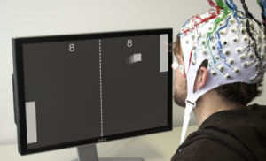
I have seen a lot of things on the internet mentioning or talking about BCI, which is Brain Computer Interfaces. This is where a computer is controlled only by a human using their brain.
It’s not something that is amazingly complicated at this time, but It has seen some good progress, especially with games. This image is from the video that is probably the most famous scene of a BCI in use on the game ‘Pong’.
It doesn’t necessarily augment human abilities, but more along the lines of; makes them easier. It takes away the use of hands from a computer and allows them to use it with thought alone, which to some people, seems like something from the future and amazing. But to me, it seems like another gimmick for money, a lot like ‘VR’ was. It even resembles a ‘VR’ helmet…
However, I feel that developments like this will have a big impact on the future of HCI (Human Computer Interaction), as it opens up new ways of people using computers. Image turning your pc on with your brain, then using Youtube or Spotify by thinking about it. It would revolutionize computers on a global scale.
Not only computers. Mobile phones, laptops, game consoles, calculators, watches, vending machines, even cars. Anything that has or is operated by a computer, that can be interacted with by a human, will then have a new interaction method opened up by this. So imagine “Brain Car Interface”. You want to start your car? Just think about it. It’s go future written all over it, and it isn’t a fantasy.
Bibliography:
Tan, D. and Nijholt, A. (2017). Brain-Computer Interfaces and Human-Computer Interaction [Accessed 6 Dec. 2017].


