
Counter culture is the lifestyle of people who reject or are against values and behavior that society is trying to make them follow or be.
I decided to look into the logos of advertisement in the 1960s and 1970’s as illustration in advertisement is also something I’m very interested in. The 1960’s and 1970’s were very colourful times with it being a very popular era for hippies so a lot of advertisements, posters and logos were full of colour and detail, ‘the 1960’s was a  magical time when people really believed in a new utopia’ sent jumpin’, 2012, Posters article.
Moscoso, V. (1968). neon rose. [printed on white index stock].
This poster by Victor Moscoso called ‘Neon Rose’ I really like this piece because I feel like it represents the 1960s as a whole, with all the bright and neon colours contrasting each other. In my opinion, relating back to the quote about the utopia, the poster as a whole has more of a positive effect rather than a negative because again of the colours as if it were to be the opposite and had duller colours it wouldn’t have the same effect on the audience. This is relevant to my interests as a practitioner because of the illustrative vibe from the poster asa lot of it looks illustrated rather photographed which was a popular thing to do back in the 1960’s as photography wasn’t really used for things like posters.

Caroff, J. (1961). West side story
I then went on to find this image of another poster which is the poster for the film ‘west side story’ and compared to the poster above there are only three colours in the posters with not much detail. I like this poster tho because of the simplicity it shows as I feel if it was too detailed it would be too much to take it in at once but with black and white against the red it’s still eyecatching.
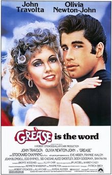 Moving on from the 1960’s I got this movie poster from the 1970s’ from the film ‘Grease’ and although it’s still being illustrated the poster is much more realistic to look at in comparison to the 1960’s ‘west side story’ this being as photography was becoming a more embraced and popular thing to use but they still wanted to keep the illustrative look going. I really like this poster because of the detail and because im aware of what the film is about I see there is more of a meaning behind it as the two characters on the front are deeply in love and are embraced with eachother.