
Having a keen interest in graphic design when Channel 4 rebranded their identity I was very interested in the outcome. What stands out most on the images is the typeface. It’s an extension of Channel 4. This custom typeface was designed by Brody Associates to portray what the channel is all about. Horseferry is “designed to reflect on the sharp, disruptive and aesthetic of this unique British Institution.”Cadwick “reflects the modern and informative nature of the public service broadcaster at information level.” [1] The harsh angles and inverted slab serifs on the Horseferry font immediately hits the viewer. On the images you can see its alignment is above the image, this is interesting as it encourages the viewer to read the text first. Furthermore, the position of that text is again very interesting the ‘Humans’ two posters for example, in the second image the text is broken up by the hyphens. Almost as if it was done to mimic the style of a robot (What the program is about.) As you read the text you take these small breaks/pauses which is very similar to the typical robotic voice. The overall layout of all the posters is consistent, clean and clear.
WWF poster advert is a piece of published work that is simple but very effective. It’s almost like a ‘stop the difference’ game, the viewer is drawn in to read the text. The text itself is short as it’s made of up a one word adjective. The important information is placed on the bottom of the poster where the eye is naturally drawn down. The typeface is a sans serif font which is ideal for this as it’s portraying a clear stern message. A serif font would have been confusing as it would conflict with the text. I’ve also noticed all the text is in capital letters again reinforcing its strong message.
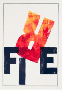
Finally is a piece of work by Alan Kitching who is a British graphic designer, animator, architect and software developer. This piece of work was created through letterpress. I enjoy this artwork as it really plays on the word ‘fire.’ The typography is playful whilst being in a sans serif font. It’s interesting to see how he has changed the format of the word, using the ‘r’ to mimic visually a flame. furthermore, the rest of the letters aren’t placed uniformly in a straight line. This piece of work is great inspiration for me as It reminds me that typography doesn’t always have to be created on a computer. In addition to this it also makes me consider the placement of the letters.


Underconsideration.com. (n.d.). Four-ward Looking. [online] Available at: https://www.underconsideration.com/brandnew/archives/new_identity_and_on-air_package_for_channel_4_led_by_4creative.php [Accessed Nov. 2017].