The images I’ve chosen are among some of the most tame of the bunch, not for any lack of spoons on my part to put more than one naked lady on my blog but almost none of the images from the assigned era appealed to me anyway and i’ve always found illustrated depictions of women through the lense of the male gaze to be mildly grotesque.

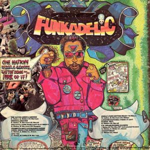
I chose my first image based purely on aesthetics, it has a sense of style that feels at home in my modern brain, this and a couple of the other illustrated ‘Parliment’ covers by Overton Loyd were easily my favourite images, I love his playful inked lineart and the bright but not obnoxious use of extreme colours.

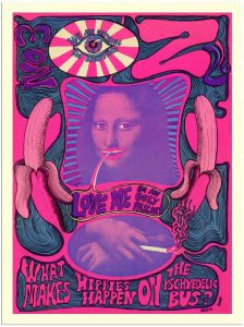
My second image feels like either juvenile scribblings or a high art piece derived from modern meme culture you’ve got chaotic elements what would now be considered badly done Photoshop and the defacing of an iconic image the only thing missing is the ‘#relatable’ caption,now that i look closer though i see that the mona lisa is actually saying ”love me im an ugly failure” which would be considered extremely relatable to the teens who make memes. that strangely easy translation into modern culture is probably the main reason I like it aside from the pleasing colours.

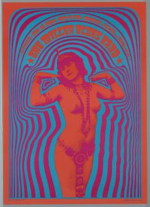
My third and final image is an eye catching poster both in terms of colour and subject matter especially) and I don’t mean to be repetitive but) to my modern brain you don’t really see women with their entire chest out on posters or public media especially not with the lady in such a confident pose, it seems to me like its not really supposed to be erotic but they just put a naked lady on there because they could , or maybe I just have different standards of eroticism via instant access thanks to the internet.
Either way with these things its almost always colour first and foremost that grabs my attention although the coding on this blog seems to dull everything down, the original picture is much more crisp and vibrant.
refer to bibliography for references.
