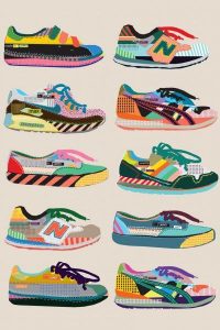
These two images are used for advertisement but they have both been created using different materials. Photography and illustration are a great way of advertising a product as they attract different target audience groups. The illustration has focused on using colour, shape and pattern whereas the photograph has kept it quite simple using smoke to highlight the shoe.
The photographer has tried to think of a way of making the trainers the focal point so they have used a black background and focused lighting. The illustrator has used a faded white background to bring out the colours of the trainers. If they wanted to focus on one shoe and brand they could repeat the shape but change the pattern and colours.
I have chosen these images as I am into illustrating over photographs and photography.I believe a mixture of both of these techniques within advertisement is very popular and successful within industries at this moment.
From my own love of trainers I am able to recognise the shoe brands in the illustration, however in the photograph it is harder to tell. i think this is important within advertisement, especially if there is no information or text added to the poster.
Bibliography


 T
T