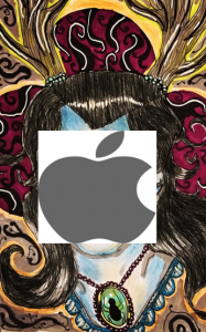
In order to appropriate a piece of my own artwork, I decided to cut and paste the Apple logo over the face of the woman I had drawn. I wanted to do a modern take on ‘The Son Of Man’ (1946) by Rene Magritte.
The process wasn’t very difficult as I just layered the apple logo over the face of my drawing and then cropped the image down in Microsoft Word. I did consider neatening up the logo more and getting rid of the plain white areas around the apple but I thought that actually the white space worked with what I wanted the artwork to convey.
The simple cut and paste job over the drawing that I’d worked on for a long time is meant to represent the 21st century and how our generation only care about what brands are popular with their peers. It is about capitalism and commercialism. The original painting by Magritte is one that most people recognise instantly and that’s why I wanted to playfully change it a bit.
I hope that this reworked image will make people think about how they spend money on things just for the brand, and about how all of this makes things difficult for independent artists and traders.
If I had more time to dedicate to this project I would really like to paint the apple myself and make it look pixelated so that it has a bit more depth to it.

