
The Counter Culture movement took of in the 1960s and was popular throughout the west especially in countries such as the USA and the UK. This anti establishment culture focused on breaking the views of what was once acceptable. Topics relating to woman’s rights, drugs, and racism were all slowly becoming possible.
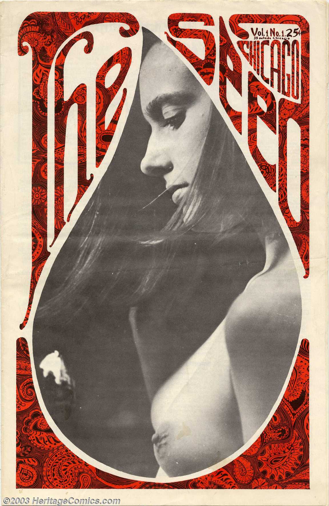
For my first image I chose a front cover from The Chicago Seed, an underground newspaper formed by artist Don Lewis and Earl Segal. This front cover was published in 1967. I’m unaware of the specific designer however what caught my attention was the use of colour coupled with the typography. Using minimal colour and sticking to a basic colour scheme appeals to me because this is the way in which I like to design. The combination of the photography intertwined amongst the text captured me because of its edgy and unorthodox approach.
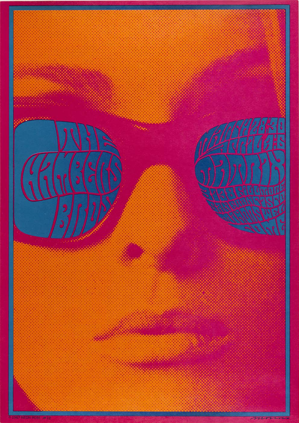
My next piece of work of interest is a poster by Victor Moscoso, a San Francisco artist who’s known for is a psychedelic poster during the 60s and 70s. This specific poster is “The Chambers Brothers”, compared to his other designs this one is quite tamed yet this is the reason this is my favourite poster by this artist. Once again this poster combines imagery and type, the composition of the photo is centred and being a fan of photography a can approach this symmetry. My favourite aspect of this design is the colour pallet, while being vibrant and visually representing the psychedelic era of the 60s. Moscoso uses a hue of colours representing a sunset giving off a visually alluring appeal.
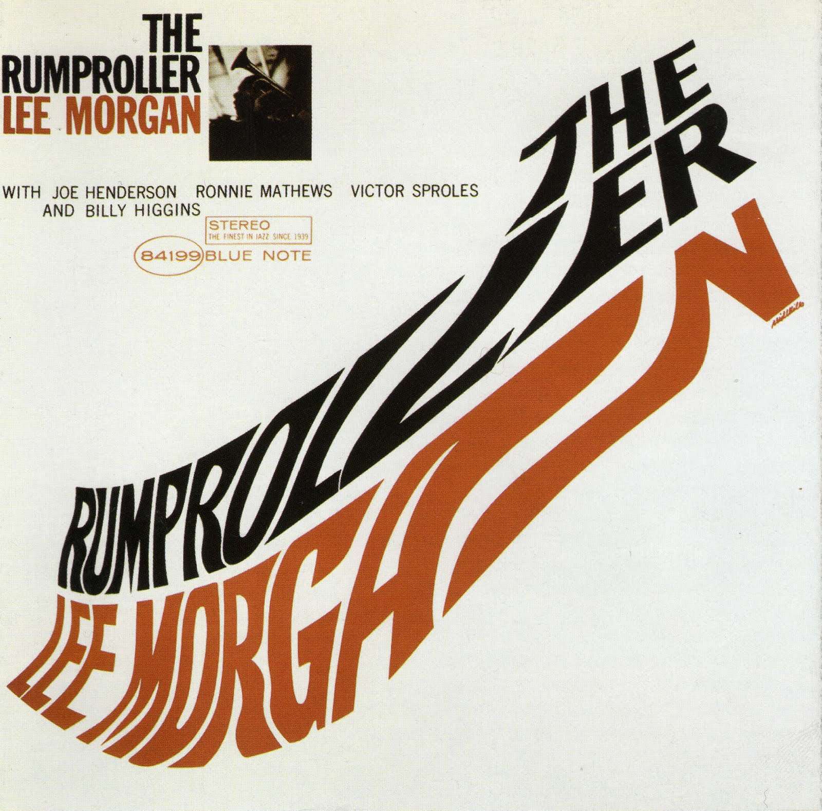
Finally, the last image is slightly different from the other. This image is a Record cover designed by Reid Miles, he’s most known for his work for Blue Note Records. Described as “A genius, ahead of his time, and the way he treated the typography as visual elements that can be broken apart and form something new still feels fresh.”. A very true stamen in my opinion, the typography used is unconventional its uniqueness is very creative especially for its time. Also the layout on the whole is rather basic but this fits my less is more mentality.
Bibliography
The Chicago Seed, (1967) : http://www.jhalpe.com/items/view/9803
Victor Moscoso “The Chambers Brother”, (1967) : https://americanart.si.edu/artwork/chambers-brothers-54527
Riles Ried “The Rumproller”, (1965) : http://www.bluenote.com/artists/lee-morgan/the-rumproller
Viljami Salminen “A genius, ahead of his time, and the way he treated the typography as visual elements that can be broken apart and form something new still feels fresh.”, (2015) : https://viljamis.com/2015/the-iconic-work-of-reid-miles/