

Photographer, Platon said that design, specifically photography, should have a ‘story, message, feeling and connection’ (Platon, 2017). Published images must all have this to attract the audience and be appealing for them.
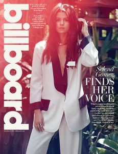
Image one is Selena Gomez’s Billboard magazine cover. This combines graphic design and photography. The logo stands out along the side and the cover is relatively simple with limited text. The lighting and colours also work well to bring another element in. In terms of Platon, the image has a story which marries with the cover story because of her wearing a suit-style outfit which conveys power and would especially connect with woman who want to be empowered.
Image two is a Starbucks Christmas print/billboard advert. It is very simple but clearly conveys that Christmas drinks are back at the coffeehouse due to the creation of a Christmas tree from the whipped cream and star at the top. This is clever design as the images haven’t been distorted, just well edited or photographed. This has a message due to what it’s advertising. Christmas is also associated with spending time with family and would, therefore, create a connection with the audience, especially as there are three drinks which implies three people.
Image three is of several drinks bottles arranged by colour in order of the rainbow. This image is visually appealing to the audience because of the way the images have been positioned for the photo, especially because of the colour order and because you can follow the trail from top to bottom. This image contains older bottles which may make some audiences connect with the image due to the nostalgia they feel but in terms of a message and story, is more about exploring colour in everyday objects.
Joe Sparano said ‘Good design is obvious. Great design is transparent’.This is true as when a design works well, a message starts to come through that the audience can understand and interpret. Images one and two do this the most whereas three has less of a message/story. Han Hoffman once said ‘Design is the intermediary between information and understanding’. This works for these images as the design allows the audience to create a connection and feeling to interpret the information in order to understand the message/story.
References
- Abstract: The Art of Design – Season 1, Episode 7 – Platon: Photography (2017) TV series. USA: Netflix
- bb30-selena-gomez-cover-2015-billboard-510 (2015) Selena Gomez Billboard Cover. JPEG image. billboard.com. [Online] Available from: https://www.billboard.com/photos/6429433/billboard-2015-the-covers [Accessed 24 November 2017]
- Starbucks Christmas drinks print (2016) JPEG image. fespa.com [Online] Available from: https://www.fespa.com/en/news-media/features/top-20-christmas-print-adverts-from-around-the-world [Accessed 24 November 2017]
- Drinks bottles (2017) Julie Ream. Encyclopedia of Rainbows: Our World Organized by Color [Hardback]
- SPARANO, J. (N/A) Joe Sparano Quotes [Online] goodreads.com Available from: https://www.goodreads.com/quotes/510598-good-design-is-obvious-great-design-is-transparent [Accessed 24 November 2017]
- HOFMANN, H. (N/A) The Digital Designer of the Future [Online] medium.com Available from: https://medium.com/bridge-collection/the-digital-designer-of-the-future-72cc0765f3e8 [Accessed 24 November 2017]
