‘Counterculture’ is a culture in opposition to the mainstream culture exercised through protests. In the 1960’s the movement involved mainly college youths who didn’t agree with their societies morals or values, they fought against this through peaceful protests. This counterculture movement created a spark of new design and ways of life. Paula Scher discussed in the film Abstract, design having sensibility and spirit and if you combine these two together with meaning, that’s spectacular and can been seen throughout this collection of work.
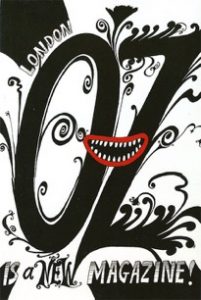
Oz magazine was launched in 1967 and became Britain’s more renowned underground magazine, today Oz is a very iconic and symbolic representation of the 60’s as a whole.
‘They were pretty dull stuff,’ remembers Richard Adams, who worked as a designer on the magazine. ‘And then the drugs took hold. And suddenly there was this complete explosion – colour, design, subject matter.’
The magazine designs follow the culture from the era, showing the counterculture in its true state. “Oz celebrated psychedelic drugs and new sexual freedoms, radical politics, philosophy and rock’n’roll” says Felix Dennis. I really like the sense of psychedelia you get from the typeface alone; the slight italic tilt and swirly lines added to the outline of the letters really captures that known 60’s trippy vibe. It shows sensibility within the image, just like Paula was saying.

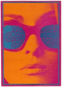
Victor Moscoso’s first independent poster series was named ‘Neon Rose’. His work is very aesthetically pleasing to look at, this is through the use of a vibrant colour pallet throughout his posters; creating the well-known psychedelic effect within his art.
Moscoso says “The musicians were turning up their amplifiers to the point where they were blowing out your eardrums. I did the equivilant with the eyeballs…”.
Besides his amazing colour pallet, I particularly like his use of composition and spirit.

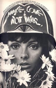
My third image is a photograph of a young innocent woman protesting the counterculture movement through anti-violence with the tagline ‘make love not war’.
The mixture of the helmet, slogan, females beaming eyes and flowers create this surreal juxtaposition and sense of innocence, therefore again adding to the fact it’s a peaceful protest. The helmet is a connotation of WW2 and it has been used to show that even though this movement isn’t violent, the importance and meaning is still a battle.
Bibliography
Abstract, The Art of Design. (2017). Retrieved November 24, 2017, from Netflix: https://www.netflix.com
Sharp, M. (n.d.). Oz. Retrieved November 24, 2017, from Pinterest: https://www.pinterest.co.uk/pin/253749760227298982/
Brown, M. (2017, July 28). Sex’crazed Rupert the Bear and other stories…The obscenity trial that brought down Oz Magazine. Retrieved November 24, 2017, from The Telegraph: http://www.telegraph.co.uk/men/thinking-man/sex-crazed-rupert-bear-stories-obscenity-trial-brought-oz-magazine/
Moscoso, V. (1967, March 28). Neon Rose Posters. Retrieved November 24, 2017, from Classic Posters: https://www.classicposters.com/Neon_Rose
Magazine, E. (n.d.). Eye Magazine. Retrieved November 24, 2017, from Pinterest: https://www.pinterest.co.uk/pin/279082508130188283/

