Post modern design began in the late 60’s it gained popularity in America, the movement was a reaction of a new generation of open minded people who created completely new radical ideas that was against the modernism . The principles of post modern design was an object and an idea with satirical quotes or photography , the idea behind post modernism is geometric shapes going against traditional conventions no grids just messy design.
Barbra Kruger is a great example  of post modernism the poster I have chosen has typography with the words “not stupid enough” with an iconic photograph of Marilyn Monroe in black and white this shows the typical aspects of post modernism. Such as bright bold typography with provoking words and the image combined a piece of art that shows the viewer the fight the young actress had in the spot light, the fight of a woman and her body as well as the constant battle of her emotional thoughts.
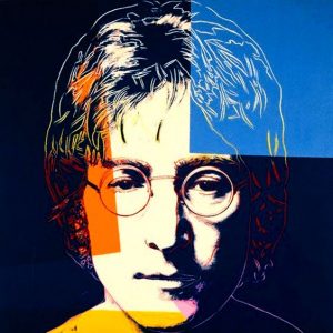
Another artist that made an impact to the art world as this time was Andy Warhol. As well as post modern begin messy design using photos collage broken text, splatters colours, black and white photography with colourful splashes of text and bright vibrant colours. the one thing Andy Warhol was good at is colour. One of my favourite images created by Warhol is an image of John Lennon although he’s most famous pieces are of Marilyn Monroe screen prints both of the images are very similar in the fact that it shows the destruction and break down of his frame using bright constructio n colours.
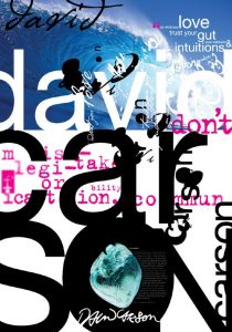
Typography also played a major part in post modernism and David Carson is one of the most well known typographers of that time known as “the art director of the era”- creative review London.
His work uses raw photography full of texture, vibrant colours and excitement is balanced against soft focused images creating a contrast within the design without over complication the designs he also uses text to break up the vibrant colours and textures as well as creating some contrast to the design.
I personally love all of these designers and combine different aspects of there work in my own for example I rely strongly on colours like Andy Warhol.
links to images:
https://www.bing.com/images/search?view=detailV2&ccid=Lf4aYNSd&id=27A9F716883376DDB4224343DD820B1E95E45876&thid=OIP.Lf4aYNSdFKOU9xu0HzWyyAEsEa&q=andy+warhol+john+lennon&simid=608034308675731710&selectedIndex=29&ajaxhist=0
https://www.bing.com/images/search?view=detailV2&ccid=DdWTKC7W&id=7ABDBE5971B10E0129316E3B3665D2C0B0C957D5&thid=OIP.DdWTKC7WSFOHE0mZ9WFxEAEsEs&q=barbara+kruger+marilyn+monroe&simid=608011828788397241&selectedIndex=2&ajaxhist=0
https://www.bing.com/images/search?view=detailV2&ccid=c3CSA%2bUb&id=7CAE2D9D66CA8C8E2C9C2F5516F0AE1D89504A7A&thid=OIP.c3CSA-UbMFwweruFNPrd8ADSEs&q=david+carson+poster&simid=608024649281308109&selectedIndex=0&ajaxhist=0

