Postmodernism is an art movement that specifically goes against the principles of modernism. Modernist artists looked for definite answers and clarity on the world whereas postmodernists questioned the world and its truths, looking more into personal experience.
This idea of exploring personal experience can be seen a lot throughout the work of Tracey Emin. One of her most famous and controversial pieces is the installation “My Bed” created in 1998.  Having seen the piece in real life, it is shocking. It completely goes against the ideas of the modernist movement. It’s messy, chaotic, dark and full of emotion. Although this installation is more fine art than graphic design, the shock factor and controversy is what interests me about the work. I like the idea of making people think strongly about my work which is exactly what she achieves.
Modernist ideas and values were also being rejected in the design world. Take designer Wolfgang Weingart and his experimental typography:
The actual typefaces that Weingart used were very similar if not the same as those used by the modernist designers. What Weingart did however, was to take this perfectly constructed Swiss design and deconstruct it. Putting elements at unusual angles, covering some of the type and layering things up.
“I experiment simply to broaden my knowledge of the vocabulary and techniques of typography. What gives me satisfaction is the practice, not the theory.” (Weingart. W, 1991)
As someone with a passion for typography, Weingart is a great designer to look at. I think it’s so important that we as designers continue to explore the limits and variations typography can provide.
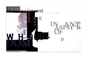
Another designer that goes against traditional layouts and typography is David Carson.
This piece of design was for an interview with the singer Morrisey. He found a quote and took it apart, placing the words all over the page, covering half the face of the artist to look ‘mysterious’. This crazy approach to design completely reflects the ideas of postmodernism- to experiment, to stop conforming to these perfect ideals.
Carson’s experimentation with page layout is something that really interests me and definitely something that would be important for myself to look at as I continue to design.
References:
- Tracey Emin’s My Bed: TateShots (2017) Available at: http://www.tate.org.uk/context-comment/video/tracey-emins-my-bed-tateshots (Accessed: 16/111/2017).
- Reputations: Wolfgang Weingart (1991) Available at: http://www.eyemagazine.com/feature/article/reputations-wolfgang-weingart (Accessed: 16/11/2017).
- Burton, P. (2017) Wolfgang Weingart. Available at: https://www.aiga.org/medalist-wolfgang-weingart (Accessed: 16/11/2017).
- Butler, A. (2017) Interview with Graphic Designer David Carson. Available at: https://www.designboom.com/design/interview-with-graphic-designer-david-carson-09-22-2013/ (Accessed: 16/11/2017).
