
During the 1960’s op art was a major development within painting it involved using geometric forms to create optical effects, capturing the imagination of the public. ‘The fashion, design and advertising industries fell in love with it’s graphic, sign-like patterns and decorative value.’ [1]
Bridget Riley ‘untitled [fragment 3/11] is an interesting piece of op art, Riley was considering the tensions found in the tight and loose undulations of lines. The raw edge sides contrast against the top and bottom edges so the viewer is immediately drawn to the pattern. The weight of the ragged lines prompts me to think of typeface and how they also vary in weight.

Untitled [Fragment 3/11] 1965 Bridget Riley born 1931 Purchased 1970 http://www.tate.org.uk/art/work/P07106
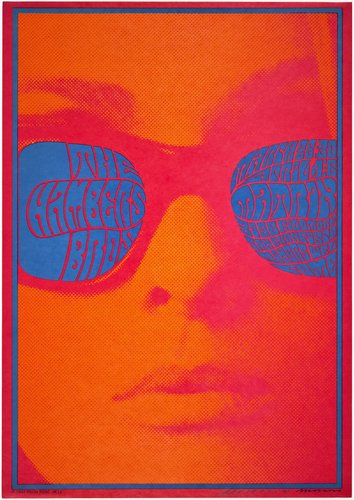
Victor Moscoso is best known for his psychedelic work during the 1960’s and 1970’s. It was during the 60’s that he started his own company, Neon Rose. This venture allowed him to have complete artistic control over the posters and the series ‘is noted for some of the most iconic images of the psychedelic era.’ [2] The series is so vibrant and intriguing you can definitely see the sprit of the 60’s within the posters. One of my favourites is ‘Neon Rose #12’ interestingly Moscoso only printed one of these posters however, it is his ‘most popular and iconic image.’ The contrast of the catalogue like image of the woman against the typography is engaging. The typeface is playful and placing the typography in the frame of the glasses is successful. The overall piece is fun and captivating without being too busy and overwhelming.
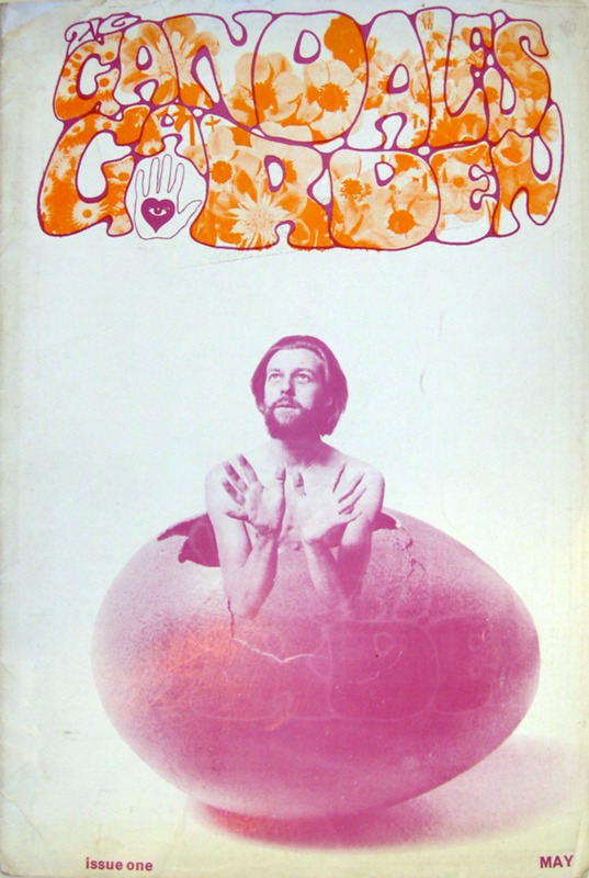
During this era young people were liberated and they found their voices. Music, films, art, politics and culture shifted to celebrate this new era. The ‘underground press/papers’ was a result of this. Gandalf’s Garden was a magazine that emerged during this era and ran to 6 issues. It differed from the distinctive black and white pages seen in the International Times and OZ. Its design approach was much gentler than some psychedelic magazine covers. The image here is from their first issue, the overall design is refreshing. The contrast of the photograph of the man (Muz Murray) against the typeface is pleasing. The colours chosen work well with one another and aren’t overwhelming. Furthermore, I think the typography really encompasses the sprit of the 60’s.
These three images are very interesting as they’re all very different but they’re important when considering my interest in graphic design. Graphic design involves various elements and these three images are something I could be inspired by. The composition and design layout of a poster, the typography and the shapes and patterns.
- 1-Tate. (2017). ‘Untitled [Fragment 3/11]’, Bridget Riley, 1965 | Tate. [online] Available at: http://www.tate.org.uk/art/artworks/riley-untitled-fragment-3-11-p07106 [Accessed Nov. 2017].
- 2-Victormoscoso.com. (2017). Victor Moscoso >> Neon Rose Series. [online] Available at: http://www.victormoscoso.com/gallery1.htm [Accessed Nov. 2017].
- Bromwich, K. (n.d.). Covering the counterculture: the 60s underground press – in pictures. [online] the Guardian. Available at: https://www.theguardian.com/media/gallery/2017/sep/23/covering-the-counterculture-the-60s-underground-press-in-pictures [Accessed Nov. 2017].