

Reid miles, Blue Notes Records, Album Cover for Joe Henderson, In ‘n out 1964.
Reid Miles ‘In ‘n out’ album art for Joe Henderson (1964), uses playful yet simple typographic elements, to play on the rhythm and stylization of Jazz music at the time. Within this time of underground culture, the attitude towards Jazz music was being seen as ‘cool’ and ‘revolutionary’. Something I appreciate as a Graphic Designer, is how Miles’ experiments with a sleek and modern aesthetic, due to the playfulness of letter forms, treating them as ‘visual elements that can be broken apart’ ; this also helps with the use of shapes. The scale of type and consideration of negative space, enables Miles to create a ‘new’ , simplistic turning point to Graphic Design, compared to the propaganda posters that people were used to previously. The ‘new’ style helps promote the idea of Jazz being seen as the upcoming underground trend – ‘His covers sound like they know what lay in store for the listener’ (Marsh, G. Callingham, G. Cromey, F, 1992, The Jazzy Blue Notes of Reid Miles).

Grace Slick and the Great Society / 13th Floor Elevators Fillmore Auditorium Concert Poster Bill Graham 1966 Poster Art by Wes Wilson.
Wes Wilsons work focus’ on the psychedelic styles of the 1960’s, communicating the radical impact of creative culture towards society at the time. What inspires his work was ‘a little bit of both music and the times’ (Montagne, R, 2016); the idea of freedom and love. Wilson uses loose forms in the compositions of typography and the letter forms themselves to express this, along with an attractive female within mostly all of his designs. His work would help communicate a sense of togetherness within society, by advertising the events in which the new hippy beliefs were expressing.
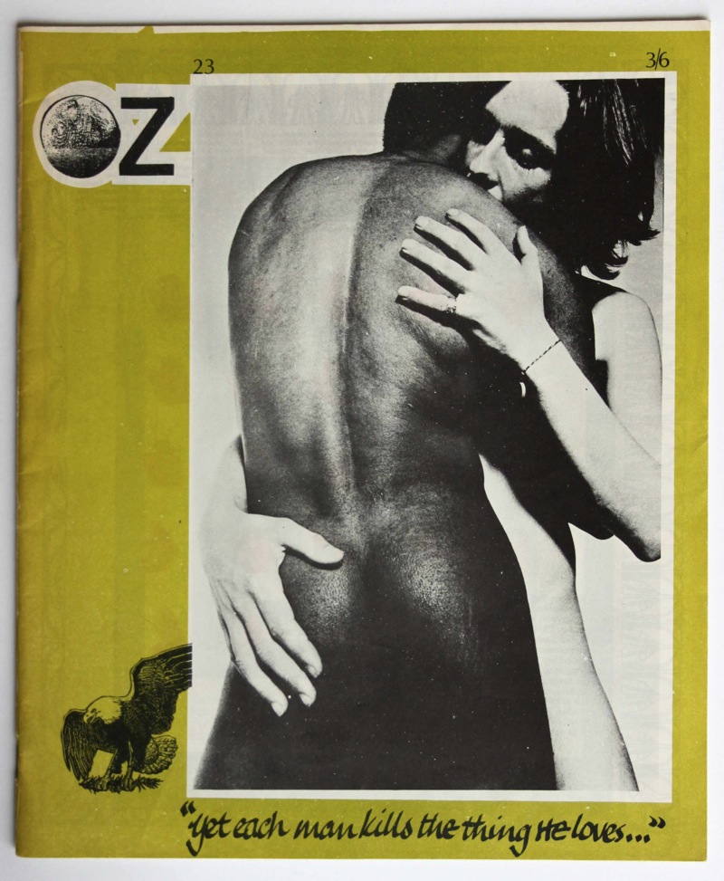
Oz 23 cover, by Richard Neville, photograph by Keith Morris, 1969.
Oz magazine persistently pushed the boundaries of cultural norms through each issue, as times were changing and the younger generations were becoming more open to new views. On the front cover of issue 23, it glorified the relationship between a black man and a white woman. Considering the strict racial beliefs of the time, it would have been a shock; especially since the two people are engaging in the closest contact possible (naked bodies touching). From a graphic design outlook, creating the image to be an extremely large scale , with little typography, foreshadows the impact the cover would have towards a society, to help normalise black and white skin together.
Bibliography:
Charchar, A. (2010). The Jazzy Blue Notes of Reid Miles. Available: http://retinart.net/artist-profiles/jazzy-blue-notes-reid-miles/. Last accessed 8/11/17.
Marsh, G. Callingham, G. Cromey, F (1992). The Cover Art Of Blue Note Records: V. 1. England: Edition Olms.
Montagne, R. (2016). Psychedelic Font: How Wes Wilson Turned Hippie Era Turmoil Into Art. Available: https://www.npr.org/2016/05/13/477900499/psychedelic-font-how-wes-wilson-turned-hippie-era-turmoil-into-art. Last accessed 8/11/17.