Artwork from the generation of the 1960s, was about revolution and rebellion and artists of the time created a way of responding to the War and government through music and art. When exploring ‘counter culture’ more and finding what artists had created in the 60’s and 70’s I found that bold contrasting colours and designs stood out to me the most, whilst I found that the most successful designs were those that filled the page entirely.”From a graphic design standpoint, psychedelia marked the switch from the strict modernist style of clean lines and clear type into a hodge-podge of influences, references and experiences”.
Psychedelic art was influenced by drugs, mostly hallucinatory such as LSD where the world was seen in kaleidoscope patterns including, abstract swirls using complementary colours and influences from Art Nouveau.

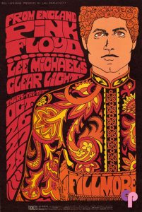
Bonnie MacLean/ Pink Floyd/ 1967
Bonnie Maclean was an artist who adopted the psychedelic style of art that was popular at this time and used it in her work. She predominantly focused on rock and roll poster art. I find that the colours are typical to the time and the style is very common amongst the psychedelic movement. The “spirals could often be found in Psychedelic works as well as concentric circles and a repetition of motifs or symbols” which is true to the movement.
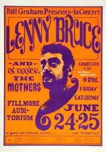
Following on from the movement, another big artist in the psychedelic world was Wes Wilson who’s work I find intriguing as he uses a lot of loose type and allows the letterforms to express themselves, with an illustrational style. Wilson uses the psychedelic style to communicate the radical impact of the underground culture in society. His work could bring people together. He also uses complementary colours within his poster which become more appealing.
Bibliography:
http://www.arthistory.net/psychedelic-art/
http://www.wes-wilson.com/
Duncombe, S. (2008). Notes from Underground: Zines and the Politics of Alternative Culture. Microcosm Publishing.
Dyer, G. (2015). Underground Culture isn’t dead – it’s just better hidden than it used to be. theguardian.com/…/underground-culture-isnt-dead-geoff-dyer
Rawsthorn, A. (2009). http://query.nytimes.com/gst/fullpage.html?res=9D0CED6173FF935A25750C0A96F9C8B63


