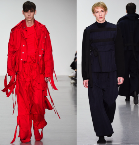
 I’ve chosen to look at Craig Green’s A/W 15 collection, as his garments entail a lot of structure and shape. The actual designs don’t look ovelry complicated but the accessories Green adds make the garments such as: belts, ties, pockets etc.
To get an overview of the collection itself, I’ve decided to also look at some of the earlier work of photographer Nick Knight who directed Green’s first campaign video and compare the two.
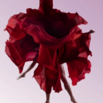
In 2011 a short fashion film called ‘dynamic bloom’ was created by combining contemporary  dancers and mainly women’s wear. Knight has captured the figures in movement, gliding through the air and forming silhouettes with the deep red sheer fabric which looks like flowers.
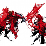
4 years later,the campaign in which Green and Knight worked together on ,looking at this image, it reminds me of martial arts because of the pose they’re paused in and the colour palette used. Black is commonly known to suggest  fear and death whereas red symbolises strength and passion. Immediately you can see the difference between them, this one includes bolder and more abrupt shapes. Even the use of a plain white background makes everything stand out and look more current and modern in comparison to the dimmed pink backdrop used in 2011.
In conclusion, I think this sums up Green’s style as a whole as all of his collections are very consistent in the sense they’re very uniform and structured but the different colour palettes and materials he explores with makes them slightly different each season.
