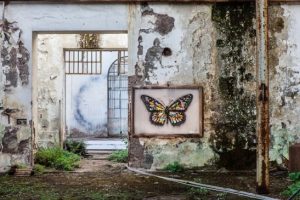
The artist used acrylic paint and spray paint to complete this piece. His background was a large canvas measuring at 80cm x 101cm. Whatson used spray paint to create the graffiti style patterns within the wings as well as the thicker black areas of the butterfly, shown by the small specks around it which gives the effect of shadowing. Behind the butterfly, is a light wash of colour with faint white lines painted over the top to create texture and to make it realistic like the butterfly has landed on something. The photographer, Alberto Blasetti, has shot the image at eye level with the art work slightly off centre. He has created a sense of depth in the photograph by including the walls of different rooms in the building. The use of the wide angle gets the viewer to look at the whole image instead of just focusing in on the art, which has become embedded in the photograph. From looking at Blasetti’s other images in his ‘Art’ collection, I have noticed a similarity in the angles of which the photographs were taken. The majority of the shots have been taken at eye level however, the images of art work taken in a gallery have been taken at a side angle to include the shape of the room. I have also noticed that all the other photos have a white background so the eye focuses on the art however, with the outside butterfly image, the photographer has purposely used it as part of the whole composition.
Task 5/6 – Visual Research
Leave a reply
My chosen designer is Gucci. The image I chose is of a piece of artwork by Martin Whatson. It is a painting of a butterfly with colourful graffiti wings inside of a wooden frame which is hung on a wall of a derelict building. I liked this image as I liked the way the painting, which is of something natural, was placed on something manmade. I also like how the butterfly and the frame around it is in perfect condition, where as the building is a contrast with peeling paint and rust.

