A(3)
As it has updated it since I last played, I’m going to look at the UI for Space Engineers (A game I very commonly misspell albeit love to create in). Whilst the improvement is minimal, it has increased usability by a genuinely good margin. From left to right we have:
A set of Grouped items for the character. From what the icons tell me, J does something with the character’s helmet, X does something with the Jetpack, O does something to do with communication and L does something with a flashlight. As one is faded out, I assume these are toggles. There is then a clear indication of a Helath Bar, Oxygen and Hydrogen levels, and Energy left in the character’s suit, all made of four bars (Clearly 25, 50, 75 and 100% respectively) with an exact percentage on the right. There is also a speedometer with exact speed at it’s centre, and the dampeners (Clearly labeled as being controlled with Z) states whether they are on or off.
We then have a set of items that we associate due to Continuity (They are in a horizontal line). The empty squares are clearly labeled with numbers, and the smaller squares below are also numbered (It doesn’t show in the image, but it does state that Ctrl is required to change toolbars). Which item is currently selected is shown by the border turning a light blue. There is also a measurement showing Real and Artificial Gravity levels, alongside an instrument that shows the players angle to the “Ground”.
Finally, we have another set of Grouped items (similar to the first group) that is used for Ships. It includes toggle symbols (we know this due to their similarity in placement and style to those on the left) for Power (Y), Communication (O again) and some form of emergency button (P, although I honestly have no clue what it does). Below are measurements for Weight (The ton weight next to it and the “Kg” inform us of this), how long the power aboard the ship will last (Evidenced by the battery and timescale next to it), another power reading (This is infact power usage as % of how much is being produced, although this isn’t clear), and Hydrogen levels once again.
All in all, it is an informative UI that does a very good job, albeit it does have some flaws (The game is in Beta however, so I’d say it’s pretty good for a Beta)
B(1)
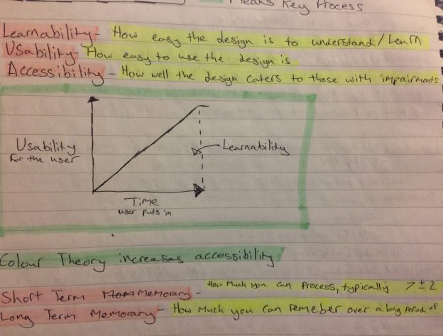
HCI is very important when designing the User Experience of a game. Some factors that stop people from continuing to play a game are Accessibility, Usability and Learnabilty, which are three concepts of HCI itself. Accessibility is all about making the product open and usable for people, no matter their physical or mental ability. This means making the product easy to get a hold of and including features to allow the disadvantaged to continue using the product e.g. screen readers and the such (Like the Alt Text of an image, hence why I try to include Alt Text in the images I put in these blogs).
Usability and Learnability are directly related, in that Usability is how easy to use the software is (e.g 3 click rule on a website, simple controls in a game, etc) whilst Learnability is measured by how easily the user learns how to use the program over time.
Game Design should have these concepts in mind as they change the User’s view of a product as time goes by, and so these concepts need to be perfected to ensure a game gets long-term players and a great community.
Refrences
Keen Software House, Space Engineers, V1.184.6


