
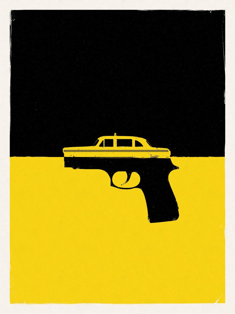
My first focus was this screen printed piece of graphic design inspired by the film Taxi Driver (Yan, 2013). This piece is minimalistic, relying on the strong juxtaposition of colour to draw the eye rather than large amounts of detail. The contrast of colour is striking, visually splitting the image in half, while evoking imagery of the New York cab through the bold yellow and black. Yan merges the image of the taxi and gun perfectly – the flat simplistic imagery fits seamlessly in this minimalistic poster, combing two important elements of the movie – the facade of the taxi driver hiding a gritty truth. This imagery is once again aided by the colour scheme, inverting the colours used in the background. The texture created through the use of screen print gives the poster a worn feel and stopping it from looking too flat and simplistic. I love design with a more illustrative element to it, and I find the intelligent simplicity of Yan’s design inspiring.
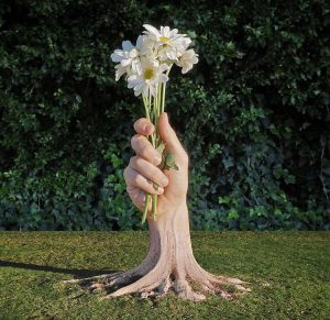
Continuing with the use of contrast I was drawn to the “combo-photo” work of photographer Stephen McMennamy (2016). I particularly like the composition of this image, which sees the trunk of a tree merged with a hand. Similar to Yan’s work, McMennamy strategically combines two images to create an otherworldly piece. However while Yan amplifies the divide between the two halves of his piece, McMennany uses the divide of the two images to his advantage to create a blended background. The eye is immediately drawn to the hybrid figure, helped by similarities in tone and size to make the images truly come together and create this striking piece.
Bibliography
- Yan, B. (2013) Travis. [image] Available at: https://hcgart.com/collections/wocp2-ol/products/travis [Accessed 18/10/17]
- McMennamy, S. (2016) flowers & hand + tree. [image] Available at: https://instagram.com/p/BEezgaRnGxg/ [Accessed 18/10/17]