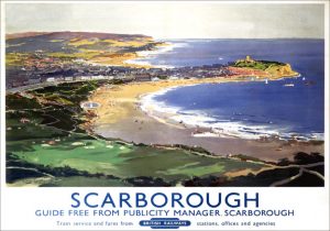
The first image I have chosen to look at is by Frank H Mason, a renowned artist and sub creator of the ‘Art Deco Travel era’. Mason is best known for his maritime artwork and designs for the British Railway Posters of the 1930’s. The poster I have decided to focus on is Frank’s interpretation of ‘Scarborough’, which can be found on display at the National Railway Museum. The poster, although produced almost ninety years ago, remains modern and timeless in its composition. This is partly due to the use of retro, contemporary colours which give off a modern tone. Mason’s work is also relatively flat in style, unlike some of his more intricate maritime works of art. This, along with the use of the ‘Gill Sans’ typeface used, further creates a classic and enduring piece.
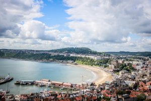
The other work I have chosen to research is by Mandy Charlton, a photographer, writer and blogger from Newcastle upon Tyne. Mandy specialises as a portrait photographer by trade, however it was one of her landscape pieces that caught my eye when reading her ’24 Hours in Scarborough’ blog. This particular photo caught my attention due to how well it captures the essence of Scarborough as a ‘charming coastal town’. It differs to Mason’s piece, as it shows a more recent presentation of the seaside through different medium. The reason the pieces work so well in comparison is that they both portray Scarborough’s quaint ambience that has remained over the last century. Both pieces also influence me in my own work as they both show a sense of timelessness, which I think is important in all aspects of design.
Image 1- charlton, m. (2016). 24 Hours In Scarborough Part 1, Scarborough Sea Life Sanctuary. [online] Mandy Charlton – Photographer,Writer,Blogger. Available at: http://www.mandycharltonphotographyblog.com/ [Accessed 8 Jul. 2016].
Image 2- Scarborough Coast Yorkshire. (n.d.). [image] Available at: http://www.travelpostersonline.com/scarborough-coast-yorkshire-br-vintage-travel-poster-by-frank-henry-mason-1948-537-p.asp [Accessed 27 Nov. 2017].


