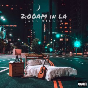
The album artwork for Jake Miller’s ‘2:00am in LA’ uses photography for the main image. The image looks as if it has been edited together but the bedroom setting was taken to the location. I feel that the album cover helps to support the title and theme that runs throughout the songs by creating the idea of wanting a quiet and relaxed lifestyle in a busy city. The artwork’s made up of three elements: the title, artist name and image. However, it still feels busy despite these being the only elements. The tone, therefore, feels hectic and contradicts the implied meanings of the image and title. Two different typefaces are used, one which is a marker-pen style, handwriting typeface whilst the other is serif typeface which creates a more serious tone and consequently represents the artist to be serious as his name is written in the typeface.
The other image I looked at was ‘All the Buildings in Sydney’, an illustration by James Gulliver Hancock. I usually prefer digital work like the album rather than illustration. This is relatively simple with most of the buildings being line drawings and only two colours being used for detail. The artist grew up in Sydney so the work is personal which is similar to the album as it has personal meaning for the artist. Both appear to be quite busy yet are actually minimal in their design by only having key features. Both also use a city as the main focus but is what makes the images appear busier but represents the city lifestyle well.


References
- Jake Miller 2am in LA album cover (2017) JPEG digital image. Allaroundnewmusic.com. [Online] Available from: http://allaroundnewmusic.com/jake-miller-palm-blvd-new-video/ [Accessed: 16 October 2017]
- Hancock, J.G. (2015) JPEG digital image. Allthebuildingsinsydney.com. [Online] Available from: http://allthebuildingsinsydney.com [Accessed: 16 October 2017]
