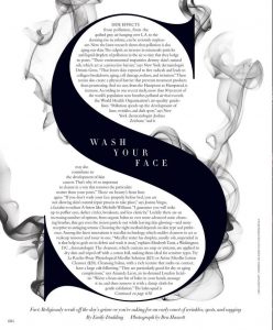
 This is my first chosen image. I was drawn to this as soon as I saw it. The hierarchy is amazing. They exaggeration of the S really attracts peoples attention, and you will definitely not miss it. So thats the first positive of this layout, the fact that it draws the audience in at first glance. They have highlighted the S for the “side effects” which is what people would want the most information on. In the centre they have placed the title “wash your face.” The type that they have used it quite bold and the whole imagine looks powerful altogether. The contrast between the black and white has also given this article a less is more vibe. They have no overloaded with colours, this is probably because the article is not such a positive or cheery topic. The black and white colours highlight the seriousness they are trying to put across. The smoke appearing to come from the S also shows something of a toxic nature, something that is causing problems for the S. Again this is to highlight the side effects, the toxic and negative side effects.
 A very simple typography publication. Has a strong hand made feel to it, almost like a simple doodle. Very well put together, along with the white on dark blue. The colour scheme draws attention to the centre where the artist most likely wanted it to be. The illustrations gives off a happy and friendly vibe, which could be the reason some people become drawn towards it.
- Jennifer Wick Laos (n.d) Typographic Poster Available at: https://www.google.co.uk/amp/s/www.pinterest.com/amp/pin/510384570248084351/ (Accessed 28 November 2017)
- Ben Hassell (n.d) Harper’s Bazaar Available at: https://www.pinterest.co.uk/harpersbazaar/ (Accessed 28 November 2017)
- Anonymous (n.d) Scandinavian posters Available at: https://www.pinterest.co.uk/ManonGhiurco/scandinavian-posters/ (Accessed 28 November 2017)

