
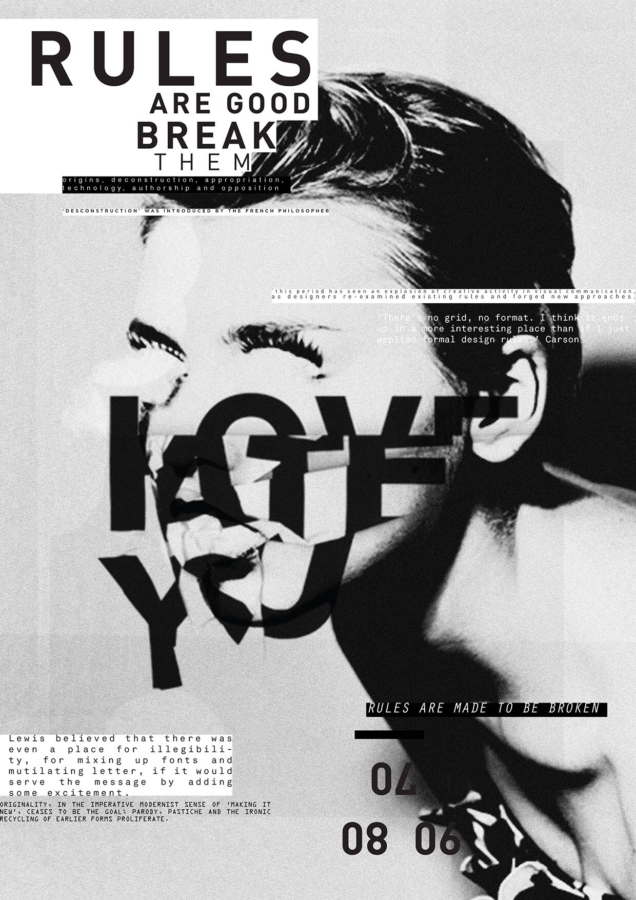
 This poster is a postmodern Graphic design. It’s a mixture of photography, and typography.
Personally, I find this very interesting, with the jumble of words and the imagery. The photograph is in black and white, which makes the black and white typography match the image. I also prefer to use a black and white image if I do add imagery into my typography work. I feel like an image with colour complicates the whole thing, and the more minimal it looks, the better in my opinion. It’s not that harsh on the audience’s eyes, but it does look confusing at first glance. Some words are cut in a way that does not make sense when you first look at it, but this is what makes it different, meaning it would attract more attention. It also says ‘rules are good break them’’ which relates to the whole layout, it’s not your tradition perfect in order typography poster.
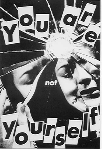 Again a very different design. The placement is not in perfect order, type is scattered around and there is again no use of colour. The design is very strong on its own, no colour was needed. The quote works well with the image used, pointing that the person in the cracked mirror is not themselves. I am interested in the cut out look of the typography, looks almost child like.
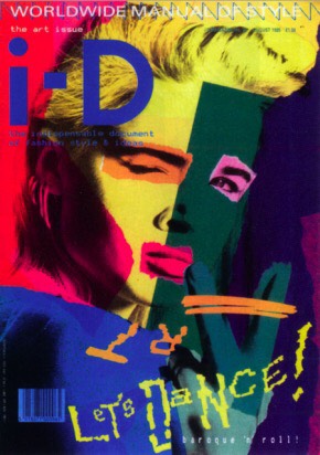 Because I gave two examples of postmodernism art without colour, I decided to choose one with colour for the final. This one is such an eye catching design, guaranteed to grab the audiences attention. This design definitely cannot be missed. This is the upside of postmodernism work, I think it grabs the attention of many people. Placements look great, the whole cut and paste look is adding more to the busy look of the page.
Looks fuller than the other two, probably because colour is involved. In my opinion the colour scheme that is used here does not work well together, but for this design it certainly has. It gives it that look of postmodernism.
- Anonymous (n.d) posters. Available at https://www.pinterest.co.uk/pin/432345632962991346/ (Accessed 20 November 2017)
- Xinying (2011) ‘Postmodernism? What exactly does Postmodernism art look like?’ Post Modernism Graphic Styles 23 August Available at: http://postmodernismgraphicstyles.blogspot.co.uk/2011/08/post-modernism-visuals.html?m=1 (Accessed 20 November 2017)
- Xinying (2011) ‘Postmodernism? What exactly does Postmodernism art look like?’ Post Modernism Graphic Styles 23 August Available at: http://postmodernismgraphicstyles.blogspot.co.uk/2011/08/post-modernism-visuals.html?m=1 (Accessed 20 November 2017)