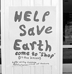
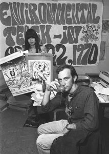
In this photograph, you can see the handmade typography on their poster. It looks like a psychedelic typeface which relates to the environmental organisation they created. Psychedelia reminds me of nature, natural, flowy and altogether a positive image. So, I think that by choosing to create their poster with this specific type really worked for them. It gives people a feel of their organisation. Typography is so powerful that people do receive vibes from certain types. Also, the small illustration makes the whole thing more playful.
 This second poster is again using psychedelic type. Although it is not as extreme as the first poster. It relates to the whole Earth theme once again, adding to the natural look. This one is not as neat and tidy, or as put in order. It appears to be more scattered. Although this could be to add more to the natural feel that the makers are going for. It also adds a more playful and fun feel to the posters proposal. It seems to be not a very serious poster, I am basing this just off of the type that was used. This shows again how powerful type can be.
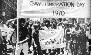
 This is a gay youth march in the 1970’s. The typography used here is very simple, not much to it. Just a plain title, and year. Does not give a whole load of information but we all know what it is. Sometimes less is more, although not much is put onto this, it gives a big message. The type that is used, is quite bold and out there. It definitely attracts attention in my opinion. It’s so neat and a strong typeface, it is powerful in itself.
- Anonymous (2009) The First Earth Day–Bell–Bottoms And Gas Masks Available at: https://news.nationalgeographic.com/news/2009/04/photogalleries/first-earth-day-1970-pictures/photo7.html (Accessed 28 November 2017)
- Anonymous (2009) The Specter of Environmentalism Available at: http://archive.oah.org/special-issues/teaching/2009_06/ex3.html (Accessed 28 November 2017)
- Anonymous (2012) 1ST ANNUAL GAY PRIDE MARCH, 1970 Available at: https://www.charentonmacerations.com/1st-annual-gay-pride-march-1970-2/ (Accessed 28 November 2017)

