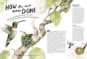
The first illustration by made by Byron Eggenschwiler, and published in a magazine called Cottage Life. The message is an educational one- the illustration accompanies an article about birds and how they made their nests. The illustration, I think painted in watercolour, really draws the viewers eyes in, and the double page spread catches your eye when you’re reading it. I think the colour scheme is effective; the range of pale greens and browns is cohesive and is pleasant to look at, as bright colours would just be overwhelming.
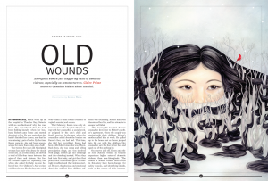
The second illustration was published in fine art magazine called Maisonneuve, and by an artist called Selena Wong. Her piece “OId Wounds” won gold in the lllustration category. I’m not sure what style her illustration would fall into- it has aspects of surrealism and pop surrealism, but I think her imagery is very effective. The story behind the piece is to show the struggles of aboriginal woman with domestic abuse, and the woman’s hair being twisted around the trees shows the message of being trapped, with only half of her face showing like she’s hiding. At first I didn’t understand what the illustration was trying to show, but when I read the article I suddenly understood all the details in the painting. I think it’s a very powerful image.
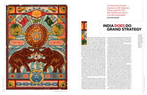
The third and final illustration is by Christian Northeast, published in Global Brief, an affairs magazine. The piece is titled “India does go grand strategy” and is screenprinted. What stands out to me about this illustration is the aesthetic and the overall look of it, it reminds me of an old circus poster. I can see how this links in with the content of the article- elephants and tigers are animals found in India, however I think if he included some mandala patterns the link would be more obvious. To be honest I think the illustration doesn’t go well with the message- the colours look dirty and muted, whereas Indian culture is very colourful and vibrant. However I didn’t really understand the article, so maybe that’s why I can’t appreciate the little details in the illustration.
Eggenschwiler. B, 2015, How The Nest Was Done, Published in Cottage Life Magazine, Available < at <https://blog.magazine-awards.com/2014/05/15/top-10-canadian-magazine-illustrations/>
Wong. S, 2016, Old Wounds, Published in Maisonneuve Magazine, Available at < https://blog.magazine-awards.com/2014/05/15/top-10-canadian-magazine-illustrations/>
Northeast. C, 2016, India does go grand strategy, Published in Global Brief. Available at <https://blog.magazine-awards.com/2014/05/15/top-10-canadian-magazine-illustrations/>


