Counter culture is one of the subculture. The norms and values advocated by this culture are often very different from the norms of the mainstream culture, sometimes even the opposite. In art area, I think it means breaking the boundaries of design. As Milton Glaser said that “art is whatever”.
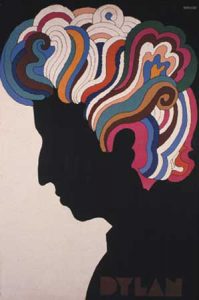
The first image is a poster which was designed by Milton Glaser. He is an American graphic designer, illustrator, and cofounder of the revolutionary Pushpin Studio. This poster designed for a singer-songwriter Bob Dylan who suffer a motorcycle accident in 1966. The designer get inspiration by a self-portrait of the singer, and he depicted his curly hair with bright and vibrant colors. The energetic color and vivid curly hair are visible sign of counter culture. In addition, the colorful hair take extreme contrast with the black face and white background, which make the poster becoming very attractive.
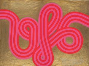
The next image is a poster for UFO Mk which designed by Hapshash and the Coloured Coat. Hapshash and Colpured is very influential partner of graphic design and avant-garde music in the late 1960s. They developed silk screening techniques that merged two or three colours with gold, silver and fluorescent colour “because fluorescents came up very strongly in the black light at the UFO club”. This poster aboves elements of Mucha, Ernst, Magritte, Bosch, Blake and Dulac, pulling them together in a style that art critic George Melly called “Nouveau Art Nouveau” and Time was beginning to call “Nouveau Frisco”.
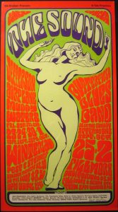
The last image come from Wes Wilson. It’s been 50 years since artist Wes Wilson invented the psychedelic font that was popular in the ’60 and ’70s. Wilson, fueled by the war in Vietnam and social tensions throughout the country, turned turmoil into art. This poster combines Wilson’s ability to fill all available space with vibrant, flowing letters together with his admiration and respect for the feminine form. The exciting color and the soft body of woman organized a vivid poster which like the following sound. I think the most ingenious point is the type which look very soft and like the feeling of women and voice.
https://www.moma.org/collection/works/8108?artist_id=2188&locale=zh&sov_referrer=artist
https://www.britannica.com/biography/Milton-Glaser
http://www.uisdc.com/classic-poster-design-in-history
https://www.theguardian.com/artanddesign/2016/sep/04/revolutionary-artists-60s-counterculture-v-and-a-you-say-you-want-a-revolution


