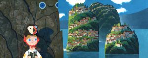
 The first image [1] is an illustration from Yvan Duque’s, a French illustrator, first child’s book ‘Comme Un Géant’, written by Marc Daniau. He normally works with gouache in a beautiful style and colour palette that is mesmerising to look at. The brush marks and other textures seen in his work add to the overall effect and is what I personally find very appealing in his and my own work which gives a personable feeling to his work.
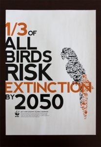
 This poster [2] is the work of Raewyn Brandon’s designed for their project for the WWF’s climate change brochure. The main requirements for this poster was for it to be a fold out publication of A3 size that would raise awareness. Throughout the publication they used clear and bold text with varying sizes to highlight its importance to the reader. In the posters such as the image to the left, the image of the animal is orange and black with the orange representing the statistic of the animals in risk of extinction.
Work such as this for the WWF is a key interest of mine that I would like to incorporate more into my work as it is a daily issue which many people don’t think they affect because their lack of connection even if it seems like a hopeless task. ‘Man is the only animal that is to be dreaded.’ (Jiddu Krishnamurti) [3].
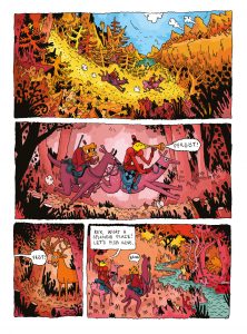
 This final image [4] is an excerpt from a graphic novel by Thomas Wellmann called Pimo & Rex published in 2013 originally in Germany and the UK. Wellmann is a freelance cartoonist who has also helped story board several episodes of ‘Adventure Time’ with Jesse Moynihan. Wellmann works illustrates his work digitally in a style that resembles lines that had been drawn traditionally which can be seen in videos that he had posted online [6]. [5] In his work the colour scheme is very consistent by using warm tones and colours, such as pinks, oranges and reds, which are very similar and makes details added subtle. The subtlety in his colours choices is something that I am interested in learning about and applying to my own work as I am unable to stop myself from adding more in terms of colours to my work to which I need to find a balance. ‘It’s unwise to pay too much, but it’s worse to pay too little.’ (John Ruskin) [7].
Bibliography:
[1] Yvan Duque. Tumblr. http://yvanduque.tumblr.com/post/166565692375
[Accessed 25/11/17]
[2] Raewyn Brandon. https://www.raewynbrandon.com/99u-conference-website-design/
[Accessed 25/11/17]
[3] Krishnamurti, J. (1987) Krishnamurti to Himself: His Last Journal. https://www.goodreads.com/quotes/tag/extinction
[Accessed 25/11/17]
[4] Wellmann, T. (2013) Pimo & Rex. Published 2013. Rotopolpress (Germany). Blankslate Books (UK).
http://www.thomaswellmann.eu/Pimo-Rex
[Accessed 25/11/17]
[5] Written by Chris McDonnell. Published 28/9/13.
http://www.cartoonbrew.com/artist-of-the-day/artist-of-the-day-thomas-wellmann-86248.html
[Accessed 25/11/17]
[6] Thomas Wellmann. Published 22/3/13. https://vine.co/v/bDmMY3KBVLP
[Accessed 25/11/17]
[7] Written by Kate Vitasek. Published 10/12/14.
http://www.vestedway.com/john-ruskin-and-penny-wise-and-pound-foolish/
[Accessed 25/11/17]
