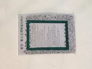
For my Manifesto project I chose to do mine inspired by William Morris. I worked on A3 and created a boarder which was full of ivy and flowers, I knew the space for the project was going to be large, so I wasn’t sure about creating something too small as I thought it would have been drowned by the surrounding Manifestos. After placing my work up, I realised from where I had done it larger the boarder wasn’t as tight as I would have liked it to be, as I had more space to fill the ivy was loose and you could see gaps of the paper underneath, which isn’t how I wanted it too look. If I were to change it I would defiantly make it smaller, as that means the illustrations around the edges would not have been so spread out and then it wouldn’t look as disorganised. With the colours as well, the one thing I can always notice is how it’s uneven, which if on a smaller scale I think I would have found it easier to create something that looked a bit more neater.

Task 12-
Leave a reply
