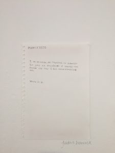
If I were to change an aspect of a piece of work I would make my exhibition piece for the Manifesto project a lot bigger.
The idea behind my piece was to create something that had elements of mischief and rebelliousness running through it, whilst also showing that a good amount of effort and thought had gone into the creation of the piece – I wanted contradiction.
I believed that creating a proper manifesto was too ‘on the nose’, I wanted to make something that made people think, whilst also being very simple in its format.
The piece had the text;
“MANIFESTO
I, as an artist, am required to provide for you an abundance of words that depict the way I feel about creating art.
Here it is.”
This text was written – in a way that was supposed to resemble a typewriter font – onto a piece of A4 sketchbook paper and ripped out. The intention was for the piece to be a very ‘to the point’ text, written in a very formal font and on a very scrappy looking piece of paper, so that it both stood out and was hidden from the audience. However I feel this was something that really didn’t work. In hindsight, there was enough contradiction within the piece already, and so the size was a step too far. The piece ended up being lost in a sea of other pieces that were of very similar size, and thus didn’t get across the message of contradiction quite so easily and shockingly.
Therefore, if this piece had been bigger, A1 or A0 for example, then it would have brought in a lot more interest and thus made more of an impact.

