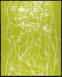
For this task I decided to choose a large-scale piece of work called ‘Water Painting’ 1999 by Gary Hume. As it is small on the screen, I tried to imagine what it would look like in the flesh, being 3050 x 2440 x 21 mm.
Moving on, I imagined what the image would look like in real life, but much smaller in scale, such as postcard size. I think the figures would become almost unrecognizable and merge together on the page. This may actually be quite interesting and may even keep the viewer looking for longer as it creates intrigue as you have to unravel the image yourself.
In order to facilitate the transformation, I would place the image in a row with the rest the series of Water Paintings, and scaling them all down so they were all the same size. I would also make the lines of the drawings thinner. This is so that when the image is scaled down, they wouldn’t become too thick and messy, I wouldn’t want the image to lose its primary characteristics of being a simple line drawing. Furthermore, images that are made smaller, tend to lose their main appeal of being big and bold and eye catching. Thus, in order to refrain from losing this trait, I would intensify the colour palette, otherwise the image may look quite dull and unappealing.
On the other hand, if I was to make the image much bigger, billboard size, the lines would have to be made much thicker and brighter. This is so that they do not become lost within the colour of the background which could happen if it was looked at from afar. I think this image in particular would benefit from being much larger as it would almost be like the figures were looking down on society.
Task 12
Leave a reply

