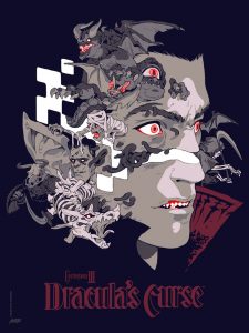
This poster by Sachin Teng is gorgeous. It’s a screen printed poster for the 1989 K onami game ‘Castlevania III: Dracula’s Curse’. The cold grey-scale combined with the intense pinks is just perfect for the sombre tone of the poster, the brighter colours almost draw you away from the horrible cursed tendrils squeezing their way out of the figures face, and the expression, to me it leaves some questions ‘is this a curse that Dracula’s put a curse on something?’ or ‘is this a curse on Dracula himself?’, its a focused yet strangely neutral expression.

‘Akira’ 1988, is an animated classic among ‘ghost in the shell’, ‘perfect blue’ and ‘paprika’ and the poster is no different the text at the bottom spelling out Akira and then splashed over with the same words in Japanese it gives a certain power to the name or if you didn’t know the overlay also says Akira it would look disrespectful or dismissive.
The lack of shadows and scenery (sans bike) gives it an almost religious look combined with the pose of the figure they could either be staring at the bike making a decision or walking purposely mind already made up, ready to do the hard thing, save the world or something.
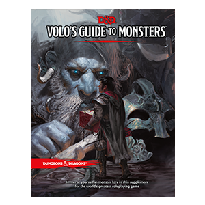
 My third and final image is the cover of a dungeons and dragons book (plus the full piece of art) ‘Volos’ guide to monsters’. This is one of those paintings where you can physically feel the Photoshop brushes the artist (Tyler Jacobson) used. it’s also the type of picture that tells more story the longer you look at it, the giant in the front has a helmet next to him that he presumably removed to talk to the human, he has his and up stopping one of his companions with a huge knife from doing something, the human is holding a huge book ‘presumably the guide to monsters’ there’s a massive pair of scissors stabbed onto the ground next to the human, what happened before that calm we see now? probably something intense.
I also like how the human is red creating a clearer divide between him and the giants who are a pale bluish grey very nice contrast.
refer to bibliography for references

